Lesson 1: Lines, Ellipses and Boxes

9:40 PM, Wednesday October 21st 2020

Lesson 1 – Drawabox Challenger

Drawabox Challenger: https://drawaboxchallenger.wordpress.com/drawabox-homework/

Lines, Ellipses and Boxes Super Imposed Lines Ghosted Lines Ghosted Plan...

Hello everyone,

Since last week, my drive to draw a lot has returned (partly due to ShadowDraw on IOS). The day before yesterday, I finally decided to start my Drawabox journey!

I added an extra section, because they were part of my progression. My first drawing was the first Lesson 7 assignment to see what level I am currently at, which I can use to compare my level when I have finished this course. But of course, you could ignore that section.

Thanks in advance.

0 users agree
12:24 AM, Thursday October 22nd 2020

Hello and congrats on completing lesson one. I'll be taking a look at your submission today. Starting with your superimposed lines these are looking pretty good for the most part although on the second page you appear to be having some issues with keeping a clearly defined starting point on some of these. https://drawabox.com/lesson/1/8/fraying The most control you have in the entire drawing process is where you start your line so you should always take the time to make sure you get that right. Your ghosted lines and planes are looking very good. You are doing a great job using the ghosting method to get very confident linework and although your accuracy still could use some work that will come with practice.

Your table of ellipses are coming along pretty well. You are doing a great job drawing through all of your ellipses although I think you were ending up with some very lumpy and deformed ellipses on the first page but I'm seeing some good improvements on working towards smoother ellipse shapes overall with the second page. That said I'm still seeing a bit of wobble and deformed ellipses with your ellipses in planes that probably needs addressing. https://drawabox.com/lesson/1/12/deformed This is most likely happening because you are a little too concerned with accuracy at this point and are slowing down your stroke to compensate. One of the reasons we use the ghosting method is so we can build up the muscle memory of our stroke beforehand. This way when we go to make our mark we can almost do it without thought. This will lead to a smoother overall line that will be less accurate at first. The more we practice using this method the more accurate we will get. You are also having some issues with your ellipses tilting off the minor axis with your ellipses in funnels. https://drawabox.com/lesson/1/13/notaligned You always want to be considering the minor axis whenever you draw an ellipse. These ellipse shapes are looking smoother overall though which is good to see. Your ellipses are coming along decently just make sure you keep using the ghosting method and don't worry too much about accuracy at first.

Plotted perspective looks great nothing to mention here. You seem to be missing a page of rough perspective boxes you need two for the homework submission. So I'm noticing a few problems with this page that we should go through. The first thing is that you tilted two of the boxes so they aren't lying flat on the ground plane. When working through these exercises I understand the temptation to make them "cooler" but these are really about learning so try and stick to the homework instructions as closely as possible. Secondly, you didn't extend the lines back on your boxes correctly. Instead you simply drew them how they should have correctly gone directly back to the vanishing point which doesn't really show you how off your estimations were. https://drawabox.com/lesson/1/15/plottinglines Finally, I'm noticing a lot of redrawn lines here which is a habit you should try and avoid. Right now it's just making your image look more messy overall and you would be much better of putting down a single confident line and sticking with it even if it's slightly off. So with that said due to the lack of following directions and missing page I'd like you to do one more pages of rough perspective boxes. Make sure you extend the lines back correctly on your boxes and try and use the ghosting method and stick with a single line.

Your rotated box exercise turned out pretty well but once again you did a bit of cheating here with using a thicker pen for outlining. Like I said earlier there is going to be temptation to try and make these exercises "pretty" but that isn't the point of why you are doing these and it just ends up making the critiques more difficult. That said you did a good job drawing through your boxes and keeping your gaps narrow and consistent and you handled the rotations pretty good as well. In your other rotated box exercise you posted you were running into a problem with not actually rotating your boxes and were instead simply drawing them moving back in perspective which is a pretty common mistake. https://drawabox.com/lesson/1/16/notrotating Finally your organic perspective exercise is looking good for the most part although I am noticing a few wonky box constructions here and there so the 250 box challenge will be a good next step for you.

Overall this was a pretty good submission. I would just try and resist the temptation to "pretty up" your homework pages and if you do want to do that that's fine but take pictures beforehand for your submission. I think you are understanding most of the concepts these lessons are trying to teach pretty well. Get that final page of rough perspective boxes submitted and I'll mark this as complete and you can move on to the 250 box challenge.

Next Steps:

One more page of rough perspective boxes. Make sure you extend the lines back correctly on your boxes and try and use the ghosting method and stick with a single line.

When finished, reply to this critique with your revisions.
2:56 AM, Thursday October 22nd 2020

Thank you for your review.

Something went wrong with showing the second Rough Perspective page. It should show up now.

Having said that, I still think I should redo (at least) that one, because, indeed, I did not extend the lines correctly (and did some unnecessary cooling-up).

redrawn lines: In the instruction video I understood one could bolden up the lines. At the time, I was having trouble with that (I remember I was looking for an appropriate pen as well). Currently, I use 0.3mm Staedler. The “cheating” with a thicker pen (an F / 0.5 fineliner) was a way to see if that one would do better. With the 0.5, I feel I cannot make lines even and that the pen is not so clean (it smudges rather easily). So I need to find a way thicken lines with my 0.3 pens without making them uneven. Or buy a better 0.5 pen.

I have afforded quite some credits. I am willing to redo every drawing that needs improvement using a new credit by resubmitting. Obviously I could only do what you request me to do and move on to the box challenge, but I think it is a very good idea to really do every exercise as it is instructed. I would not say I was rushing or careless—not at all. However, your instruction made me realise I could probably take my time more (I was marathoning the drawings). I think I will learn a lot more that way, than if I would move on after redoing the rough perspective assignment.

Regards,

Manolito Mystique

6:23 AM, Thursday October 22nd 2020

Just to be clear, the revisions Rob assigned should be submitted as a reply to his original critique - not as a fresh submission. This will not cost you any credits, it is included as part of the original critique. Aaaalso it is best that you use a 0.5 pen - 0.3 is too narrow, and 0.5 is what the lesson mentions you should be using.

11:19 PM, Thursday November 5th 2020

Dear Rob,

Here is my revision. I have purchased 0.5mm fineliners.

https://drawaboxchallenger.wordpress.com/drawabox-homework-revised/

9:18 PM, Friday November 6th 2020

Okay these are looking better. I'm going to mark this lesson as complete and you can move onto the 250 box challenge.

Next Steps:

The 250 Box Challenge

This critique marks this lesson as complete.
The recommendation below is an advertisement. Most of the links here are part of Amazon's affiliate program (unless otherwise stated), which helps support this website. It's also more than that - it's a hand-picked recommendation of something I've used myself. If you're interested, here is a full list.
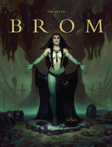
The Art of Brom

The Art of Brom

Here we're getting into the subjective - Gerald Brom is one of my favourite artists (and a pretty fantastic novelist!). That said, if I recommended art books just for the beautiful images contained therein, my list of recommendations would be miles long.

The reason this book is close to my heart is because of its introduction, where Brom goes explains in detail just how he went from being an army brat to one of the most highly respected dark fantasy artists in the world today. I believe that one's work is flavoured by their life's experiences, and discovering the roots from which other artists hail can help give one perspective on their own beginnings, and perhaps their eventual destination as well.

This website uses cookies. You can read more about what we do with them, read our privacy policy.