


This website uses cookies. You can read more about what we do with them, read our privacy policy.
0 users agree
7:24 PM, Tuesday March 21st 2023
Welcome to drawabox, and congrats on completing Lesson 1. I’ll be taking a look at it for you.
Starting off, your superimposed lines look good. They’re smooth, properly lined up at the start, and of a consistent trajectory. You’d have benefitted from trying out some arcing lines, too, but that’s alright. Your ghosted lines/plans look quite confident, also, and I’m pleased to see that you’ve not neglected to plot start/end points for their non-diagonal center lines – most students do!
Onto the ellipse section, the table of ellipses exercise improves nicely by page 2. You’ll still have a little trouble keeping your rotations matched up (for which I’ll recommend spending a little longer ghosting), and sometimes you’ll revert to a lesser pivot mid-ellipse (for this, see if you can always check back, to ensure that you’re still drawing from the correct pivot), but overall, these are looking solid. The ellipses in planes look fantastic! Despite their more complicated frames, they do a good job of maintaining, and in most cases even improving!, their prior smoothness/roundness. Finally, the funnels look solid, also. I’d draw them a little bigger, just to be safe, and for an extra challenge, increase the degrees of the ellipses as they move away from the center.
As for the box section, the plotted perspective exercise looks nice, but you should’ve used a ruler for your hatching lines. The rough perspective exercise is a little mixed. The convergences look solid: they start off strong, and show some nice improvement throughout the set. The linework is confident, but scratchy. It’s interesting that you decided to redraw some lines; this is normally a habit of students that mess up their initial line, and go over it a second time as a kneejerk reaction, but your lines are fairly confident. Perhaps your pen is dying? Either way, each line is drawn once, and only once, regardless of how it turns out. Skipping ahead a little I notice that your organic perspective exercise looks nice, but, for the sake of an example, had there been any lineweight applied to those boxes – the ones in the back, in particular – it would’ve caused them to read as if they’re in front, thus contradicting what their size is saying, and confusing the viewer. Thus, we want to be very very cautious with our use of lineweight, intentional or otherwise. Anyway, good aside from that! The rotated boxes exercise, too, looks good, if a little small. As I hinted at with the funnels, drawing big is important, as, firstly, it makes engaging the shoulder easier, and, secondly, it gives your brain some much-needed room to think. Anyway, your boxes are snug, and they do a good job of rotating, so good work here. Finally, the organic perspective boxes look good, too. They’re a little dramatic in their foreshortening, but even as they are, their increase in size communicates the flow we’re after effectively.
Next Steps:
I’m happy to mark this lesson as complete, and send you off to the box challenge. Best of luck to you!
The recommendation below is an advertisement. Most of the links here are part of Amazon's affiliate program (unless otherwise stated), which helps support this website. It's also more than that - it's a hand-picked recommendation of something I've used myself. If you're interested, here is a full list.
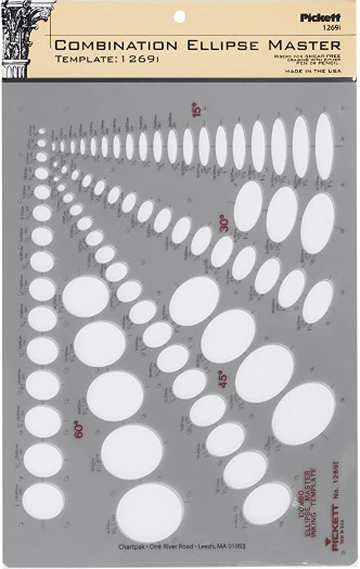
Ellipse Master Template
This recommendation is really just for those of you who've reached lesson 6 and onwards.
I haven't found the actual brand you buy to matter much, so you may want to shop around. This one is a "master" template, which will give you a broad range of ellipse degrees and sizes (this one ranges between 0.25 inches and 1.5 inches), and is a good place to start. You may end up finding that this range limits the kinds of ellipses you draw, forcing you to work within those bounds, but it may still be worth it as full sets of ellipse guides can run you quite a bit more, simply due to the sizes and degrees that need to be covered.
No matter which brand of ellipse guide you decide to pick up, make sure they have little markings for the minor axes.