


This website uses cookies. You can read more about what we do with them, read our privacy policy.
2 users agree
12:36 AM, Monday June 27th 2022
Hi! I'll take care of reviewing your homework today.
I'll try to be as concise as possible, and first of all congratulations on finishing it.
Take your time to read, no need to rush.
Arrows:
-
I will mention that the folds of your arrows look good, and they overlap correctly.
But your arrows lack a sense of depth.
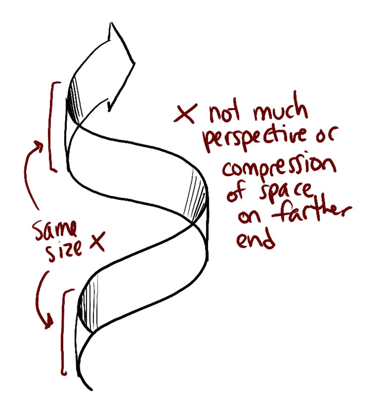
Such as in this image: https://d15v304a6xpq4b.cloudfront.net/lesson_images/0f7c806c.jpg
This depth is difficult to achieve at first.
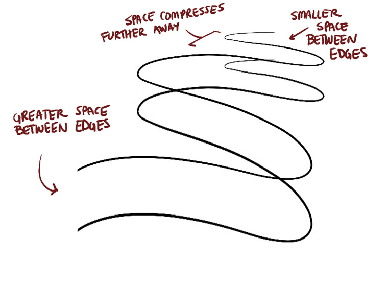
It is achieved by compressing the space and size of your arrow as it moves away from you, the viewer.
https://d15v304a6xpq4b.cloudfront.net/lesson_images/011d064f.jpg
It also helps to start thinking of your leaf space as a vast, wide world, where there is a "far" and a "near".
-
Take a little more patience when drawing the shadow lines of each arrow, they look a bit rushed. I know they can be seen as a secondary part of the drawing, but they should receive the same care and planning as the other parts.
-
I want to mention to you about moderating the use of line weight; it only applies to a shape that overlaps another, and a little will be more than enough, don't overuse it.
Organic shapes / Ellipses and contour curves:
-
The overall shape of your "sausages" is appropriate, nothing is overdone. This is great.
-
Regarding the ellipses and contour curves, I like that they are well aligned to their minor axis as well as changing degree (thickness) according to their position.
-
There are times when you scribbled over your mistakes. I get the idea of this, but try to leave your mistakes intact.
This way, those of us who critique your homework will be able to give you steps to follow to fix them.
- On the ellipses and contour curves, you seem to be focusing a lot on how many of these you draw.
The more of these you draw, the more likely you are to get tired and the quality of these will decrease.
Instead, draw a few ellipses or curves, as long as they are well planned and thought out.
Textures:
- The work on studying textures looks very appropriate.
And the transition from dark to light is correctly extended.
- It is also very useful that you are modifying the silhouette of your textured dissections.
This way, you will get a better impact when describing your shapes.
- In several textures you are focusing too much on the black (negative) spaces and their outline; when your focus should be on the shadows cast.
Think more about identifying such shadows, and just take care of drawing those, nothing else.
- I see that you are also working with "light" textures such as hairs.
In these cases, it is appropriate to apply a process like the one in this image:
Where we outline the line and its shadow.
This way, they won't look so monotonous and each hair will have some depth.
Intersection of shapes:
- All the shapes look like they belong to the same scene, which is good.
However, applying a shallower foreshortening will help you to improve that effect.
- I see you worked a bit with the intersections, if you still don't understand them don't worry, we will see them in more detail later.
Organic intersections:
- I'm glad you caught how the shadows cast on the shapes are cast.
I know you will progress even more with practice.
- While the shape of your sausages looks good, their position on top of each other can look a bit unstable.
This is normal, and thinking about the solidity of each one as you draw it will help it improve.
https://i.imgur.com/KJQhpn8.png
Imagine you're stacking water balloons.
Homework:
I'll leave you with a couple of activities to correct your mistakes, and I should mention to be patient.
All of this can be a lot to take in, so it's okay to go through it at your own pace.
Next Steps:
Draw:
1 page of arrows.
1 page of organic intersections.
Take into account everything mentioned in the critique.
9:30 PM, Wednesday June 29th 2022
Thank you for the review!
I went back and redid those exercises, trying to fix the things you pointed out.
I think I accidentally drew one sausage a little unstable but I think I got the rest of them.
11:57 PM, Wednesday June 29th 2022
Okay, those are very good corrections!
You'll notice that you can feel a greater solidity in the objects in both exercises.
That's the result we were hoping for.
Great job!
(By the way, I am sorry for the extensive order of the review, it was difficult for me to summarize that day)
This community member feels the lesson should be marked as complete, and 2 others agree. The student has earned their completion badge for this lesson and should feel confident in moving onto the next lesson.
6:10 PM, Thursday June 30th 2022
Thanks! And don't worry about the long review, it was really helpful.
The recommendation below is an advertisement. Most of the links here are part of Amazon's affiliate program (unless otherwise stated), which helps support this website. It's also more than that - it's a hand-picked recommendation of something I've used myself. If you're interested, here is a full list.

Cottonwood Arts Sketchbooks
These are my favourite sketchbooks, hands down. Move aside Moleskine, you overpriced gimmick. These sketchbooks are made by entertainment industry professionals down in Los Angeles, with concept artists in mind. They have a wide variety of sketchbooks, such as toned sketchbooks that let you work both towards light and towards dark values, as well as books where every second sheet is a semitransparent vellum.