Lesson 1: Lines, Ellipses and Boxes

3:25 PM, Friday February 14th 2020

Lesson 1 - Album on Imgur

Direct Link: https://i.imgur.com/rrAz4Aq.jpg

Post with 99 views. Lesson 1

So I've always been used to drawing Box shaped forms with my lanes going over the edges, so I need to get used to drawing them exactly where they meet.

I also haven't drawn in a while...

2 users agree
5:18 AM, Saturday February 15th 2020

Yo! Grats on clearing lesson 1! You have an extra page of table of ellipses, I'm just gonna assume that was an error, but as a general note, don't grind.

Anyways, onto the crits.

Superimposed lines: Excellent work on establishing confidence in your lines. I see no wobble. However, especially in your curves, there is some double end fraying. Do keep that in mind for the future.

Ghosted lines: In general, its pretty damn good. There is some curving in your lines, however. You've pointed it out in one of your lines, but in general, deal with making a confident, straight line first. Accuracy comes after. So, even if you appear to go off the mark in execution, trust in your ghosting always.

Ghosted planes: Again, good work. While there is some arcing and curving in your lines, its not very major. Do note that the "+" should also be ghosted.

Table of ellipses: Ellipses are nice and confident, and have the proper elliptical shape. You've done this one well, nice job!

Ellipses in planes: While the shape of the ellipses here is good, do take note of your execution. On a single ellipse, there are occasions where your ellipses become inconsistently fainter/darker. Do remember to keep a consistent, perpendicualr pen to the page to ensure maximum ink flow.

Funnels: There is occasional tilting of your ellipses. Do remember to rotate your page accordingly as you draw. The ellipses are lined up according to the minor axis, so good job there.

Plotted perspective: Its great. You might wanna have some hatching in the future, however.

Rough perspective: I see that you've managed to hold on to your line confidence even here. This is really good, as I see most people struggle to maintain this. Other than that, you've gotten the idea down, so keep at it!

Rotated boxes: Okay, so I think you've kinda gotten the idea down on this exercise. I won't get you to redo, but there are some points that are worth mentioning. Firstly, the edges of the boxes should always be close to each other for the purpose of easy estimation. This is lacking in some of the bottom faces in the "+". Secondly, the bottom boxes should also converge, like the surface boxes. In general, I find this to be somewhat lacking. Finally, you should be using line weight to make things easier for yourself while drawing. I think you may have become a little disorientated as you drew as a result. A good attempt overall, however.

Organic perspective: Box construction ain't perfect, but you'll get to know that soon. Aside from that, you should draw the boxes fully, even if its hidden behind another box. You can then use line weight to establish dominance in the boxes. In this exercise, I think you've grasped the idea of "bigger=closer" very well, so good on you for that.

Overall, I think this is a solid submission. You've shown a great understanding of the concepts in the lessons, and you've done everything with a good amount of confidence. Keep up the good work!

Next Steps:

Onward to 250 boxes! All the best!

This community member feels the lesson should be marked as complete, and 2 others agree. The student has earned their completion badge for this lesson and should feel confident in moving onto the next lesson.
5:43 PM, Sunday February 16th 2020

Thanks for the feedback! It was a lot more complete than I expected, I appreciate the effort :)

I'll be sure to be on the look out to fix what you've mentioned and keep exercising my lines.

Thanks for the encouragement!

The recommendation below is an advertisement. Most of the links here are part of Amazon's affiliate program (unless otherwise stated), which helps support this website. It's also more than that - it's a hand-picked recommendation of something I've used myself. If you're interested, here is a full list.
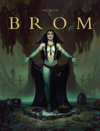
The Art of Brom

The Art of Brom

Here we're getting into the subjective - Gerald Brom is one of my favourite artists (and a pretty fantastic novelist!). That said, if I recommended art books just for the beautiful images contained therein, my list of recommendations would be miles long.

The reason this book is close to my heart is because of its introduction, where Brom goes explains in detail just how he went from being an army brat to one of the most highly respected dark fantasy artists in the world today. I believe that one's work is flavoured by their life's experiences, and discovering the roots from which other artists hail can help give one perspective on their own beginnings, and perhaps their eventual destination as well.

This website uses cookies. You can read more about what we do with them, read our privacy policy.