


Lesson 5: Applying Construction to Animals
6:31 AM, Saturday December 18th 2021

Notify me immediately if there are any issues.
I can see that the work you did for this lesson has been spread out a fair bit, and there is definitely a great deal of improvement over the course of the last three months. As a whole, you have definitely grown quite a bit, and you've demonstrated by the end a fairly good grasp of how these forms interact with one another in 3D space, and how they can be manipulated to create solid, believable structures on the page. There are however issues that come up here and there, so I'll try and call out everything I see.
The most significant issue is one that doesn't come up consistently throughout your work, but it also isn't entirely eradicated by the end. It is however one that I called out in my critique of your Lesson 4 work (and I recommend you go back and reread what I said there) - you're still, at least in a number of these drawings, putting a lot of emphasis on the idea of "decorating" your drawings once you hit the detail phase and all your construction is complete. We can see this in a number of drawings, including this duck from mid-October, and this bull from mid-November. The main issue here comes down to the fact that you are focusing largely on drawing what you see in your reference, without understanding how what you see is meant to convey the presence of specific three dimensional textural forms. In skipping this crucial step of understanding the forms that make up your textures, you instead ended up putting down a lot of really arbitrary strokes, often resorting to things Lesson 2 stressed as being things to avoid. For example, scribbling and form shading. In the case of the bull, you do appear to be trying to employ some implicit shadow shapes, although there are some very strange choices in terms of where you've placed them. For example, we end up with arbitrarily thick sections on its face/muzzle, and here on its back leg there seems to be an arbitrary block cutting off what might have been an additional mass.
I'm breaking this off into a second point just to avoid clutter. Right now, your approach to detail at least in these drawings does not suggest a specific understanding of the actual textural forms at play. Between the observation of what's present in your reference image, and the execution of the marks you ultimately use to convey some specific detail or texture, there needs to be an intermediate step of understanding the nature of each textural form. It's that understanding which we then use to craft and design the shape of each cast shadow.
It's worth mentioning that while this bull still has similar concerns, it is vastly better than the other one, simply because the marks you put down are not just transferred blindly from reference to drawing. Rather, they do reflect some thought being put towards what you understand as being represented in the reference image, and so your textural marks are more understated, and more focused. Again - this is still not adhering to the points raised in Lesson 2's texture section, but it is better for a number of reasons. You are also doing much better when it comes to designing the tufts of fur along your form's silhouettes, like on this fox.
I am definitely seeing improvement in your use of additional masses - you're definitely continuing to do a better job of designing their silhouettes, although there are still ways in which this can be improved. As shown here, there are two main changes. Firstly, I've made sure that both sides of each mass are visibly wrapping around the existing structure, as shown in green. Secondly, I've brought those masses down a bit further so they can wrap around the masses at the rabbit's shoulder and pelvis. All quadrupedal animals tend to have more muscle built up around these areas, simply because it allows them to walk and run around, but they're not always super easy to pick out of a reference image if you don't know to look for it. We are of course simplifying what those masses look like into basic smushed ball forms, but doing so still gives us something to integrate our additional masses with, creating a more solid, cohesive end result.
On the topic of additional masses, I did notice some cases where you employed a number of contour lines, usually when you didn't feel a mass felt solid enough on its own (based on the design of its silhouette). You don't do it all the time, but it does come up here and there - likely where you feel less confident about how solid a given mass looks. Unfortunately, those kinds of contour lines (that is, the ones we encounter initially with the organic forms with contour lines exercise) are not suitable here, and don't actually contribute towards the problem. They will make a form feel solid in isolation, but they do not help to establish the form as part of a larger structure, and they do not help define the relationship between that form and the existing structure. They also suffer from diminishing returns (so 3 contour lines is not going to be three times as good as 1), and when we try to just pile them on, we tend to execute them a little more sloppily. The solution always comes back to the fact that the additional mass's silhouette was the issue, and it's that shape which needs to be rectified. Of course, it won't be fixed in the construction where it went wrong, since we're not allowed to alter the shapes of our forms. But each drawing is an exercise, and so we learn from one and apply to the next.
Now, for leg construction, you're a bit mixed. There are definitely areas where you're making really solid use of the sausage method, and others where you're opting for different strategies - for example, you used the sausage method pretty well on the back leg of this fox, but in straying from it for the front legs you ended up drawing more complex forms (or rather, jumping back and forth between 3D and 2D with some of those segments just being partial shapes rather than their own complete 3D structures. Remember - ensuring that every form we draw is complete and enclosed, and that we're thinking about how they actually exist in relation to the other forms that are present, is pretty critical to what we're doing in this course. We're not just drawing a bunch of objects/creatures/etc - each one is an exercise where we're going through the same kind of 3D spatial puzzle over and over. It's required for you to be thinking about everything you add as though it exists in 3D space, and the first step to that is ensuring that they are all fully enclosed shapes.
The last point relates to how you approach head construction. This course has a few different ways presented for tackling head construction (each being different because they were produced at different times). Each one has something of value to offer, but you'll find the most recent one on the informal demos page, and it is also definitely the best one to follow. When I have time to do so (which I'm working towards - right now I'm stuck revising Lesson 0 and 1), I plan to integrate it into the main lesson material, but until then it will have to be somewhat split up. Either way, try to apply this specific technique to your head constructions as closely as you can, down to defining the forehead as well as using a specific shape - the upturned pentagon - for the eye sockets. You've largely been using a lot of ellipses, or other shapes. The pentagon has multiple advantages - it allows us to create individual "cuts" into the surface of the cranial ball, helping us to understand how the eye socket exists on its surface (something we do not get when drawing sockets as ellipses), and the shape itself allows for a wedge in between the sockets to fit the muzzle, and a flat surface upon which the forehead can be set.
And that about covers it! While there certainly are a number of things of which to take note, you are still showing a great deal of improvement over the set. I'm going to go ahead and mark this as complete.
Next Steps:
Move onto the 250 cylinder challenge, which is a prerequisite for lesson 6.
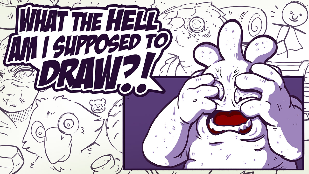
Right from when students hit the 50% rule early on in Lesson 0, they ask the same question - "What am I supposed to draw?"
It's not magic. We're made to think that when someone just whips off interesting things to draw, that they're gifted in a way that we are not. The problem isn't that we don't have ideas - it's that the ideas we have are so vague, they feel like nothing at all. In this course, we're going to look at how we can explore, pursue, and develop those fuzzy notions into something more concrete.
This website uses cookies. You can read more about what we do with them, read our privacy policy.


