Lesson 2: Contour Lines, Texture and Construction

11:35 PM, Thursday July 15th 2021

Lesson 2 drawabox - Album on Imgur

Direct Link: https://i.imgur.com/ntbAOK4.jpg

Post with 3 votes and 79 views. Shared by starcaptain818. Lesson 2 drawabox

I had trouble with the ribbons so I did an extra page to try to figure it out.

I also really struggled with the intersections with cubes only because I just couldn't figure out how the corners of two cubes intersecting would look and how to draw that. I also struggled to really get a feeling for texture of a crumpled piece of paper.

I've noticed that my drawing has improved, but I still struggle with controlled and precise lines, but I think its a matter of slowing down and planning each line.

0 users agree
8:34 AM, Sunday July 18th 2021
edited at 8:36 AM, Jul 18th 2021

I'll be the TA handling your Lesson 2 critique.

You're making progress towards understanding the concepts introduced in this lesson and hopefully this critique will help you in your future attempts.

  • Starting off with the arrows section you want to be making sure you're drawing confidently to keep your arrows as smooth as possible, accuracy will come with mileage. There are spots where your arrows bulge/narrow suddenly, this is an issue because it gives the impression that your arrows are stretching which hurts their solidity. Remember that as our arrows move closer to the viewer we want them to widen consistently. It's good to see that you're trying to implement line weight, just remember that you want to keep your applications subtle and you'll become consistent with mileage. here are some things to look out for when applying it. I'd like you to experiment more with foreshortening in your future attempts, by utilizing it in both the arrows themselves as well as the negative space between their curves we can create a stronger illusion of an object moving through 3D space as demonstrated here.

  • Moving into the organic forms with contours exercise your forms are getting a bit too complex. We want to create our forms with both ends being the same size and to avoid any pinching, bloating, or stretching along the form's length as discussed here. You're keeping your line work mostly confident here which is great, if you feel uncomfortable working with contours still don't stress with more mileage it'll become more natural. Speaking of contours I'd like you to try and shift the degree of your contours more. The degree of a contour line basically represents the orientation of that cross-section in space, relative to the viewer, and as we slide along the sausage form, the cross section is either going to open up (allowing us to see more of it) or turn away from the viewer (allowing us to see less), as shown here. Quick final note, remember to draw through your ellipses even the tiny ones on the end of the form and they should only be on the end of the form facing the viewer.

  • In the texture exercises you're focusing largely on outlines and negative space rather than cast shadows created by forms along the texture itself. This makes it difficult to create gradients with implied information which we could then use to create focal points in more complex pieces, by doing so we can prevent our viewers from being visually overwhelmed with too much detail. You also show that you're drawing from memory rather than giving yourself enough time to focus on your reference. Most of our time when doing exercises like this will be spent observing our reference and looking away for a quick second to add something to our page. For more on the importance of focusing on cast shadows read here. I'd also like to quickly direct you to this image which shows that when we're working with thin line like textures if we outline and fill the shadow we will create a much more dynamic texture than simply drawing lines.

  • It's quite common for people to feel like they don't fully grasp the form intersections exercise, if you feel like you may fall into this category try not to stress too much. This exercise is just meant to get students to start thinking about how their forms relate to one another in 3D space, and how to define those relationships on the page. We'll be going over them more in the upcoming lessons. Your forms are looking quite solid here and they believably appear to belong in the same cohesive 3D space, good work. I will quickly point out that you have some line wobbling occurring here as well, just remember confidence is our first priority always.

  • While wrapping up your submission with the organic intersections exercise you show that you need a bit more time becoming comfortable with thinking of how these forms interact in 3D space and how they'd wrap around one another. I recommend trying to stack your forms perpendicularly rather than trying to keep them headed in the same direction to help make wrapping them around one another a smoother task. Your forms here get a bit too complex which makes the overall task more difficult, I'd like you to try simplifying your forms a bit more in the future and would like you to draw through all of your forms as well, it helps deepen our understanding of the 3D space we're attempting to construct. When drawing your shadows you don't always push them far enough to cast, instead they mostly hug the form creating them, try pushing them further. It appears like your shadows aren't following a consistent light source, I recommend pushing your light source to the top left or right corner of the page to start with, it's easier than working with a light directly above your form pile.

I won't be moving you on to the next lesson just yet, each lesson builds upon each other and I'd like to make sure you understand a few of these concepts a bit more before potentially creating more problems down the road.

With that being said I'd like you to please re-read and complete:

  • 1 page of the organic forms with contours exercise

  • 1 page of the organic intersections exercise.

Once you've completed the pages mentioned above reply to this critique with a link to them, I'll go over them and address anything that needs to be worked on and once you've shown you're ready for the next lesson I'll move you on.

I look forward to seeing your work.

Next Steps:

Please re-read and complete:

  • 1 page of the organic forms with contours exercise

  • 1 page of the organic intersections exercise.

When finished, reply to this critique with your revisions.
edited at 8:36 AM, Jul 18th 2021
12:12 AM, Friday July 23rd 2021

Here is the link to the two exercises.

I think I am starting to understand organic forms a bit more and the contours exercise made more sense the second time around. I still feel like I struggled wish shadows and really thinking about how the forms would overlap in the intersections exercise, but things are feeling clearer. I am starting to get a sense of how to visualize the 3D space on the page in my head. The problem is trying to translate that onto the page, but I'm sure that'll come with practice.

12:32 AM, Friday July 23rd 2021

Hey there, it appears your link isn't working.

You may have accidentally deleted a character while making the link, try posting it again and I'll take a look.

4:30 PM, Sunday July 25th 2021

Sorry about that! here's the link: https://imgur.com/a/gTKEr3e

View more comments in this thread
The recommendation below is an advertisement. Most of the links here are part of Amazon's affiliate program (unless otherwise stated), which helps support this website. It's also more than that - it's a hand-picked recommendation of something I've used myself. If you're interested, here is a full list.
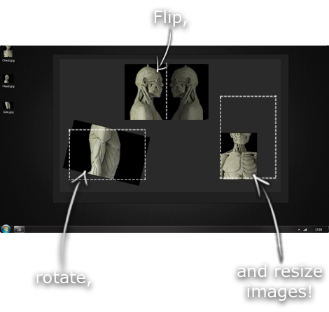
PureRef

PureRef

This is another one of those things that aren't sold through Amazon, so I don't get a commission on it - but it's just too good to leave out. PureRef is a fantastic piece of software that is both Windows and Mac compatible. It's used for collecting reference and compiling them into a moodboard. You can move them around freely, have them automatically arranged, zoom in/out and even scale/flip/rotate images as you please. If needed, you can also add little text notes.

When starting on a project, I'll often open it up and start dragging reference images off the internet onto the board. When I'm done, I'll save out a '.pur' file, which embeds all the images. They can get pretty big, but are way more convenient than hauling around folders full of separate images.

Did I mention you can get it for free? The developer allows you to pay whatever amount you want for it. They recommend $5, but they'll allow you to take it for nothing. Really though, with software this versatile and polished, you really should throw them a few bucks if you pick it up. It's more than worth it.

This website uses cookies. You can read more about what we do with them, read our privacy policy.