View Full Submission View Parent Comment
2 users agree
6:55 PM, Saturday April 11th 2020

Arrows

Pretty confident and good, to improve them, you can try to exaggerate more how they get bigger as they get closer towards the viewer, more exponentially. The lineweight added in your overlaps is a bit stiff too, remember you should do it with a single superimposed line drawn from the shoulder.

Hatching seems a bit rushed too, so remember to take your time with each mark.

Organic forms

Pretty good in general, you got a few that are a bit stretched ellipse-like, and some pinching a bit, so remember that they have to be 2 identicall balls connected by a tube of consistent width. Ellipses and curves get a bit wobbly at times, but pretty confident in general. Remember that confidence is more important than accuracy, don't hesitate to sacrifice accuracy to get those as confident as you can.

Textures

Pretty good job in general. There are a few places where you focus a bit on contours, so remember that we should only draw cast shadows.

Form intersections

A few things.

  1. Don't repeat lines, even if they're wrong.

  2. Hatching is a bit rushed, take your time

  3. Don't forget to place starting and ending point before drawing each line, and to ghost it, it looks like you've been rushing those pages, you should be doing your best on every page of the homework, if you feel like you're rushing, take a break and come up later.

  4. Main objective of this exercise is to draw forms in a cohesive manner in space, by mantaining consistent foreshortening on them. To do that it's better if you focus in shallow perspective forms, as they are easier to handle.

Organic intersections

Pretty good and solid in general, great job! There are some places where the shadows look like they might be sticking a bit to the forms, so careful on that.

Next Steps:

I want to see another page of them before marking this as complete, keep in mind the things I said and be sure not to rush it! Good luck and keep up the good work!

When finished, reply to this critique with your revisions.
6:29 PM, Friday May 22nd 2020

Hello!

Thank you for your critique! It has been a long time but here is the page of form intersections

https://imgur.com/X5f9gJc

Hope you have a good day ahead!

8:58 PM, Friday May 22nd 2020

That's much better! Only thing I can notice is that you have some divergences on some parts, careful with them, pay attention when drawing each box so it doesn't happen.

Next Steps:

Congrats on finishing lesson 2! Next step is lesson 3, though I can see you've already have finished it.

As I mark this as complete, you can critique l1, box challenge, and l2. I recommend doing it as it is a way of learning more, and solidying concepts. If you do it as well you'll have your critiques faster, as it'll take less time for me and other people who critique to get to higher lesson submissions, including yours. Ofc it's optional don't feel forced to do it.

Good luck and keep up the good work!

This community member feels the lesson should be marked as complete, and 2 others agree. The student has earned their completion badge for this lesson and should feel confident in moving onto the next lesson.
The recommendation below is an advertisement. Most of the links here are part of Amazon's affiliate program (unless otherwise stated), which helps support this website. It's also more than that - it's a hand-picked recommendation of something I've used myself. If you're interested, here is a full list.
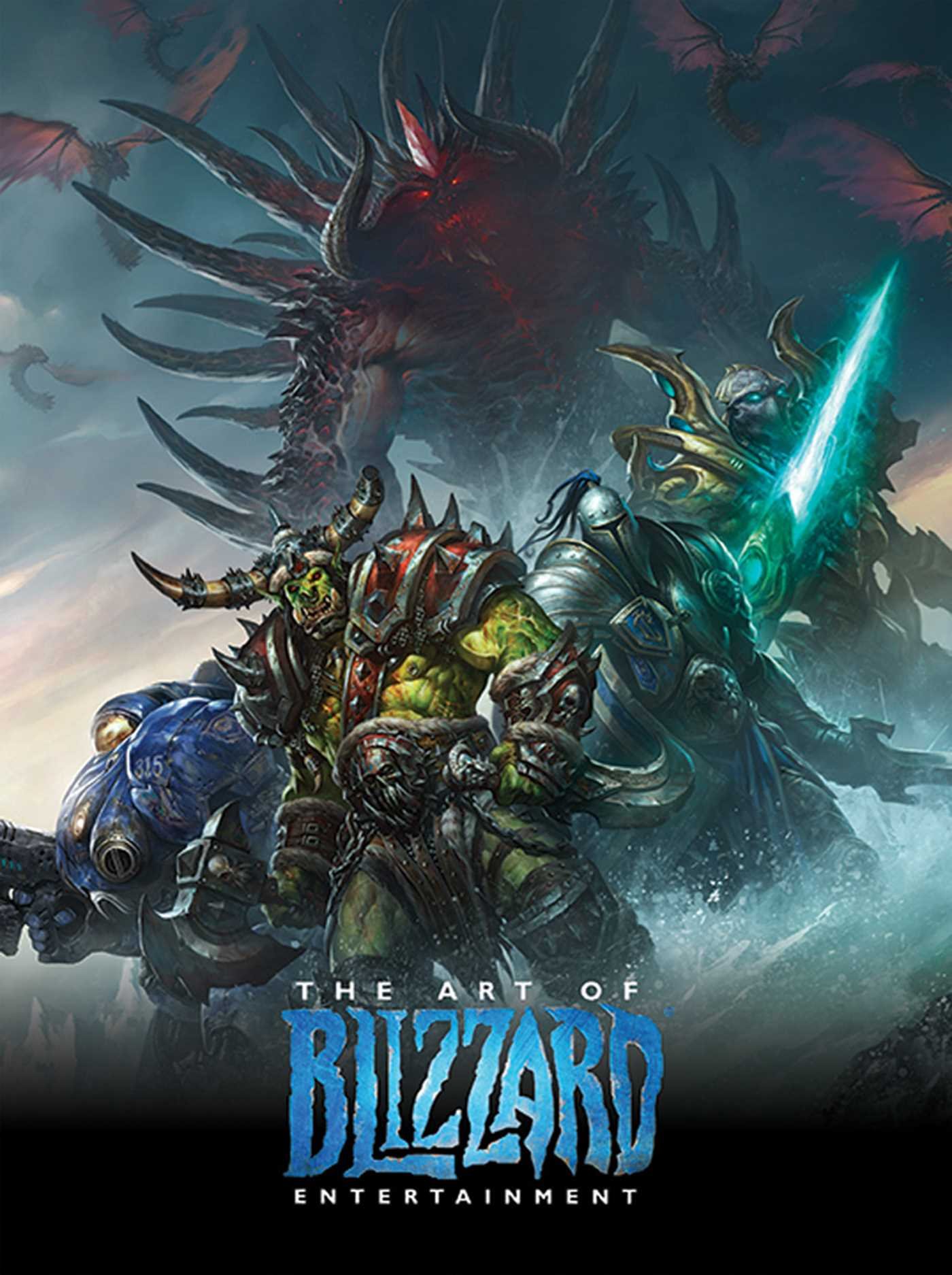
The Art of Blizzard Entertainment

The Art of Blizzard Entertainment

While I have a massive library of non-instructional art books I've collected over the years, there's only a handful that are actually important to me. This is one of them - so much so that I jammed my copy into my overstuffed backpack when flying back from my parents' house just so I could have it at my apartment. My back's been sore for a week.

The reason I hold this book in such high esteem is because of how it puts the relatively new field of game art into perspective, showing how concept art really just started off as crude sketches intended to communicate ideas to storytellers, designers and 3D modelers. How all of this focus on beautiful illustrations is really secondary to the core of a concept artist's job. A real eye-opener.

This website uses cookies. You can read more about what we do with them, read our privacy policy.