


Lesson 2: Contour Lines, Texture and Construction
11:48 PM, Wednesday August 4th 2021

Hi! This is my lesson 2 submission.
Feedbacks and comments are appreciated.
I'll be the TA handling your Lesson 2 critique.
You're making progress towards understanding the concepts introduced in this lesson and hopefully this critique will help you in your future attempts.
Starting off in the arrows section your lines are looking smoothly and confidently drawn. There are spots where your arrows bulge/narrow suddenly, this is an issue because it gives the impression that your arrows are stretching which hurts their solidity. Remember that as our arrows move closer to the viewer we want them to widen consistently. It's good to see that you're trying to implement line weight, just remember that you want to keep your applications subtle and you'll become consistent with mileage. here are some things to look out for when applying it. Great use of foreshortening so far, by utilizing it in both the arrows themselves as well as the negative space between their curves we can create a stronger illusion of an arrow moving through 3D space as you can see demonstrated here.
Moving into the organic forms with contours exercise some your forms are getting a bit too complex or simple at times. We want to create our forms with both ends being the same size and to avoid any pinching, bloating, or stretching along the form's length, as well as make sure we avoid creating something too simple to work with as discussed here. You're keeping your line work confident here which is great, if you feel uncomfortable working with contours still don't stress with more mileage it'll become more natural. Speaking of contours you're doing a good job trying to shift the degree of your contours so far, be sure to keep experimenting. The degree of a contour line basically represents the orientation of that cross-section in space, relative to the viewer, and as we slide along the sausage form, the cross section is either going to open up (allowing us to see more of it) or turn away from the viewer (allowing us to see less), as shown here.
In the texture exercises you're focusing largely on outlines and negative space rather than cast shadows created by forms along the texture itself. This makes it difficult to create gradients with implied information which we could then use to create focal points in more complex pieces, by doing so we can prevent our viewers from being visually overwhelmed with too much detail. For more on the importance of focusing on cast shadows read here. I'd also like to quickly direct you to this image which shows that when we're working with thin line like textures if we outline and fill the shadow we will create a much more dynamic texture than simply drawing lines.
It's quite common for people to feel like they don't fully grasp the form intersections exercise, if you feel like you may fall into this category try not to stress too much. This exercise is just meant to get students to start thinking about how their forms relate to one another in 3D space, and how to define those relationships on the page. We'll be going over them more in the upcoming lessons. Your forms are looking quite solid here and they believably appear to belong in the same cohesive 3D space, good work you're on the right track so far.
While wrapping up your submission with the organic intersections exercise you do a great job demonstrating that your sense of 3D space is developing as your forms begin to wrap around each other believably. You're keeping your forms simple and easy to work with which is a good strategy to help produce good results. When it comes to your shadows you're pushing them enough so that they cast rather than just hugging the form that creates them which is a great start. Your shadows appear to be following a consistent light source, be sure to experiment with different angles and intensities when trying this exercise again in the future. I recommend pushing your light source to the top left or right corner of the page to start with, it's easier than working with a light directly above your form pile.
Overall this was a solid submission, while you may have some things to work on I have no doubt you will improve with more mileage. I'll be marking your submission as complete and moving you on to the next lesson.
Keep practicing previous exercises as warm ups and good luck in lesson 3!
Next Steps:
Keep practicing previous exercise as warm ups.
Move on to lesson 3.
Hi, thanks for the feedbacks. I'll try working on maintaining a consistent increase in arrow widths and varying the light sources for the organic intersection exercise as you suggested.
By the way, I don't quite understand what you mean by "In the texture exercises you're focusing largely on outlines and negative space rather than cast shadows created by forms along the texture itself."
I've read all the links that you provided, but it didn't quite help me. Could you please point out specifically where the problem is in my work. May be put a red mark or name the texture that's most problematic or something?
Texture is difficult so no worries, I'll try my best to point out a few examples of your mistakes as well as explain how you can go about approaching the exercises. All I ask is that you be a bit patient with me because even explaining it to try and make sense can be a bit tricky, if you still have questions afterwards feel free to ask them.
For examples of you focusing on outlines I'd point to your mushroom, leaf and honey comb dissections.
For negative space your red meat and glass dissections stand out.
In your ceramic dissections and pebbles analysis you focus a bit more on form shadows as well.
I'm glad you made a leaf attempt because it's what I usually use to explain the process and having a direct comparison will hopefully make it a bit easier to understand.
I'd like you to open up this leaf texture and we'll get started. When we ask people to draw a texture they often over simplify the process and just focus on what they observe, while observing a reference is definitely an important aspect they tend to not think about the method we're teaching in this course which is constructional drawing. Now construction does involve observation, so it's not so much that people are doing the entire thing wrong, in reality the methods you chose to draw your textures can be totally valid and even ideal in certain scenarios, they're just not correct in every scenario or what the goal of these exercises have in mind.
Looking at the leaf texture I provided you'll notice it's in black and white, while we shouldn't rely on it all the time converting an image to black and white is definitely helpful, especially in the beginning. People tend to focus in on colour changes and they'll try to recreate them on a page when again we're trying to focus on cast shadows. Red meat is often a good example of this, they'll see red meat with strips of white fat through it and darken all of the red sections of meat and just leave the white fat highlighted, this is an example of focusing on negative space. By converting our image to black and white we deal away with these issues the best we can and are just left with black and white, much like what we're working with tools wise.
Now if we provided this image to someone and said "draw the texture of the leaf you see here" what often ends up happening is people will try and draw every little vein or if they don't have incredible patience they'll try and simplify the image and just capture the main vein and it's large branches, this would be them focusing on outlines.
Instead what we want to do is slow down and think about how this leaf is constructed. If we think about all the veins running through this leaf they're basically just long organic forms or cylinders, while the fleshy bit of the leaf could be described as a flat plane or even a thin box, while hanging off a plant or branch there's probably a bit of a curve involved as well from the weight of the leaf and it being affected by gravity. But even neglecting the fact that it's curved when working super up close like this it's basically just some organic forms intersecting with a plane/box much like the work we did in the form intersections exercise.
Now that we're thinking about how all these forms are positioned in 3D space, we can add a light source much like we did in the organic intersections exercise and depending on the position of this light we can determine where and how intense our cast shadows will be.
Now let's take a look at the leaf texture again (it's here if you closed it) and let's just focus on the main vein as well as the branching vein on the far left of the image. If you look closely along the bottom of the main vein there's cast shadow, and on the branching vein you can see that along the right side of it there's shadow as well. From this we can determine that the strongest light affecting these veins is somewhere to the upper left of the the image. All we need to do now is just simplify which shadows we merge, pick how many of the veins we are actually going to focus on and draw the cast shadows.
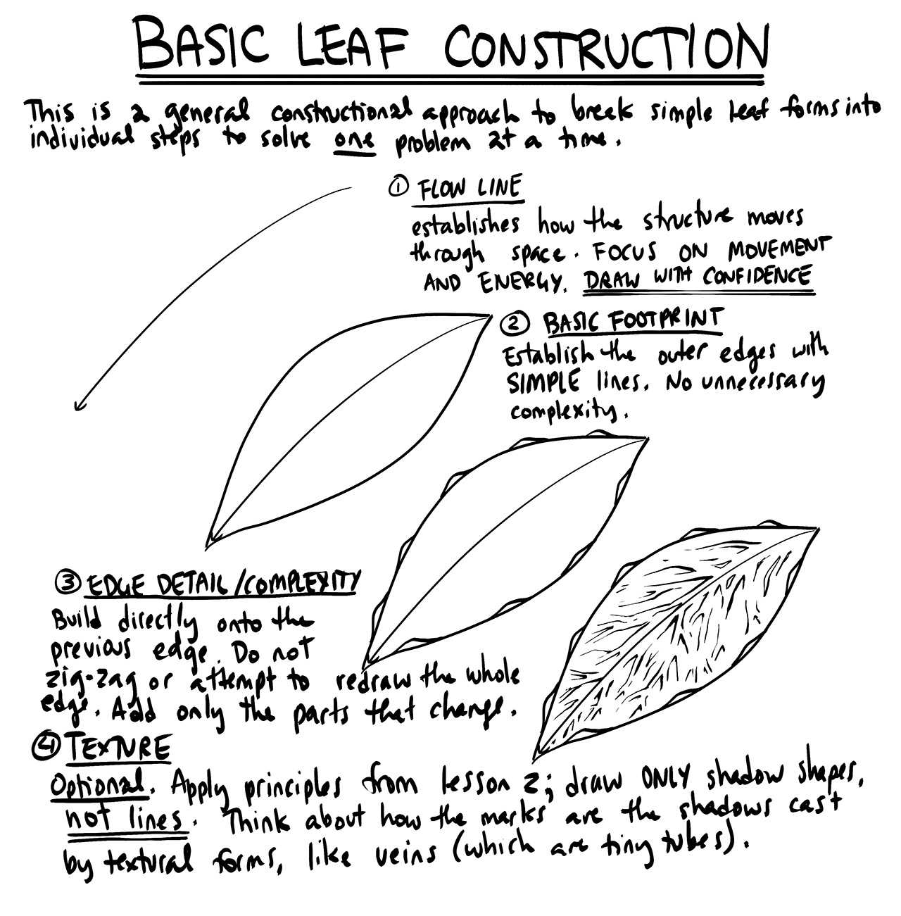
An example of what this would look like actually comes up fairly early in lesson 3 but I'll show it to you now so you can have an idea of what the goal is. This is a quick breakdown of how to draw a leaf, the final result on the right implies information by just focusing on the cast shadows, keep in mind that depending on the lighting some shadows will be more intense (they're fairly evenly lit here as opposed to working with a gradient like we try to in lesson 2). While sometimes the end result may not always be easily identifiable based on so few details, it's often just a single part of a puzzle that helps give the viewer information so they can determine what it is. As an example you may not think that looks like a leaf, but if it was green and had a stem and was attached to something brown it would progressively be more and more convincing. By implying information we can save ourselves time/work/stress and prevent the viewer from becoming visually overloaded by trying to capture every single little vein in a leaf that's in the background and not even the focus of our image.
It's definitely by no means an easy task, but if you're able to learn how to focus on these shadows it's incredibly helpful. If you take a look at paintings you'll see lots of information being implied just from brush strokes, shadows, bits of colour etc. Craig Mullins is an example of someone who does a really good job at implying a ton of information.
While the explanation was a bit lengthy, I hope it was helpful. Apologies if you're still left feeling a bit unsure but I do promise it will make more sense with time if you continue along with your studies, sometimes things just take a while to click. That being said if you do have questions feel free to ask and I'll do my best to answer them or bring in Uncomfortable to help point you in the right direction.
Hello, that was very clear and to the point. I think I understand where I went wrong now. I was using this demo as my reference for red meat and metal bar without considering the form intersections and cast shadows at all.
I'll try to keep in mind how far my drawing should go. Admittedly, I was panicking so much when trying to transform colorful photos into a black and white drawing that I just decided to throw in everything I could.
Thank you very much for the reply! It really helped clear my confusion ???? I really appreciate your help.

Some of you may remember James Gurney's breathtaking work in the Dinotopia series. This is easily my favourite book on the topic of colour and light, and comes highly recommended by any artist worth their salt. While it speaks from the perspective of a traditional painter, the information in this book is invaluable for work in any medium.
This website uses cookies. You can read more about what we do with them, read our privacy policy.


