Lesson 1: Lines, Ellipses and Boxes

5:58 PM, Friday April 10th 2020

lesson 1 - Google Drive

lesson 1 - Google Drive: https://drive.google.com/drive/folders/1NfMpxMdaN-BsYEHQRJfU8KhmWpnYXlm9?usp=sharing

width=device-width,initial-scale=1,minimum-scale=1,maximum-scale=3,user-...

Heyo!

I've completed the lesson 1 exercises and I want to add some of my own findings that I'll hopefully keep in mind for the future:

  • Be more patient when drawing out your lines

  • Good posture gives already so much better results

  • Make sure your chair is in the correct position when you start drawing

  • Make sure you aren't looking straight down on the paper, but slightly ahead (I have a normal desk), to make sure your arm is not locked in an awkward position

  • Ghosted lines: adjust the paper if you keep missing the mark, draw at an angle, so that you can see where you're heading

  • Planes: put more pressure on the pen to get out more ink, slow down slightly to get more ink on the paper, don't hold your pen at an extreme angle -- some of the planes look like there's some missing lines, but the ink didn't flow correctly because of the grip/angle/speed

  • Ellipses: don't be afraid to do the secondary pass-throughs; start your ellipses from the straight point instead of a curve to avoid your ellipses turning into eggs where they shouldn't; don't do ellipses in ellipses since the curvature of the outside ellipse will not be a good point to aim for, make sure your ellipses follow the axis (especially on the funnel exercise)

  • Plotted perspective: stop trying to fix your mistakes, it doesn't give you anything

  • Rough perspective: stop letting your brain on the steering wheel and do it from your mechanical memory, slow down when ghosting the lines (the lines looked way better during the first exercises), don't draw during coffee high because your arm has no idea how to use all that energy

  • Rotated boxes: STOP LETTING YOUR BRAIN ON THE STEERING WHEEL; there's a lot of compensation in size especially in the corners, the boxes don't have adequate space between them and some are smaller boxes and not properly rotated, don't try and fix your mistakes!!!

  • Organic perpective: take more time when drawing the boxes, ghost the lines more, most of the boxes are a mess, many mistakes in putting the lines on the paper, more variety in boxes

Thank you in advance to whoever gives me additional critique!

Yours truly,

kitkat

3 users agree
3:46 PM, Tuesday April 28th 2020

Lines are pretty good and confident in general. I can only see a bit of wobbliness on the superimposed lines, so remember that in these exercises, you should always prioritize confidence over accuracy.

A wobbly line will always be worse than a confident line, no matter how off the confident line is.

If you take a look over the ghosted lines notes you'll see the levels of lines:

Level 1: Line is smooth and consistent without any visible wobbling, but doesn't quite pass through A or B, due to not following the right trajectory. It's a straight shot, but misses the mark a bit.

Level 2: Line is straight, smooth and consistent without any wobbling and maintains the correct trajectory. It does however either fall short or overshoot one or both points.

Level 3: Line is straight, smooth, consistent without any wobbling. It also starts right at one point and ends exactly at the other.

As you can se, wobbly lines aren't mentioned, which means that they would be worse than level 1.

Ellipses have a tiny bit of wobbly too, here as well confidence > accuracy, don't hesitate to sacrifice accuracy to get them as confident as you can.

Boxes are p good too, though I think your lines quality have decreased a bit. Remember to approach every line just as you did on the ghosted lines exercise, take your time with them.

You are also repeating some lines, no matter how off a line is, don't repeat it, keep going as if it was correct.

On organic perspective, you can add lineweight to the silhouette of the box on the parts that overlap with other boxes to clarify the relationships between boxes. Perspective on the organic perspective has issues as well, but you'll work on that on the box challenge, don't worry about it!

Next Steps:

Pretty good job so marking this as complete. Congratulations on finishing lesson 1 and keep up the good work!

This community member feels the lesson should be marked as complete, and 3 others agree. The student has earned their completion badge for this lesson and should feel confident in moving onto the next lesson.
6:20 PM, Tuesday August 4th 2020

Oh I didn't realise that you don't get an email notification for when someone gives critique.

Thank you for the feedback, Elodin!

The recommendation below is an advertisement. Most of the links here are part of Amazon's affiliate program (unless otherwise stated), which helps support this website. It's also more than that - it's a hand-picked recommendation of something I've used myself. If you're interested, here is a full list.
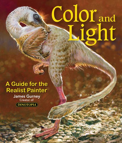
Color and Light by James Gurney

Color and Light by James Gurney

Some of you may remember James Gurney's breathtaking work in the Dinotopia series. This is easily my favourite book on the topic of colour and light, and comes highly recommended by any artist worth their salt. While it speaks from the perspective of a traditional painter, the information in this book is invaluable for work in any medium.

This website uses cookies. You can read more about what we do with them, read our privacy policy.