Lesson 1: Lines, Ellipses and Boxes
6:10 AM, Monday June 22nd 2020
First submission! i did the drawabox a while ago and wanted a fresh new start with professional feedback. Hope my uploading formats are correct!

Hiya! I’ll be looking through this~
Starting off, your superimposed lines look great! They’re smooth, properly lined up at the start, and, mostly, of a consistent trajectory. The ghosted lines/planes look quite good, too, though I’ll recommend placing start/end points for all of your lines (including and especially the non-diagonal center lines), and not extending a line that stops short.
The table of ellipses exercise looks good. Save for that one frame that has floating ellipses (page 1, row 3, column 1), they all do a good job of touching all available sides in a frame, are of a consistent degree/angle, and of many different ones, too. They’re also confident, and, for the most part, circular. I say for the most part, because they have a habit of starting out a little bumpy/pointy, then stabilizing, so try to be a little less scared of that first mark, if at all possible. If you’re not confident in the built up motion, continue ghosting. If you decide to commit, know that there’s no more time for hesitation. The ellipses in planes look quite good, too. They’re still fairly circular, despite the added difficulty of having to touch all 4 sides of the plane, and quite smooth, too. There’s the occasional exception to both, certainly, but this is normal. So long as you continue pushing in that direction, they’ll continue to improve. Finally, the funnels exercise looks solid. The ellipses are snug, properly cut in half by the minor axis, and they even increase in degree as they move away from the center. Next time, however, see if you can use a ruler for the minor axis- it, and the arcing lines, count as the frame of this exercise.
Immediately, there’s a bit of a problem in the box section- you haven’t split your page into frames, as per the instructions, and have instead fit a single, large composition in the entirety of it. I’ll let this slide, as what’s here is good, but, if at all possible, try to mimic the composition of the example homework, from now on. So, starting off, the rough perspective exercise looks good. Occasionally, you’ll correct an incorrect line, which, as you know, is discouraged, but this doesn’t happen too often. For the most part, the lines that should be at infinity are, and the ones that should converge do- the convergences improving throughout the set. Line quality is quite good, too- nicely done. The rotated boxes exercise looks quite good, as well. It’s big, the boxes are snug, and rotate comfortably. The addition of hatching does a lot to clarify it, too, so I’m glad to see that you’ve taken the time. It’s not enough of an issue to bring up, but so that I give you one recommendation, be a little bit more careful in regards to line quality in exercises like this. At the end of the day, all you’re doing is drawing a single line, from point A to point B, over and over. Don’t get overwhelmed by the big picture. Finally, the organic perspective exercise looks fantastic. I’m really pleased that you’ve decided to draw through your boxes for it- this is not required, but always nice to see. The boxes, too, look good. They’re of a consistent, shallow foreshortening, their increase in size is subtle, and believable, and there’s plenty of overlaps, too. Nicely done, all around.
Consider this lesson complete, and feel free to move on to the box challenge.
Next Steps:
250 Box Challenge
Thank you BENJ for the detailed critique!

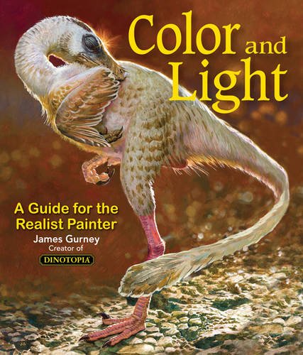
Some of you may remember James Gurney's breathtaking work in the Dinotopia series. This is easily my favourite book on the topic of colour and light, and comes highly recommended by any artist worth their salt. While it speaks from the perspective of a traditional painter, the information in this book is invaluable for work in any medium.
This website uses cookies. You can read more about what we do with them, read our privacy policy.