


Lesson 2: Contour Lines, Texture and Construction
1:47 AM, Monday June 13th 2022

Here is my hw for lesson two.
I'll be the TA handling your Lesson 2 critique.
You're making progress towards understanding the concepts introduced in this lesson and hopefully this critique will help you in your future attempts.
Starting off in the arrows section your lines are looking smoothly and confidently drawn. There are spots where your arrows bulge/narrow suddenly, this is an issue because it gives the impression that your arrows are stretching which hurts their solidity. Remember that as our arrows move closer to the viewer we want them to widen consistently. It's good to see that you're trying to implement line weight, just remember that you want to keep your applications subtle and you'll become consistent with mileage. here are some things to look out for when applying it. I'd like you to experiment more with foreshortening in your future attempts, by utilizing it in both the arrows themselves as well as the negative space between their curves we can create a stronger illusion of an object moving through 3D space as demonstrated here.
Moving into the organic forms with contours exercise you're doing a good job keeping your forms simple, plenty of people tend to over-complicate them. You're keeping your line work confident here which is great, if you feel uncomfortable working with contours still don't stress with more mileage it'll become more natural. Speaking of contours I'd like you to try and shift the degree of your contours more. The degree of a contour line basically represents the orientation of that cross-section in space, relative to the viewer, and as we slide along the sausage form, the cross section is either going to open up (allowing us to see more of it) or turn away from the viewer (allowing us to see less), as shown here.
In the texture exercises you're focusing largely on outlines and negative space rather than cast shadows created by forms along the texture itself. This makes it difficult to create gradients with implied information which we could then use to create focal points in more complex pieces, by doing so we can prevent our viewers from being visually overwhelmed with too much detail. For more on the importance of focusing on cast shadows read here. I'd also like to quickly direct you to this image which shows that when we're working with thin line like textures if we outline and fill the shadow we will create a much more dynamic texture than simply drawing lines.
It's quite common for people to feel like they don't fully grasp the form intersections exercise, if you feel like you may fall into this category try not to stress too much. This exercise is just meant to get students to start thinking about how their forms relate to one another in 3D space, and how to define those relationships on the page. We'll be going over them more in the upcoming lessons.Your forms are looking quite solid here and they believably appear to belong in the same cohesive 3D space, good work.
While wrapping up your submission with the organic intersections exercise you show that you need a bit more time becoming comfortable with thinking of how these forms interact in 3D space and how they'd wrap around one another. I recommend trying to stack your forms perpendicularly rather than trying to keep them headed in the same direction to help make wrapping them around one another a smoother task. Your forms here get a bit too complex which makes the overall task more difficult, I'd like you to try simplifying your forms a bit more in the future. When drawing your shadows you don't always push them far enough to cast, instead they mostly hug the form creating them, try pushing them further. Your shadows appear to be following a consistent light source, be sure to experiment with different angles and intensities when trying this exercise again in the future. I recommend pushing your light source to the top left or right corner of the page to start with, it's easier than working with a light directly above your form pile.
Overall this was a solid submission, while you may have some things to work on I have no doubt you will improve with more mileage. I'll be marking your submission as complete and move you on to the next lesson.
Keep practicing previous exercises as warm ups and good luck in lesson 3!
Next Steps:
Keep practicing previous exercise as warm ups.
Move on to lesson 3.
Thanks so much for your critique I will try to keep all of it in mind and cant wait to. heck out the links you shared. I will be very busy the next few weeks with buti will try my best to keep up with the excercises
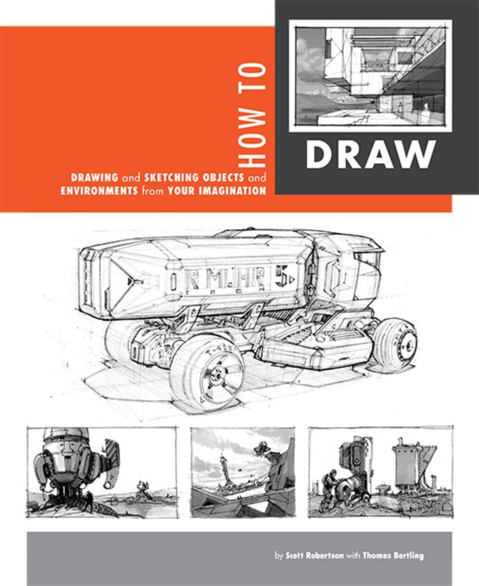
When it comes to technical drawing, there's no one better than Scott Robertson. I regularly use this book as a reference when eyeballing my perspective just won't cut it anymore. Need to figure out exactly how to rotate an object in 3D space? How to project a shape in perspective? Look no further.
This website uses cookies. You can read more about what we do with them, read our privacy policy.


