This website uses cookies. You can read more about what we do with them, read our privacy policy.

2:49 AM, Tuesday December 22nd 2020
Starting with your form intersections, these are drawn quite well. Your box constructions show that you haven't gotten too rusty with those freely rotated forms, and the intersections themselves show a clear understanding of how the forms sit in space, and how they relate to one another within it. The only thing I'm gonna slap your wrist for a little bit is the dashed/dotted line for the ellipse on the second page. I know that you wanted to make the intersection clear, but I really want to stress how important it is that within this course we stay away from any kind of broken lines. Every line is solid - in this case since we wouldn't see the intersection after all, there would be no need to draw it - but if you do draw a line, ensure that it is drawn with a continuous stroke. Outside of Drawabox, you're welcome to do it as you like, of course.
Moving onto your actual object constructions, your work here is very, very well done. At a glance, I'm worried I won't have much to call out for criticism, but we'll see. What I appreciate most is that you didn't go out of your way to pick on particular challenging or tricky objects - there were certainly challenges in most of these drawings, but they were all within an entirely normal range of difficulty for this lesson, and so you were able to focus in on the specific topics we're learning here.
The first drawing, for example (where we see another dashed line - fortunately the only other one for the rest of the submission), is an excellent subject to study. It's not got a lot of different parts, but it forced you to think through a lot of different variables, placing many landmarks and fleshing them all out in 3D space. You did an excellent job with it, and the result feels solid and three dimensional.
The drawing that follows is probably the weakest of the set, primarily because it was approached more sloppily than the others. Your mark making here is definitely more rushed, there's no box that encompasses the whole thing (meaning that the length of the two "arms" probably isn't equal in perspective), and the lines appear to have been drawn with less care, which undermines the object's overall solidity. There are definitely some similar issues in this plug, but I can see you getting more familiar with the amount of effort that'll have to be invested into each drawing, and after that, you've clearly accepted it and started approaching your marks and construction with more patience.
Instead of talking about each and every construction, I'm going to jump down to the lighter, which I believe was your most complex subject matter, and which also came out looking the best. You had to deal with a few complex forms here - the squashed cylinder for the body, the normal cylinder for the axle, and some partial ellipses as well. All of these were constructed quite well, and I have just two points to call out:
-
Remember that in this course, we're not getting into rendering/shading - so you shouldn't have darkened the inner face of that top. It's a minor point, but having students get a little too caught up in decorating their drawings can be a problem in the grand scheme of things.
-
Similarly, I definitely did notice that there was a lot of careful chicken-scratchy addition of line weight to help separate your drawing from the construction lines. Remember that all line weight should be drawn with the same techniques, using the ghosting method, executing confident strokes, not tracing or chicken scratching. Also, line weight should be focused primarily on clarifying overlaps between forms. Don't get caught up in making your construction lines disappear, and the object super obvious. The drawings we're doing here are all exercises in spatial reasoning, so the end result of the drawing isn't our focus, and we shouldn't let it be.
Aside from that, your work is coming along well. I'll go ahead and mark this lesson as complete.
Next Steps:
Feel free to move onto the 25 wheel challenge.

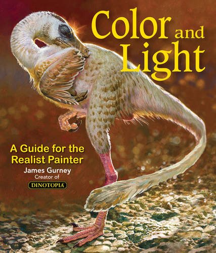
Color and Light by James Gurney
Some of you may remember James Gurney's breathtaking work in the Dinotopia series. This is easily my favourite book on the topic of colour and light, and comes highly recommended by any artist worth their salt. While it speaks from the perspective of a traditional painter, the information in this book is invaluable for work in any medium.


