


Lesson 1: Lines, Ellipses and Boxes
5:58 PM, Tuesday December 12th 2023

Hello! Thank you for taking a look at my work, it is appreciated!
Hi Times! I'm Cakes and I'll be giving feedback on your submission.
1. Lines
In Superimposed Lines, you have done a good job varying the lines as they come out from short, medium, to long and C curves as well. Don't forget to incorporate S curve into your warm-up routine for more variety. The wobbliness is to be expected because you are just starting out. With more warm-up, you will better control of your arm to produce smoother strokes. The mistake of [fraying at the start] is minimal in most strokes but most noticeable on the three horizontal rows in the second page.
The markmaking in Ghosted exercises & later on in Box section has one common issue. It is mentioned here in an exercise of Lesson 2. You appear to go over a line multiple times with thinner, fainter strokes and then use another pen that produces thicker strokes to draw on top for a clean-up pass. The resulting pass has shakiness and wobbliness to it. Another possibility that your lines look like the result of "clean-up passes" is that you might have hovered the pen too close to the paper and the page caught some ink during ghosting movement. However, I should briefly mention that the recommended size for the pen's tip should be 0.5mm or at the very least, within the range of 0.4-0.6mm as mentioned here so the thickness of your strokes is unusual to see. Nevertheless, from one dot to another, there should be only one single clean stroke. Your markmaking should be as clean as possible with no "vibrating" strokes and no shakiness/wobbliness. You can have a look at another homework submission here and pay close attention to their lines.
2. Ellipses
In Tables of Ellipses, you add some unecessary elements to ellipses. For example, in the 1st page some ellipses fall into this mistake and in the 2nd page, you treat some ellipses as a frame on their own & add more ellipses inside. Ellipses within a frame should have the same degree & orientation. In Page 2 - Column 2 - Row 3: in the right diagonal frame, ellipse's degree is not consistent as the 3rd ellipse has greater degree & rounder than the other. In the diagonal frame to the left, ellipse's orientation is not consistent as the 1st ellipse is more vertical while the other are tilted.
In Tables of Ellipses, besides the wobbliness/shakiness in markmaking of ellipses, ellipse's shape is warped and deformed as well. When ellipse's shape is smooth with no deform, you can divide it into four quarters like this and each of them shares the same curviness. Deformed ellipses are a result of trying too hard to make an ellipse touching the bound a.k.a focus too much on accuracy. You can see that mistake in the biggest ellipse of Page 2 - Column 1 - Row 3 where you bend the ellipse as hard as possible to touch the frame.
In Ellipses in Planes, you can see the same mistake about accuracy. Take the rightmost ellipse in Page 2 - Row 2 for example. By forcing it to touch all four sides, you create a noticeable protrusion to the left of the ellipse. This ellipse should look like this image instead. Comfy talks about this mistake in this video from 0:45-1:50 so make sure to rewatch it.
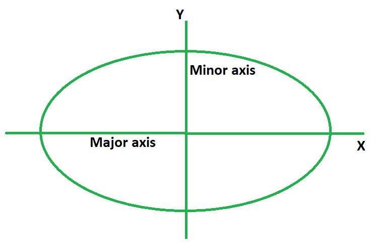
Be careful when space out the bound of the Funnel because if you draw one arc differently, the minor axis won't cut the funnel into two symmetrical halves. Take a look at the horizontal funnel for example, you can see that the top portion of the funnel is narrower than the bottom. With that being said, you have done a great job aligning ellipses with the minor axis. Don't forget to incorporate the second variation of this exercise where ellipse's degree (how wide/narrow an ellipse is) slowly increase as they reach either side of the funnel.
3. Boxes
I already mention the markmaking issue in Line section so I won't go into much detail here. Just put this here as a reminder.
In Rough Perspective, you should avoid drawing boxes that are too close to the vanishing point because they don't offer any learning experience. The further the box is, the harder it gets to estimate the box's convergence to the vanishing point. As a result, you are prone to make a bunch of mistakes and learn a lot from them.
You should reread the goal of Rotated Boxes exercise. In this exercise, we do not rely on the vanishing point to draw our boxes so there is no need to draw extending lines towards it. Rather, we take information from existing boxes in order to construct new boxes. Take a look at this image for example, we can draw new green & orange edge that are almost parallel to the edge of neighbouring boxes (highlighted in red). We can then draw new blue & yellow edge that slant into green & orange edge we draw in the previous step. The back plane is a smaller version of the front plane so it will follow the same drill (see this image). You should avoid using pens of different colors when doing the exercise too as your hatching should be black like other lines.
Resist the urge to comeback and correct your lines because you only have one chance to execute a line. Once you execute a line, you are done with it and move on to the next. You appear to correct your lines in Organic Perspective and also using a different colored pen when doing so. Most of your boxes are isometric where they have parallel edges instead of converging edges. This video from 6:15-7:06 explains why it's important to draw boxes with converging edges.
Next Steps:
1 page of Tables of Ellipses
1 page of Ellipses in Planes
1 page of Organic Perspective
Good evening,
I hope you are doing well :D
After reading your critique, I've completed the exercises you requested, taking the feedback into account as best as I could.
In terms of your assessment of my previous work, I agree with most of you points, but there we a couple misunderstandings, which I'll include for the sake of completeness:
I did not use a second pen. All marks I made were done by a brutally abused Sakura Pigma Micron 08, which is a 0.5mm pen. I'm generally a clumsy person, and I have a very "heavy hand", so I've worked on this. Also, as a result of this "heavy hand", I often accidentally touched the paper while hovering. This should hopefully be corrected now.
For the mistakes in the ellipses, the obvious ones like drawing inside and bisecting ellipses were done mostly out of either curiosity or frustration, but sorry for doing it none the less.
I hope I've made improvements to my submissions :D

These are what I use when doing these exercises. They usually run somewhere in the middle of the price/quality range, and are often sold in sets of different line weights - remember that for the Drawabox lessons, we only really use the 0.5s, so try and find sets that sell only one size.
Alternatively, if at all possible, going to an art supply store and buying the pens in person is often better because they'll generally sell them individually and allow you to test them out before you buy (to weed out any duds).
This website uses cookies. You can read more about what we do with them, read our privacy policy.


