Lesson 3: Applying Construction to Plants

2:47 PM, Thursday February 11th 2021

Imgur: The magic of the Internet

Direct Link: https://i.imgur.com/cp7DQG1.jpg

Discover the magic of the internet at Imgur, a community powered enterta...

Hi!

Thank you very much for your time and evalulation!

I've really enjoyed learning this part of Draw-a-box!

(I've done lots of extra pages of leaves to further my understanding. I've included one extra page here.

Also included an extra branches page to show my understanding of the intersection/branching.

And I also included an extra page of the final plant contruction, this one colored in and a little more developed)

0 users agree
1:23 AM, Friday February 12th 2021

Starting with your arrows, you've done a great job of capturing how these flow fluidly and smoothly through space. One thing I want you to take more care to exaggerate, however, is how the gaps between the zigzagging sections compress as they move further away from the viewer. This will help you sell the depth in the scene more successfully, as shown here.

You definitely carry that same confidence and fluidity over into your leaves exercise, where you capture not only how the leaves sit in space, but also how they move through the space they occupy. That said, the page of leaves is a little lacking - not only did you neglect to fill the page (there's a fair bit of empty space towards the top), but you also didn't really push the leaves at all in terms of building up more complex edge detail. Note that in the instructions for this exercise, only the very last step - texture - is considered optional.

Scrolling through the album, I can see now that you included another page further down, which was pushed further. Here you did a good job for the most part in building up more complex edge detail in a constructional manner, although in the top right you did fall into zigzagging your edge detail which resulted in a weaker relationship to the structure from the previous, simpler stage of construction. I'm glad to see that you did it correctly in the rest.

One thing I am kind of concerned about though is that there seems to be these faint marks underneath some of your drawings - as though you did some kind of underdrawing first, before committing in pen. While I cannot be sure of whether that is an artifact from the photograph, or perhaps something showing through the other side of the page, if this is an approach you employed, note that it is entirely against the instructions for this course as a whole, and should not be used moving forward.

Moving onto your branches, it appears there were instructions that were missed. As explained here, you should be extending each segment fully halfway to the next ellipse, providing a healthy overlap between segments to help transition from one to the next more smoothly and seamlessly, and to help avoid the slightly "sudden" shift that we can otherwise end up with as we move between them.

Continuing onto your plant constructions, there is definitely progress over the set, and your work is moving in the right direction, but there are a few important points I want to draw your attention to.

  • First and foremost, make sure that you draw each form you construct in its entirety, rather than allowing them to get cut off where they are overlapped by another. Forms do not cease to exist where we do not see them, and drawing each one completely allows us to better understand not only how they sit in 3D space, but also how they relate to the forms around them. These drawings are after all, exercises in spatial reasoning, and so that is the main focus - not on keeping them clean and tidy.

  • You've definitely demonstrated a focus that strays away from how this course is meant to be approached. It's entirely understandable that you want to make nice, pretty drawings, and even to colour them after the fact. Remember that back in Lesson 0, I stress the importance of following the instructions to the letter and not attempting to push them in any other direction. This is because I do not want students to be distracted from the core focus of the lessons, as they are written. Again - these drawings are just exercises, and as long as we focus on them as being so, and only so, we will gain a great deal more from them than if we have other side-priorities relating to decoration and presentation beyond ensuring every mark we draw serves a purpose. When it comes to the focus on 'decoration', it's important to keep in mind that what we're doing in this course can be broken into two distinct sections - construction and texture - and they both focus on the same concept. With construction we're communicating to the viewer what they need to know to understand how they might manipulate this object with their hands, were it in front of them. With texture, we're communicating to the viewer what they need to know to understand what it'd feel like to run their fingers over the object's various surfaces. Both of these focus on communicating three dimensional information. Both sections have specific jobs to accomplish, and none of it has to do with making the drawing look nice. What this means is that we're not concerned with the kinds of things that the eye alone can see - patterns, markings, etc. We are focused on the kinds of things that we can feel with our hands, and conveying them through out drawing.

  • One last minor point - make sure that when you construct anything cylindrical, that you do so around a central minor axis line to help align your ellipses. Of course, also be sure to draw through all of your ellipses, as discussed back in Lesson 1.

You do have a number of very nice drawings here - I find the hyacinth to be especially well done, so it's no surprise that you wanted to colour it. Just remember above all else that when you're doing Drawabox work, you're not serving any other purpose, or working towards any other goal. Your mind should be closed off from that, focusing only on the exercise before you.

Don't worry though - these mistakes aren't entirely uncommon, and students who are especially enthusiastic about drawing tend to fall into them even moreso. I'm going to assign some additional pages below for you to realign your intent, so moving forward you'll be able to get the most out of the course.

Next Steps:

Please submit the following:

  • 1 page consisting half of leaves, half of branches

  • 2 pages of plant constructions

When finished, reply to this critique with your revisions.
4:08 PM, Tuesday February 16th 2021

Thank you so much for your detailed critique!! I admire your work and teaching style very much, so having your feedback is greatly appreciated.

Funny thing is I've been drawing leaves in my spare time (50% time) trying to understand how they work and problem solve. I did dozens of pages of leaves. But when it was time to submit the homework for review, I probably didn't grab a good enough one. (I've included a photo showing a dozen other leaf pages, just to show you my mania...lol)

Thanks for the branches feedback. I really needed to focus better on overshooting the ellipses - and I hope I did better this time.

My two plants are the Sea Grape and the King Oyster Mushroom (from your tutorial). In the sea grape, I struggled with the one leaf showing its underside, and probably made it too dark relative to the top-side leaves. Or maybe I should have added more texture to the topside? Any suggestion here is appreciated. (I also struggled with the ground cover, which was straw-like. This was my first time with this texture, and I'm not entirely unhappy with the result)

The King Oyster has many stray lines of ellipses - something I still struggle with. I've been doodling stacks of ellipses in correct perspective to improve.

https://imgur.com/a/sBId77q

7:43 PM, Thursday February 18th 2021

These are coming along well! Your branches and leaves look especially well done, and your plant constructions are solid. I have just three things for you to keep in mind:

  • Don't go back over things quite as liberally as you have, without good reason. Drawing through ellipses is fine and encouraged (though remember that you're only supposed to do it 2 times before lifting your pen). Looking at the mushroom's cap, you went back over it a lot. Line weight isn't meant to be so heavy and obvious - it should be subtle, like a hint you're giving to the viewer's subconscious, to clarify how certain forms overlap. You also don't need to be reinforcing the silhouettes of your structures if there's nothing further to clarify.

  • I'm noticing a tendency to press a little harder on your pen when drawing the later phases of construction. For example, here, when adding the additional edge detail to your leaves, you tend to do so with a darker mark than the original edge. No need for that. Line weight itself is something we add at the end, once we've got all the forms and construction down. If we try to vary the line weight like that earlier on, we end up in situations where we have line weight on the interior of a given structure, rather than at its edge.

  • As I mentioned in my original critique, don't get caught up in the need to decorate things. Texture and detail is better off added with a light touch. You're doing better here than before, so that's great - but here you've shifted more towards filling in the spaces between the veins, rather than focusing on each being a cast shadow relating to the vein forms themselves. Make sure every cast shadow shape you draw clearly relates to a given form that is casting it. It's very easy to slip back into just filling in negative space between forms instead, especially when we get particularly heavy with texture.

Anyway, I'll go ahead and mark this lesson as complete. Keep up the good work.

Next Steps:

Move onto lesson 4.

This critique marks this lesson as complete.
8:48 PM, Thursday February 18th 2021

thanks again for your critique. and for this amazing course. for the first time in my life, i feel like im becoming noticably better at drawing.

The recommendation below is an advertisement. Most of the links here are part of Amazon's affiliate program (unless otherwise stated), which helps support this website. It's also more than that - it's a hand-picked recommendation of something I've used myself. If you're interested, here is a full list.
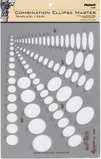
Ellipse Master Template

Ellipse Master Template

This recommendation is really just for those of you who've reached lesson 6 and onwards.

I haven't found the actual brand you buy to matter much, so you may want to shop around. This one is a "master" template, which will give you a broad range of ellipse degrees and sizes (this one ranges between 0.25 inches and 1.5 inches), and is a good place to start. You may end up finding that this range limits the kinds of ellipses you draw, forcing you to work within those bounds, but it may still be worth it as full sets of ellipse guides can run you quite a bit more, simply due to the sizes and degrees that need to be covered.

No matter which brand of ellipse guide you decide to pick up, make sure they have little markings for the minor axes.

This website uses cookies. You can read more about what we do with them, read our privacy policy.