This website uses cookies. You can read more about what we do with them, read our privacy policy.

10:23 AM, Monday November 7th 2022
Welcome to drawabox, and congrats on completing Lesson 1. Let’s take a look at it, shall we?
Starting off, your superimposed lines look good. They’re smooth, properly lined up at the start, and of a consistent trajectory. They do, sometimes, tend to fray a little too quickly, so do make sure that you’re not drawing them using your elbow, but otherwise, no worries. Your ghosted lines look fairly confident, too, though I’d have liked it if you’d filled your page a little more – there’s a little too much empty space in it, right now. The ghosted planes, too, are equally confident, though they’ll sometimes wobble as they approach their end points. The way around that, is, quite simply, to stop being so conscious of them. It’s perfectly fine for your lines to stop short of or overshoot their end points. It’s not fine for them to be wobbly.
The table of ellipses exercise looks mostly good. Your linework is confident, and I can – from how light your hand is – that you’re not especially stressed about the accuracy of your marks, here. That’s how it should be! However, seeing how you’ve failed to draw through many of the minimum of 2 times (instead opting for 1 and change), I’ll assume that a lot of that is wildness, more so than confidence. Recall that confidence is not without its preparation – we draw confidently because we’ve done all we can do to ensure accuracy in a previous step. Nonetheless, beyond that, all is looking good. The ellipses in planes look better in this respect, and they do a good job of maintain the smoothness/roundness of their neighbors from the previous exercise. The funnels revert back to their prior state but, beyond that, are snug, and properly cut in half by their minor axes.
The plotted perspective exercise looks very sloppy. Am I correct in assuming that you’ve drawn this freehand? Or is it just the lineweight that has been drawn like that. It’s a little hard to tell, but whichever it is, it’s incorrect – this exercise (the entirety of it!) is to be drawn using a ruler.
The rough perspective exercise struggles with its linework, too. I will however, praise the amount of preparation here; there’s a lot of unused points on the page, which tells me that you really took your time, planning each line. As for the line quality issue, the trick is to remind yourself that each box consists of 12 lines, each of which is equal to one unit of work (don’t mistakenly think that the unit of work is one box!) If you do, then it should be obvious that there’s no difference between each of these lines, and each of the ones in the ghosted lines/planes exercises. If those could be confident, why not these too, y’know? Also, remember that each line is to be drawn once, and only once, regardless of how it turns out. Don’t get into the habit of automatically reinforcing your lines, if you please.
For the rotated boxes exercise, it seems like you forgot to plot the reminder boxes (one of the first steps!) The boxes themselves are big, however, which is a great positive. They do have some trouble rotating, which is normal, but you’ve not drawn through them (which isn’t!) It seems like, for 13 of these boxes, you’ve simply drawn the visible bits, and then implied the rest of the lines. Though that’s a technique that we’ll make use of ourselves, before long, in this exercise the goal is to understand rotation through drawing through our forms, as if we have x-ray vision. It’s important, therefore, to periodically consult the example homework, to make sure that you’re not straying too far off of the intended result.
The organic perspective exercise is fairly well done. I wonder, however, if you’ve plotted start/end points for these lines, or simply extended them arbitrarily. I ask, because there’s quite a lot of overshooting here, as compared to your other exercises. (If you’ve not, please do, from now on.) Beyond that, however, the boxes are well constructed, and flow well, as per their size and foreshortening.)
Next Steps:
I’ll be marking this lesson as complete, and sending you off to the box challenge, but I’ll request that you be a little more attentive towards instructions, in it. You wouldn’t want to draw 250 boxes wrong… Good luck!
1:51 AM, Wednesday November 9th 2022
Than you so much for the feedback! Especially for bringing to my attention that i slow down at the end of my marks to try hit the end point. I will continue to work on focusing on confidence.
Thank you for your work!

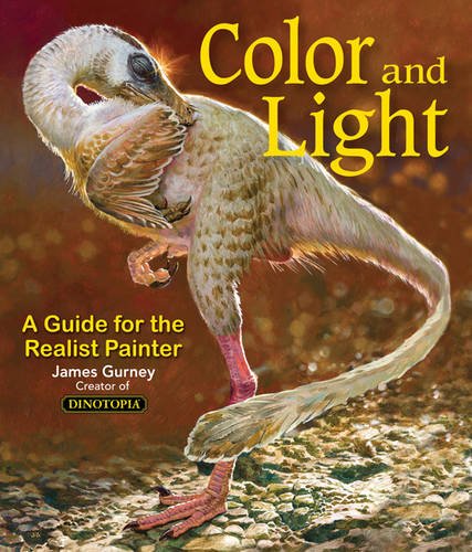
Color and Light by James Gurney
Some of you may remember James Gurney's breathtaking work in the Dinotopia series. This is easily my favourite book on the topic of colour and light, and comes highly recommended by any artist worth their salt. While it speaks from the perspective of a traditional painter, the information in this book is invaluable for work in any medium.


