View Full Submission View Parent Comment
8:34 PM, Thursday February 25th 2021
edited at 8:38 PM, Feb 25th 2021

So I looked through your revisions, and they definitely helped me better understand what you were asking. I made notes directly on your work.

So to answer your question, it comes down to the core principles of how we approach construction as a whole. Instead of trying to "solve" many problems all at once, focus on one at a time. Every additional mass we add represents a single form, so isolate the specific element you're trying to capture, and then focus on establishing how your additional mass "grips" the existing structure. For this, we employ my explanation of thinking about where to place outward curves vs. inward curves, placing complexity along the silhouette to respond to contact made with other structures.

While your tiger drawing is the only one where you're really employing this somewhat correctly on the torso, you're not quite emphasizing that use of inward/outward curves correctly just yet. You're definitely not far off overall, but I think this tendency to try and make bigger, "enveloping" forms or simply trying to do too much with a single form is distracting you from using the techniques I demonstrated previously. You can see how the additional masses are built up one at a time in this rat demo.

Also, here are some additional notes on thinking about how to use the additional masses.

Edit: One thing I forgot to mention is that right now in your rhino and tiger, you're showing areas that you're working more from memory than from direct observation. This is something we can easily slip up on, especially as we try to focus on figuring out the relationships between our forms as we construct. Remember the importance of observing your reference almost constantly, only looking away to capture a specific form in your construction, then looking back to refresh your memory once again.

Next Steps:

Please try doing the 3 additional animal constructions again.

When finished, reply to this critique with your revisions.
edited at 8:38 PM, Feb 25th 2021
2:59 PM, Monday April 19th 2021

Hi Uncomfortable!

Here are three additional animal constructions. I decided to try the same animals so that I could (hopefully) chart my improvement a bit better through comparison

https://imgur.com/gallery/Gwmqire

Thank you so much!

Russlemania

9:11 PM, Monday April 19th 2021

So while this is definitely a move in the right direction (and looking at your previous work, it's by a considerable margin), there are a few things that stand out to me, looking over these revisions:

  • First and foremost, your drawing appears to exist in two phases. There's the fainter, at-times sketchier (like looking at the rhino's head) underdrawing where you don't appear to be completely committed to the marks you've put down, and there's the darker (honestly sometimes equally sketchy) marks where you've gone back over the first set to commit to those lines. This simply isn't how your markmaking should be approached in this course. Every single mark you put down is itself committed. No sketching, no broken lines, no hesitant strokes where you're not exactly sure if that's where the line should go. If you're putting it on the page, you've made a decision, and that decision needs to be respected.

  • Related to the previous point - line weight generally shouldn't be used to reinforce the entire silhouette of a shape, because this causes us to fall into the trap of simply tracing back over the existing linework (focusing too much on how it flows across the 2D page, rather than how it represents an edge moving through 3D space). Instead, stick to the fairly limited purpose of line weight - which is to help clarify how particular forms overlap one another in specific localized areas. Just like every other mark, your line weight should also be added using the ghosting method, to ensure that your execution is confident and smooth.

  • I know I raised the issue of observation in my previous critique, and you have definitely improved on that front. That said, there are definitely areas - especially the rhino's back legs - which don't look like they're accurate in their proportions. Of course, I don't have the reference images to compare to - in the future, it's probably a good idea to include them so I can judge this more accurately. Also, when it comes to leg construction, you're doing a good job with the basic sausage structures but you don't appear to be going any farther than that. Legs are more than just chains of sausages - we can return to our reference and find all kinds of little forms present along the structure that we can build up with additional masses. I know it's been a while, but this is something I raised in my initial critique of your lesson 4 work.

  • It looks like your head construction isn't really incorporating the points raised in the informal demo explanation I linked you to some time ago. Pay attention to the specific shape of the eye socket, and of how all the pieces (muzzle, cheekbone, brow ridge) fit together around the eye socket like a puzzle. Your rhino's head is very much falling short in this regard.

  • Remember that the circle we draw in the eye socket is itself the eyeball, and that the eyelids then need to wrap around it. Your eye in the fox drawing appeared to be a pretty straight diamond, ignoring the curvature of that form.

  • Your fur's getting better too, but with the fox's tail it definitely gets haphazard, and elsewhere it's still fairly quantity-over-quality. Fewer tufts that are more purposefully designed will always be preferable.

Here are some notes directly on your fox.

I'd like you to do another two pages of animal constructions to apply what I've laid out here. Go for different animals, rather than sticking with the same ones. Provide me with the reference images with your submission, and if you haven't been already, definitely look for reference images that are as high resolution as you can manage.

Next Steps:

2 more animal constructions.

When finished, reply to this critique with your revisions.
12:44 PM, Wednesday May 26th 2021

Hi Uncomfortable

Here is the link to my two drawings, this time with references included. I tried two different animals as you have suggested, namely a wolf and a crocodile

https://imgur.com/gallery/q8uzgPV

I tried my best to keep all my lines as uniform and confident as possible to minimise the sketching mentality that you pointed out last critique. I hope it is more successful this time. I realised that part of the issue is that when i start doing detail, i naturally start using a lot more force because i begin to use more of my wrist then my shoulder when adding the scales/ fur (and also my microns begin to blunt out a bit in the late state of my drawing). I would also admit that I struggle with showing restraint when adding detail as I grew up a doodler and picked up the bad habit of chicken scratching/ adding detail mindlessly . That's something I think I will still need to work on, and i hope i did not overcomplicate the crocodile drawing especially

I also had quite a bit of trouble with the wolf's snout. i need to work on being able to capture the angle in which its face is turning.

Thanks for the patience and the tutelage. Its been a hard journey but I really appreciate the lessons and the critiques and Im learning alot!

Russlemania

View more comments in this thread
The recommendation below is an advertisement. Most of the links here are part of Amazon's affiliate program (unless otherwise stated), which helps support this website. It's also more than that - it's a hand-picked recommendation of something I've used myself. If you're interested, here is a full list.
PureRef

PureRef

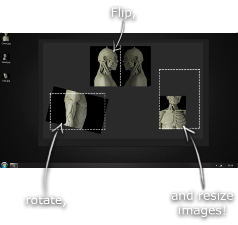
This is another one of those things that aren't sold through Amazon, so I don't get a commission on it - but it's just too good to leave out. PureRef is a fantastic piece of software that is both Windows and Mac compatible. It's used for collecting reference and compiling them into a moodboard. You can move them around freely, have them automatically arranged, zoom in/out and even scale/flip/rotate images as you please. If needed, you can also add little text notes.

When starting on a project, I'll often open it up and start dragging reference images off the internet onto the board. When I'm done, I'll save out a '.pur' file, which embeds all the images. They can get pretty big, but are way more convenient than hauling around folders full of separate images.

Did I mention you can get it for free? The developer allows you to pay whatever amount you want for it. They recommend $5, but they'll allow you to take it for nothing. Really though, with software this versatile and polished, you really should throw them a few bucks if you pick it up. It's more than worth it.

This website uses cookies. You can read more about what we do with them, read our privacy policy.