


Lesson 2: Contour Lines, Texture and Construction
7:38 PM, Thursday July 23rd 2020

Any feedback appreciated!
ARROWS:
They are looking ok for the most part! You need to watch out for your line weight, don't overdo it in the whole arrow, only on the segments they intersect/overlap so you have a more define stroke. Make sure to apply the foreshortening and thickening of the arrows as they move through space as shown here in some you did it well in others is a hit or miss, just keep this in mind as you move to the next lesson.
ORGANIC FORMS:
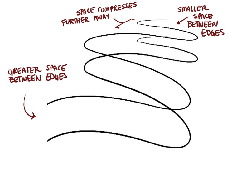
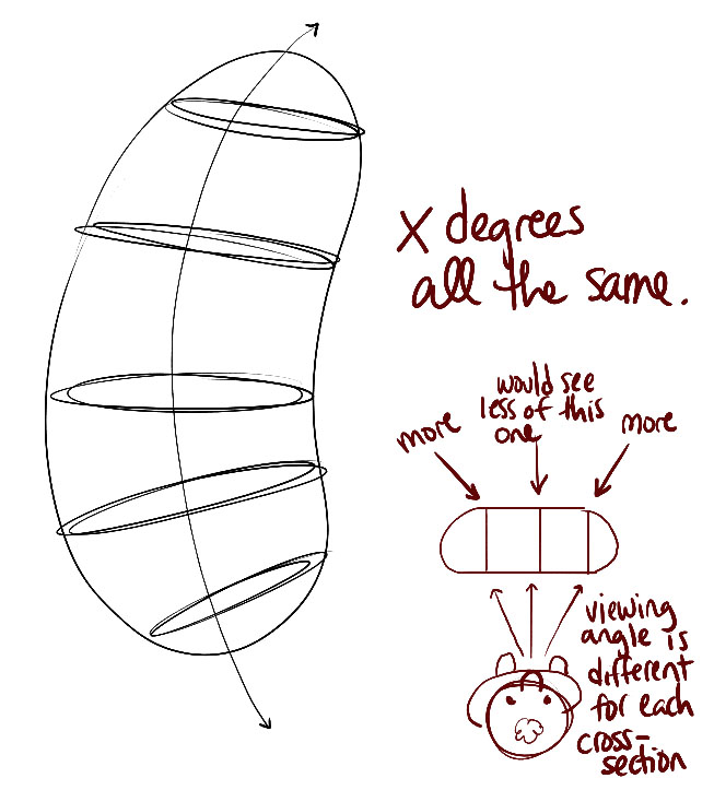
You are maintaining it to regular sausage shapes as is recommended, there are some of them where you are squishing them more in one side or the other, again just a mistake that with a little more practice you can improve upon it. Now your ellipses are maintaining almost the same degree throughout the sausages remember how they change and increase or decrease as shown here and here Your contour curves are not properly wrapping around your forms like here Remember to mark the ending (the small ellipses) on the sides facing you!
TEXTURES:
Firs and foremost I'll say you did a great job in this section, really good execution so I'm gonna nitpick some things to critique over.
Your texture analysis is great! now, your darker side of the transition could use a bit darker areas to ease the transition into the mid-area.
DISSECTIONS:
Again, great implementation of the cast shadows-only approach, there were some places where you fall back into lines to convey textures as in your strawberry texture but overall, really good work! your textures are wrapping around and you even implemented the gradient from the texture analysis.
FROM INTERSECTION
So, for the most part, is a solid work here, your forms do look like they share the same space, your form intersection is good overall, you have some issues with confident lines and some wobbliness as in your cylinders and ellipses again, they will improve as you do them on your warmups!
ORGANIC INTERSECTIONS
Solid organic forms and you are adhering to simple shapes for the majority of them! (Some are not so, try and treat them like a pile of filled water balloons piled up on the ground).
The most significant point I could notice was that your shadows are sticking to the forms it's casting them instead of the form that they are been cast at! As shown here.
Other than what I point out, great submission! keep the good work and feel free to move to the next lesson!

Some of you may remember James Gurney's breathtaking work in the Dinotopia series. This is easily my favourite book on the topic of colour and light, and comes highly recommended by any artist worth their salt. While it speaks from the perspective of a traditional painter, the information in this book is invaluable for work in any medium.
This website uses cookies. You can read more about what we do with them, read our privacy policy.


