


Lesson 3: Applying Construction to Plants
2:59 AM, Thursday August 11th 2022

Hey thanks for critiquing :)
Hey, Jackc! Here is my critique, I hope it will be helpful to you!
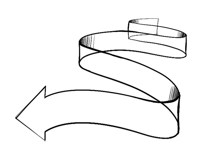
Organic Arrows
These are pretty good, but you can improve the shading. Specifically, it looks out of control. You want to convey the surface as well as the shadows. Keep the hatching lines parallel, going across the surface (see the shading lines here).
The Leaves Exercise
Nice work with the compound leaves and edge detail! I see you made some mistakes, but you corrected yourself, good job! Concerning the shadows/texture, you might want to avoid “scratches” like in the leaves at the bottom of the page; better use the texture like in the leaves in the middle.
Another, maybe counter-intuitive idea, might be to texturize the light areas since light gives more information. This can make your drawings “pop out” even more.
The Branches Exercise
Although most of your lines are confident, I can see fraying and double strokes, almost as if you used a pencil and erased it later. Don’t worry if a line goes wrong. Don’t redo the line - try to work around it. It’s a valuable skill, especially later on when things get much more complex. I am glad to see that you passed each ellipse twice, and really tried to align everything to the axis. However, you can make this even better by changing the degrees of your ellipses.
Plants
First off, nice work, and well done with applying what you’ve learned in the Leaves and Branches exercises. Your plants look three dimensional and I can see you thought about the forms that make them up. Keep this up! You have the required number of constructions as well.
I noticed that some of your mushrooms have very “frayed” ellipses – did you go over them more than three times? Maybe your fineliner stopped working? Anyway, go over the ellipses 3 times max, and other lines and curves only once.
Concerning texture, most of it is pretty good. You might want to avoid lines such as those on this mushroom. At least make them thicker on the darker end, just like with the gradient in Lesson 2.
That’s it! Nice work!
Next Steps:
Congratulations on completing Lesson 3!
You can move on to Lesson 4.
Thanks!
I see what you mean with the almost "scribbling" shading I have with the arrows. It also doesn't help that the shading is the inverse of what it should be and I didn't realize I'd made that mistake until the end. I'll try out texturing the lighter parts of leaves, I hadn't thought of that. Also, you were right about my fine-liner running out of ink. There was a week where I only had access to one pen so that's why some ellipses look almost split.
Anyway I'll work on improving and thanks for critiquing!
Cool plants, i really like the shadows and the textures.
thanks :)

These are what I use when doing these exercises. They usually run somewhere in the middle of the price/quality range, and are often sold in sets of different line weights - remember that for the Drawabox lessons, we only really use the 0.5s, so try and find sets that sell only one size.
Alternatively, if at all possible, going to an art supply store and buying the pens in person is often better because they'll generally sell them individually and allow you to test them out before you buy (to weed out any duds).
This website uses cookies. You can read more about what we do with them, read our privacy policy.


