Lesson 3: Applying Construction to Plants

12:13 AM, Thursday December 8th 2022

Draw a box lesson 3 - Albert Galilov (Darkwings) - Album on Imgur

Direct Link: https://i.imgur.com/7HTx0qg.jpg

Find, rate and share the best memes and images. Discover the magic of th...

Hello,

I think I understand this lesson, but it still wasn't easy especially with some of the leaves as part of a plant.

Thank you for your Official Critique in advance!

Best regards,

Albert

0 users agree
12:17 AM, Saturday December 10th 2022

Hello Darkwings, I'm ThatOneMushroomGuy and I'll be the TA handling your critique today.

Arrows

Starting with your arrows you've done quite well in this exercise, they're looking quite confident and smooth which helps communicate the fluidity that arrows carry as they move through space. Your shading is also quite well done and correctly located and it's good to see you applying the extra lineweight on top of your overlaps. Lastly you've done a good job on using the depth of your page.

In order to keep developing your skills, try to get out of your comfort zone, your arrows are quite similar in their perspective, their orientations and how their overlaps are located. Remember that arrows are a fluid and flexible object that can twist and bend in all sorts of ways, try to capture this flexibility by attempting to diminish the amount of negative space between your arrow's overlaps as well as experimenting with all the different ways arrows can move.

Leaves

Continuing with your leaves, they're looking quite well made, they've got a great sense of energy to them and move nicely across the page, you're not only capturing how these leaves sit statically in this space, but how they move and flow through the depth of the page as well.

Be weary of unnatural bends, however, as some of your leaves aren't folding in the way that would be the most natural.

Your addition of edge detail is also coming out really nicely, you're not attempting to capture more than one piece of edge detail with a single stroke and you're generally building this edge detail additively.

On your use of texture it's few and far in between, but it still looks like you're approaching it very explicitly. Remember the principles of texture in Drawabox, and make sure to visit these useful notes on adding texture to leaves and here are some useful reminders on texture in general.

Branches

Onto your branches, they're coming out very decently as you generally apply the instructions for the exercise, but make sure that when you're extending the lines in your branches, extend it fully to the halfway point between ellipses.

There are also a couple of places where you don't place your pen back at the ellipse point before extending your next line, this effectively removes the healthy overlap we seek to achieve in this exercise.

Remember how branches should be approached: by starting your segment at the first ellipse point, extending your line past the second ellipse with confidence, and then stopping at the halfway point between ellipses. After that, start a new segment at the second ellipse mark, superimposing your new line on top of the preexisting one as best as you can, extending it past the third ellipse and stopping halfway to the fourth ellipse. Repeat these steps until your branch is complete.

Onto your ellipses they're also turning out pretty alright, the thing that you could improve upon here is the variation of your ellipse's degrees, you clearly seem to be aware of this phenomenom, but you're not pushing it to it's full extent as some of your ellipses are looking a little bit too consistent which hurts the solidity of your forms. Remember that as your cylindrical forms shift away from the viewer, the degrees of your ellipses will also shift.

Plant Construction Section

And lastly in order to finish this critique it's time to talk about your plant constructions, you're doing a good job with them, I can see that you're applying the methods and techniques previously introduced in the lesson to great effect. Your drawings here have a good sense of tridimensionality present in them, you're clearly developing a strong foundation of spatial reasoning.

There are of course, always a thing or two that can be improved, moving forward here are some of the points that you should keep in mind when tackling these exercises again.

  • When tackling any kind of cylindrical structure, for example, mushrooms, make sure to start your construction with a minor axis in order to keep your various ellipses aligned.

  • Make sure not to leave arbitrary gaps between your flow line and your outer edges, they must connect in order to keep the relationships between phases of construction tight and specific.

Speaking of specific, when using ellipses in order to establish a boundary for how far out the general structure of your petals will extend. As such you must respect this decision by making sure your flow lines do not extend past this boundary, otherwise it might as well not exist.

For your cactus attempt, you stop adding texture to it halfway through. When you make a decision, commit to it. If you decide to add texture to a drawing then you must continue until you're finished.

For your attempt at the potato plant demo there's something I would like to mention.

In the actual demonstration for this plant the area that's filled in with black is basically so densely packed with leaves and branches that the cast shadows are completely covering the ground between the gaps that would otherwise show the dirt underneath, that's what those black areas signify in the demo. But in your potato plant the camera angle is different and the shadows don't all line up, suggesting that you may be misinterpreting these black areas as some kind of arbitrary artistic choice.

Your pages often have big and empty spaces that could have been better utilized by drawing your initial constructions a bit bigger. This page is one of the most glaring examples as it's basically entirely empty.

This page seems like it was meant to be filled with many more drawings but it seems like you've given up on it partway through. Don't try to pre-plan how many drawings you wish to fit on a given page beforehand, draw your initial construction as big as you need it to be, and only after it's finished you can gauge how much space there is left on a page, if there is enough then great, start another construction and upon finishing it gauge again whether there is enough space on the page perfectly fine to have a single drawing in your page.

Another good thing about drawing bigger is that it will not only allow you more room to work through the spatial reasoning challenges that arise when tackling these exercises, allowing you to apply the methods and techniques introduced in the lesson more effectively, and also give you enough space to fully engage your whole shoulder when drawing.

Whike your attempts at texture are very sparse and rare, it's still often coming out very explicitly.

Texture in the context of this course is an extension of the concepts of construction. In a lot of ways they're the same concept, with construction being focused on the big and primitive forms that make up different objects, with texture simply being focused on conveying to the viewer the small forms that run along the surface an object, if it's thick and rugged, or if it's smooth and sharp, essentially texture is a form of visually communicating to the viewer what it would feel like to run their hands across that object's surface.

None of this has to do with decorating any of our drawings, what we draw here is based on what's physically present in our construction. As introduced here in what are essentially the "principles" of texture in Drawabox and how it is used in the course, we can notice that we should focus on each individual form and how it casts a shadow on neighboring surfaces, understanding how each individual form sits on a 3D space, and closely analyzing all of this information present in our reference to be able to translate it to our study.

The shape of this shadow is important as it's the shape that defines the relationships between the form casting it and the surface it's being cast on, only after careful observation can we understand how to best design a shadow shape that best conveys the texture of an object, as well as how that shadow would be affected by the surface it's being cast on, as a shadow cast on a round surface will be round, while a shadow on a plain smooth surface will suffer less distortion to it's original shape.

This approach is of course much harder than basing our understanding of texture on other methods that may seem more intuitive, but in the long run this method of texture is the one who enforces the ideas of spatial reasoning taught in this course. By following these ideas and as you keep applying it to your work, you'll find yo urself asking how to convey the texture in the most efficient way possible, with less lines and ink, focusing more on the implicit mark-making techniques introduced in Lesson 2. Going forward here are a couple of final reminders of how texture in Drawabox is approached.

Final Thoughts

You're applying the concepts and techniques introduced in this lesson to great effect. As such your plants are looking quite well constructed and solid. The only things holding you back from your full potential are skipping or forgetting some steps sometimes, as well as not drawing big enough.

I believe you understood the purpose of this lesson and that you're applying the things you've learned from it really well, as such, I'm going to be marking this lesson as complete. Good luck in Lesson 4.

Next Steps:

Don't forget to add these exercises to your pool of warm ups in order to keeo developing your skills.

Move on to Lesson 4.

This critique marks this lesson as complete.
12:40 AM, Sunday December 11th 2022

Hello ThatOneMushroomGuy,

Thank you very much for the detailed critique.

I have a few follow-up questions.

Arrows:

Can you please show me one or two examples of different perspective arrows (from what I draw)?

Leaves and Branches

I do more of these in my warm-ups to practice and improve my skills with your suggestions.

Plant Construction

I probably misunderstood from the demo that I need to try to construct the mushrooms without a minor axis, I will add it to my warm-ups to continue practicing cylinders with a minor axis.

Texture drawing (like we should in drawabox course) is still very difficult for me to do (thanks to lesson 2, I am a lot better with that and have a better understanding of textures), I will revisit the texture lesson as you suggested to me (with the links that you shared here) to improve my texture skill more.

In meanwhile I will start lesson 4, thank you very much.

Best regards,

Albert

11:37 PM, Sunday December 11th 2022

Hello Darkwings, I'm very glad that you found my critique helpful.

For more examples of arrows you can see the page of example homework provided on the lesson page.

Best of luck in Lesson 4.

12:34 PM, Thursday December 15th 2022

Hello ThatOneMushroomGuy,

Thank you for your reply.

Best regards,

Albert

The recommendation below is an advertisement. Most of the links here are part of Amazon's affiliate program (unless otherwise stated), which helps support this website. It's also more than that - it's a hand-picked recommendation of something I've used myself. If you're interested, here is a full list.
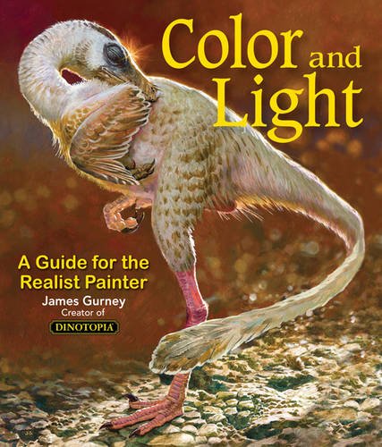
Color and Light by James Gurney

Color and Light by James Gurney

Some of you may remember James Gurney's breathtaking work in the Dinotopia series. This is easily my favourite book on the topic of colour and light, and comes highly recommended by any artist worth their salt. While it speaks from the perspective of a traditional painter, the information in this book is invaluable for work in any medium.

This website uses cookies. You can read more about what we do with them, read our privacy policy.