


Lesson 1: Lines, Ellipses and Boxes
1:11 AM, Wednesday October 28th 2020

Not great, but here.
(P.S I'm not sure, but I think some may have been rushed)
Upload order is a bit jumbled. That might be something to watch for later BUT shouldn't hamper it.
1) Super Imposed - No Flaying on the starting point which is good, only a few arcs and wobbles so you are confident here. I suggest trying tsome more line styles but this should be good enough to count as duneon. Check.
2) Ghost Lines and Planes - You have some arcing on your lines, trying to course correct. This is something we can practice out of, as your planes look a lot of better. Check.
3) Ellipses - These seem pretty good. Your Ellipses in Planes look soild besides being too big as your most common error. Tend to see too small. Your Funnels and tables look good as well. The only thing is you might be drawing too many on some of them. Try to limit down to 2-3. The other minor issue is that most your Ellipses in your tables are straight up or lean right. It's not required but try some left leaning ones when you use it as a warm up.
4) Plotted - These are great. I would suggest maybe using hatching to show off the front(and maybe in a different color to stand out).
5) Rough - Getting some more arcs on your lines and there's weird extra lines every so often. If these are correction lines, that's bad to do right now. If this is just "Pen is too low" that's understandable. Still your traced back to the VP is in a nice grouping so you get the idea here. Maybe ghost some more before you do so as a warm up.
6) Rotated - This is pretty rough. I'm finding it hard to see where one box ends and another starts. Everything seems too shoved together here for me to really get a good look at anything that isn't the front facing panels. However It's still hard to gauge it, some of the boxes look to be far bigger or too slanted to really tell.
7) Organic - These are about half okay? You seem to have the core idea but in practice some of them look like they give up halfway through the line in trying to get smaller. Both third panels seem to just stall after a point in the box size.
Next Steps:
Unless someone else come along and suggests otherwise or thinks you're doing fine(I can be wrong), I would suggest trying another 2 panels of the Organic to try and get the shifting size better and the Rotated boxes to be done. The entire backside seems to be hard to gauge what's happening, so I would consider trying another color pen for anything that isn't the front facing panel.
Apologies for the very late response but will this do?
https://imgur.com/gallery/7E4sqOD
For the rotated boxes, I understand that they were kinda hard to visualize because of the too many lines so hopefully shading in the spots would help.
As for the extra lines, yes they were correction lines, I correct lines because sometime they just don't match up or don't exactly connect with the corners. If I shouldn't correct my lines, then should I just leave the mark there?
Thanks.
Try to leave the inccorrect lines there, at least for now. Let them sit and stare back at you. Mocking you. Judging you. Staring into your soul......, wait where was I? Oh right.
Leaving the lines uncorrected will let us see what we still need to correct on the next attempt where as trying to fix it covers up said mistake. Unless it's so messed up that it even provides no info(Such as a line going completely the wrong way for some reason) then maybe try again. or just draw another box.
Your work has improved, and I believe you can go forward.
Next Steps:
Sink your teeth into the 250 box challenge.
This recommendation is really just for those of you who've reached lesson 6 and onwards.
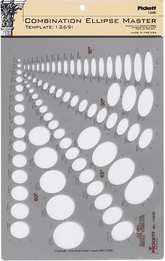
I haven't found the actual brand you buy to matter much, so you may want to shop around. This one is a "master" template, which will give you a broad range of ellipse degrees and sizes (this one ranges between 0.25 inches and 1.5 inches), and is a good place to start. You may end up finding that this range limits the kinds of ellipses you draw, forcing you to work within those bounds, but it may still be worth it as full sets of ellipse guides can run you quite a bit more, simply due to the sizes and degrees that need to be covered.
No matter which brand of ellipse guide you decide to pick up, make sure they have little markings for the minor axes.
This website uses cookies. You can read more about what we do with them, read our privacy policy.


