Uncomfortable in the post "LESSON 2: Organic Forms, Contour Lines, Dissections and Form Intersections"
2014-12-23 00:30
You've done pretty well.
For the organic forms with contour lines, the vast majority of them are good. There are a few where the contour lines don't wrap around the form properly (to varying degrees). Bottom left of page 2, for example, is probably the worst of the lot. On the top left of that same page, I really like how you've drawn through the full ellipses. A lot of people skip that step, but it's very important. If you ever find yourself struggling with the contour lines, go back to doing that for a bit, and it should set you straight. Still, in general they're quite good!
Your dissections are alright. The forms are drawn well, and I like the attention to layers in the dissections themselves - for example, the thickness of the coconut shell, or the layer of the fish skin. Your textures leave a bit to be desired. This is definitely a great time to look at photo reference, and use it to inform the kind of details you work into your textures. Try to avoid random scribbles, like on the coconut, and try and show intent and forethought behind every mark you make. All that said, I really like the surface texture on the object above and to the left of the fish. It's simple, subtle, but attractive. Reminds me of a cucumber.
On the following page, the other fish-like-thing largely went wrong because you over did it with the texture, and applied it as though the object was flat. You've got to remember that as the form turns, the scale texture will also turn and will grow somewhat denser around the sides. Furthermore, putting in all that detail must have been very tiresome for you - and unfortunately, it made the whole drawing far too busy and noisy. A drawing needs to direct the viewer's eye around, using focal points (areas of high detail or contrast) and rest areas (areas of empty space with very little detail or information). You can use these concepts to save yourself some time (it gives you an excuse not to render the crap out of everything). I go more into this sort of thing in the future lessons.
Your form intersections have been done well, but I see that you drew them in pencil originally and then went over it with ink. Unfortunately, that runs a little contrary to some of the things I'm trying to teach. Our focus here is not on the quality or attractiveness of the resulting drawing, but rather the steps that bring us to completion. Every step requires the artist's full attention - some people will have a habit of looking ahead, and tweaking their approach so the end result is cleaner. I'm trying to break that habit, for now. It'll come in handy later on, but only once you know what you're doing. For now it's getting in the way.
I'd like you to do one more page of form intersections, from start to finish, in ink. I want to see you draw through each form - including the lines that are hidden. Basically, approach it by drawing a form in the centre of your page in its entirety. Then draw another form nearby, in its entirety. Then decide whether they intersect, and how that occurs. This decision places them in relation to each other.
This step by step I included in the bonus content section of this lesson goes over that process. Also, you may want to avoid drawing long forms that are stretched in one direction - like long tubes and such. You've actually handled them quite well (most people have difficulty with it since it makes perspective a far larger concern than it really needs to be for this exercise). Equilateral forms (more or less equal in all three dimensions) are way easier to deal with.
Uncomfortable in the post "LESSON 5: Drawing Animals"
2014-12-22 18:25
Nice! I'm really loving the frogs at the end, the forms are really well put together. Your method for shading is a little too noisy for my taste though - all of the little hatching lines create areas of very intense contrast, which draws the eyes. In some cases, you've managed the focal points quite well (the two top frogs), but in the one beneath, I can't help but look at its back.
The ostriches are really well done as well, especially the two full-body ones. The detailing on the head's pretty neat, but it's looking a little flat. It doesn't look like you did much in the way of lay-in on the head structure, so that's probably the reason. The gait of the one on the top right is really good - it feels like it was caught right in the middle of its stride, and like it's eager to burst forwards. Lots of tension, well done.
Page 2's alright - quadroped animals like this have been difficult for me as well, Something about the legs throws off my sense for proportions, and ends up making the whole thing feel a bit more rigid. Looks like the same thing's happening here. I'm sure it's just a matter of practice, more on the observational side than technique. Good attempts at construction though, I can see you trying to put them together one form at a time.
One thing that may help is to place a mass for the ribcage, and a mass for the pelvis. For example, here's a critique I did for someone else a while back. The first step (on the right) shows me blocking in the head, ribcage and pelvis. Admittedly, I should have been more complete with my forms - drawing full ellipses instead of sketchy little approximate messes. Still, the idea is there.
I really like the second turtle head study, and the textural study below. Working with those dark, black shapes adds a lot of interest without increasing the contrast too much. One tip I have is to use more smaller shapes as you transition to regular, clear space.
Overall, nice work! I think you've done enough to consider the lesson complete. You still definitely need work and practice, but I think you've done a good job of digesting and applying a lot of the concepts in this lesson. When you feel comfortable and ready, go ahead and move onto the next lesson.
Uncomfortable in the post "OPTIONAL CHALLENGE: 250 Boxes"
2014-12-22 18:08
Definitely a marked improvement between the first and last pages. The first page showed a handful of weird boxes - especially around the bottom (33, 32, 34). By the end you get a lot more confident, for the most part. 237 still looks off, though.
What you've got to keep in mind is that there is a horizon, and your horizontal vanishing points will sit on that line. If we're dealing with 2 point perspective, the verticals will always be perpendicular to your horizon. So, if your horizon is tilted, the verticals will tilt as well.
The viewer's eye will look subconsciously compare the angle of the verticals and where each vanishing point seems to lie. You can form a line between those two vanishing points, and the brain automatically checks if the angle between the vertical and this line between the VPs is around 90 degrees.
It's a little different with 3 point perspective, but similar enough. Take a look at this overdrawing. In 237, your VPs are sitting on totally different horizon lines, relative to the verticals.
Anyways, keep an eye out for that. 33, 32 and 34 have similar issues. The vast majority of your boxes are still pretty good, though.
Uncomfortable in the post "LESSON 2: Organic Forms, Contour Lines, Dissections and Form Intersections"
2014-12-21 22:54
Overall, you did good. Your organic forms with contour lines, as well as your dissections, are very well done. They show great volume, they feel very three-dimensional. Your dissections are really interesting, too.
As far as understanding space goes, your form intersections are well done. The intersection part of it has mistakes but despite the name of the exercise, that's not the focus. Rather, it's more about learning how objects can exist in the same 3D space, and how they can relate to each other in terms of orientation, position and scale.
For that, you showed strong understanding. However...
I am very against how you approached it, with the dashed lines. It shows a preoccupation with the quality of the final drawing. When you look too far ahead, you do not pay the appropriate amount of attention to the step you're currently on. As such, your forms don't come out as well as they could. A great example of this is your spheres.
Draw your forms out completely. Solid lines, using the techniques for ellipses and lines that we covered in the last lesson. As soon as you start using dashed lines, your brain starts doing the drawing, because the flow becomes broken up. What we want is for your brain to tell your muscles what you want, and your muscles to concern themselves with how the shapes are drawn.
At the end of the day, these are all exercises. They are expected to be messy. Gradually you will learn how to bring the viewer's attention to specific lines, and make your construction lines recede and even disappear. Here's an example by my instructor, Peter Han. All of the construction lines are there, and they're solid, but you can barely even make them out.
Anyways! Despite my rant, you did pretty well. Just keep that construction drawing thing in mind, and feel free to move onto the next lesson.
Uncomfortable in the post "OPTIONAL CHALLENGE: 250 Boxes"
2014-12-21 17:38
Ghosting your lines may help you gain a greater degree of control over how far your lines go. They'll still go further than you want at first, but it'll help reel it back.
Ghosting is essentially marking a point where you want your line to start, and one where you want it to end. Then you go through the motion of drawing that line several times without putting your pen to the page. Then, once you're comfortable with the motion and feel that it's starting and stopping where you want it to, you just lower your pen to the page and repeat the motion again, making a mark.
For the line weight, it's probably better to go over the lines again afterward - worrying about line weight when you're drawing the initial lines is just going to complicate things. Breaking them up into steps is probably a much better approach. You don't always necessarily know what lines you want to emphasize right off the bat, anyways.
When going over the line, try to avoid going slowly. Confidence is extremely important, and when you go slowly you'll probably end up wobbling all over the place. The lines might go off course at first, but gradually that will happen less and less as you gain a greater degree of control over your hand.
After all, none of these exercises are intended to create beautiful drawings. They're just exercises. Usually that means drawing a lot of crap that steadily gets less crappy over time.
Uncomfortable in the post "LESSON 2: Organic Forms, Contour Lines, Dissections and Form Intersections"
2014-12-20 22:38
Haha, eventually you'll come to understand what I mean. The whole dynamic sketching curriculum that this lesson leads into is all about visual communication. It's a really important skill that is very useful in just about all facets of representational art. When your goal is to communicate a concept for something that exists in 3D space, you may find yourself needing to throw in elements that aren't actually there to further emphasize your points. Contour lines are a great example of this.
But then again, I personally just really like looking at the raw stuff when it's done well!
Uncomfortable in the post "LESSON 2: Organic Forms, Contour Lines, Dissections and Form Intersections"
2014-12-20 21:51
Ah, this is definitely much more interesting to look at. If you'd simply gone over them to thicken the important lines (as you did on your overlay), they would have been just about perfect.
Uncomfortable in the post "OPTIONAL CHALLENGE: 250 Boxes"
2014-12-20 19:14
Haha, tedious, isn't it? But worth it. Comparing the first page to the last, your lines become far more confident. You've definitely earned your badge!
That said, there are still a few issues that you seem to be missing with your red corrections. Most significantly, in a lot of cases your far plane is coming out bigger than your near plane. It's a problem you seem to have fairly consistently, so it may take some effort to consciously think about that whenever you draw a box. Over time, it should correct itself, as long as you are aware of the problem. A more concrete way of trying to fix it is to draw through your boxes completely - including the lines that are hidden by the rest of the form.
Anyways, you definitely showed me that you can take your time with each box, and draw them fairly cleanly. I think you should be ready to tackle the next lesson.
Uncomfortable in the post "LESSON 2: Organic Forms, Contour Lines, Dissections and Form Intersections"
2014-12-20 19:06
In the future, refrain from doing that. The lessons and exercises here aren't about making pretty drawings - there are a lot of benefits to not letting yourself do an overlay afterwards.
-
It helps me understand how you approached the drawings, allowing me to do give more helpful critiques
-
It helps you learn how to draw with a greater sense of purpose and direction. You end up having to think about every mark you make. You become more careful, and you also learn to bring the viewer's attention to certain lines over others, causing the original construction lines to recede.
Uncomfortable in the post "LESSON 2: Organic Forms, Contour Lines, Dissections and Form Intersections"
2014-12-20 15:24
Great work! Your organic forms convey a good sense of volume, and the contour lines wrap nicely around them. Your dissections have done a good job of creeping the fuck out of me. Good volumes, nice experimentation with different textures, also great work with the pressure control. The ellipses you drew for your contour lines are faint and sometimes a little bit broken, but they follow through the shapes very well. Usually when they're so faint, they end up being tentative and timid - yours are confident, so that shows through into the final drawings. I really like the one you labelled 'wtf'... It was well earned.
Your form intersections are pretty good. I would like to see more drawing through of the forms, but they seem to be mostly correct. Usually I try to discourage using forms that are stretched in one dimension (long tubes, etc), because they complicate things and bring perspective more into the equation than what is ideal. Still, you handled it quite nicely.
I only noticed one obvious mistake: the cylinder in page 8 is backwards. The further end is larger than the closer one. The visible cap, as well, its ellipse is very.. pointy.
Overall though, very well done! Feel free to move onto the next lesson.
Oh - I also noticed the vast difference between your previous lesson and this one. You were far more careful, and the thought you put behind every mark is very clear.
Uncomfortable in the post "OPTIONAL CHALLENGE: 250 Boxes"
2014-12-20 14:55
Well done! Your boxes were pretty solid to begin with, but they've still shown improvement in some small ways by the end. Your lines are quite confident and steady.
The only piece of critique I can think to give is in regards to your line weights. They're generally quite pleasing (I like that you've thickened the lines outside of the boxes, it does a good job on emphasizing the idea that the box is a single cohesive object rather than a series of connected lines). Lines of the same weight, however, going all around an object will start to flatten it out. Keeping this in mind, it might be better to thicken some of the lines on one side just a little bit more. Think of it like lighting - the lines that your light source don't hit can be a little bit thicker.
You did do this perfectly on a few occasions - for example, 184. Even 112's going in the right direction.
Anyways! Great work overall, you've earned your badge.
Uncomfortable in the post "LESSON 2: Organic Forms, Contour Lines, Dissections and Form Intersections"
2014-12-20 01:28
The first page is better than the second, but I do think you're getting the idea. As you wrote along some of them, the contours aren't always quite curving enough to wrap around the form, but you are successfully conveying a sense of volume. Keep at it!
Uncomfortable in the post "LESSON 2: Organic Forms, Contour Lines, Dissections and Form Intersections"
2014-12-18 22:44
Fantastic work on the organic forms and the dissections. You carried the volume through very well on both exercises, and I like all of the different kinds of textures you experimented with. You were definitely willing (and eager) to get into the tedium of it all - that will definitely serve you well in the future.
The form intersections were definitely the weakest section - and as you said, they are friggin' hard. There's a few things in your approach that I would definitely like to see changed.
One thing we want to try and emphasize throughout all these lessons is confidence. People have a tendency to start off timidly, carefully, afraid to ruin the final drawing by being too sure at the get-go. This causes an artist to undermine their own strengths and it comes through into the final drawing.
I can see in your form intersections the fainter lines where you tried to draw through the forms. Drawing through the forms is great, but the way you approached it is not. At every step in a drawing, you should be focusing 100% on that step, as if it were the final step. Meaning, you if you're blocking in a sphere, you draw a solid circle (similar to how you'd do it for the ellipse exercises, going around the circle a couple times if need be - this should also help you achieve some better circles, since your spheres are definitely a weak point). You try and be neat, but what's most important is getting a solid circle on the page.
Afterwards, you can pick which lines you'd like to emphasize with extra line weight - the ones you don't emphasize will automatically recede. You'll notice that the example I included in the lesson (from my own sketchbook - that is the homework I submitted to my instructor when I was doing this exercise) shows each line as quite visible. Nothing attempting to hide.
Secondly, while you were kind of drawing through the forms in that method, there are some forms that you didn't draw through entirely - for example, the pyramid at the bottom of page 8, the box at the top left of page 9, etc. Right now you're at a stage where you're not 100% sure of how these forms work in 3D space at different orientations, so draw through them as completely as you can. Admittedly, you did do this for a lot of the forms, so kudos for that.
Lastly, you are making this exercise harder on yourself than it needs to be. There's a lot of stretched forms that you're using - long tubes, long boxes, things that have been stretched significantly in one dimension. That puts an emphasis on perspective in the scene, and we don't really want to be bothering with that any more than we need to. So- instead, try sticking to forms that are more equilateral. Equal in all three dimensions. So for a box, something more cube-like. For a cylinder, a tube that is kind of squat, only as tall as it is wide. This way you can picture it as though you are playing with large blocks, and merely mashing them together.
As for that tinkercad thing - nice find! It's definitely perfectly okay to use 3D modeling software to find out how two forms might intersect in a given situation. There's at least a couple different kinds of intersections that I don't understand myself (usually involving curves) so I generally have to look that stuff up as well.
Anywho, I'd like to see two more pages of form intersections from you, keeping in mind the things I've mentioned above. I'm not sure if you saw this in the notes (I added it a week ago), but take a look at this step by step for form intersections. It might help with the whole idea of focusing on the step you're on, and keeping yourself from looking too far ahead.
Uncomfortable in the post "LESSON 2: Organic Forms, Contour Lines, Dissections and Form Intersections"
2014-12-17 23:33
Welcome back!
Your organic forms with contour lines are looking quite good. The first page of dissections is alright as well, though the second falls flat. I've noticed this a lot with other people, that they'll do really well with the organic forms, but the dissections don't work out as well - despite essentially being the same thing. When approaching things like that, remember that the dissection is basically taking the organic form one step further - so first, you draw the organic form, put in your contour lines, and then worry about how to dissect it. It's very easy to get overwhelmed by the concerns of detail that are involved in later steps, but you have to work towards ignoring them, and focusing only on the step you're on. This becomes more important as you move onto the next lessons.
Your form intersections start off kind of meh, but by the end they're pretty good. I like seeing that kind of progression, it shows that the practice is paying off. One thing you should keep an eye on though is your ellipses. Sometimes they're alright, but especially when you're working with a sphere, an ellipse that's off can have a big impact. Definitely keep up with doing those first two exercises from lesson 1 as warm-ups.
Anywho, you're more or less ready to move onto lesson 3.
Uncomfortable in the post "LESSON 5: Drawing Animals"
2014-12-16 22:46
I'm actually quite impressed. You experimented a lot, and some of those experiments didn't work out, while others worked out better. You clearly applied a lot of the concepts we've been covering over the past few lessons (contour lines, form intersections) and also played with different, more organic approaches.
I really like the cats (and possibly a few dogs?) at the bottom of the first page. They're very gestural, but the proportions and the shape relationships are well done, even if they're loose sketches. Second page is hilariously bad (mostly the faces), but it happens when you experiment. The only way to learn is to make mistakes!
I can start to see a more solid construction coming out with the rats. They're still loose, but they're coming together, and starting to hold more form.
I really love your ducks. Page 5's got some really neat constructions. The boxy one is especially cool - you've captured the essence of a duck, but it's just boxes. Unrefined, but still very well communicated.
The big duck on page 6 is lacking some of the solidity of the previous ones, but I like how you developed a clear focal point around its head, with the fine detailing in contrast with the looseness of the rest of its body. It's a great example of setting up a hierarchy of focal points and density of detail.
The lizards are looking really nice too. Again, they're loose, but they're doing a good job of capturing the 3D form and volume - especially the middle one.
I like these drawings a lot, but I'd like to see you do a couple more pages of tighter drawings. Feel free to do more experimentation and loose sketches to get a good sense of what you're going to draw, but in the end, submit to me two pages that combine the construction and solidity of your lizards and your quick duck sketches, with the careful application of detail and focal areas of the larger duck on page 6.
Also don't feel like you need to rush to complete these. I see that you've been going through the lessons pretty quickly - taking a break might help you digest what you've learned.
Uncomfortable in the post "LESSON 2: Organic Forms, Contour Lines, Dissections and Form Intersections"
2014-12-16 15:47
Ahh, I see. Sometimes it's hard to tell pencil and ballpoint apart in photos and scans, so I always have to be vigilant.
Uncomfortable in the post "LESSON 2: Organic Forms, Contour Lines, Dissections and Form Intersections"
2014-12-16 00:31
You're showing some improvement over the course of the organic forms with contour lines. They start off rather flat (the contour lines don't really wrap around the forms). As you progress, I can see that you correct that, so the later ones (page 4) look much better. Drawing the full ellipses definitely helped.
Your dissections are kind of weak, though - you revert back to flattening them out as you did at the beginning of the previous exercise. They should simply extend from the organic forms. Draw an organic form, and then once that's finished, you can turn it into a dissection. That said, your second page of dissections also looks better. It seems that at first you reverted to drawing them flatter, but as you got used to it, you corrected some of your mistakes.
The form intersections are... they're not awful. They're not great either, but while the execution leaves something to be desired, the underlying understanding you're demonstrating is decent.
The biggest problem is your spheres, they're making the rest of it look bad. You're trying to draw the circle in a single motion, and just like the rest of us, you're not skilled enough to do so. Instead you have to resort to drawing around the circular motion a couple times. Practicing your ellipse exercise from lesson 1 as a warmup will also help. See how I tackle the circles in the top right corner? It both helps me practice more effectively, and also results in a more generally correct circle. It's messier, and won't be suitable for a proper illustration, but these are all just exercises.
Do one more page of form intersections, keeping all that in mind, and going over the links I provided in my last response. Draw your forms a little bigger, and make them more equilateral. Avoid long, stretched forms (like lengthy tubes or long boxes) and stick to forms that are equal in all three dimensions.
Also, is there a particular reason you're avoiding doing these exercises in ink?
Uncomfortable in the post "Who Are You? Introduce Yourselves!"
2014-12-15 03:11
Welcome to /r/ArtFundamentals! I hope the lessons here are of good use to you.
Uncomfortable in the post "LESSON 2: Organic Forms, Contour Lines, Dissections and Form Intersections"
2014-12-15 02:33
Very nice! Onwards to the next lesson.
Uncomfortable in the post "LESSON 4: Drawing Insects, Arachnids and Other Creepy Crawlies"
2014-12-15 01:15
Here's some critique. Overall, you've done pretty well. There's just a couple things to keep in mind.
-
Right now your line weights are 100% uniform, which flattens the drawings out. Check out the bonus notes on the side bar, there are some that deal with line weights. Also look at other peoples' submissions, that help as well.
-
Read this. Your hatching is a little sloppy, but moreso there are better ways you could go about it that both reinforces the curvature of your surfaces and also generally looks better. In terms of the sloppiness I mentioned though, just slow down a bit and think about the marks you're drawing before you draw them.
-
Always be sure to draw the smaller details so they fit in line with your lay-ins. That's what the lay-ins are for. You'll notice on the second page from the left, on the bottom row, I did a quick demo of sticking to the lay-in.
Overall, you did enough successful drawings for me to be comfortable with letting you go to the next lesson. Be sure to carry this critique over to the next subject.
Uncomfortable in the post "LESSON 2: Organic Forms, Contour Lines, Dissections and Form Intersections"
2014-12-14 17:11
Your dissections (mostly) look fine to me. I really like them, actually, they're very creative and explore all different sorts of objects. Similarly, your organic forms came out very full and voluminous, which is definitely what we're after.
Your form intersections are remarkably well done. You made some choices that I wouldn't have (for example, using a lot of stretched shapes like long tubes and long boxes that make things more complicated by emphasizing perspective too much) but you still handled them pretty well. The last page is a bit weaker, but the first two are quite strong.
I drew these notes yesterday, a step-by-step on how to approach the form intersections. Though you did them well, I figure they might help just a bit, if you were curious as to how I approach them.
Feel free to move onto lesson 3!
Uncomfortable in the post "LESSON 4: Drawing Insects, Arachnids and Other Creepy Crawlies"
2014-12-14 04:21
Unfortunately nothing comes to mind. Proportion as an observational skill mainly just comes from, well, looking at things, and studying them. That's more or less just practice.
Uncomfortable in the post "LESSON 2: Organic Forms, Contour Lines, Dissections and Form Intersections"
2014-12-14 04:20
Your organic forms with contour lines are really well done. I like the flow of the forms, and they all feel like they carry great volume. Your dissections are quite interesting too. With the fish, the only thing that bugs me is the fact that the skin is paper thin. I did this explanation for someone earlier this evening, it applies very much here. Always add just a touch of thickness, it'll really help sell the drawing. Still, I really like your different subjects. All the different textures are really neat.
I'm not terribly pleased to hear that for the form intersections, you did them in pencil first. Try to avoid that in the future, because while it may help you succeed at the assignment, it defeats the purpose of working in ink at all. You've got to build the confidence that will allow you to work in pen as comfortably as you would in pencil.
That said, page 4, and even moreso page 3 came out very well. One thing that definitely needs improvement though is your use of hatching when you're shading. Depending on how you use it, it can very easily flatten out a drawing, even if everything else works towards successfully demonstrating volume and form. The reason for this is that every single line is interpreted as a tiny contour line. If it's flat, the surface will appear flat. Here's some notes explaining what I mean.
I would like you to do one more page of form intersections - strictly in ink, no preliminary pencil work. Try to follow these steps that I drew out this evening. Don't plan too far ahead, just draw a form on the page. Then draw another form. Once it's drawn in its entirety, THEN start making decisions of how it will intersect with the other one. Then repeat this process over and over.
Uncomfortable in the post "LESSON 4: Drawing Insects, Arachnids and Other Creepy Crawlies"
2014-12-14 03:58
Spider on the bottom of page 4 is awesome. Also our wasps are showing some good volume (which was a bit weaker in the plants). I liked seeing the step by step, it shows that your lay-ins are solid.
One thing I'm concerned about though is your proportions. I can't see the reference images, so I can't be sure, but in various cases (the wasps for instance) the different major components of their bodies don't seem to have the correct size relationships between them.
Secondly, I think you may be getting sloppy when it comes to observing your reference. Proportion is likely a part of that (a more significant symptom), but on a less significant level, you tend to make significant mistakes with the legs and the faces of spiders. I think you may still be oversimplifying those finer details into what you think you see (a basic human adaptation that we all have to train ourselves to ignore) instead of drawing what is actually there. As I said, you're doing that only for these finer details. Maybe that is your natural response when you become overwhelmed with the detail, I'm not sure. Either way, I think it's something that practice will help remedy.
Okay, so. I want to see two more pages of insects, and in addition to that, studies from the following images, all of which are flies:
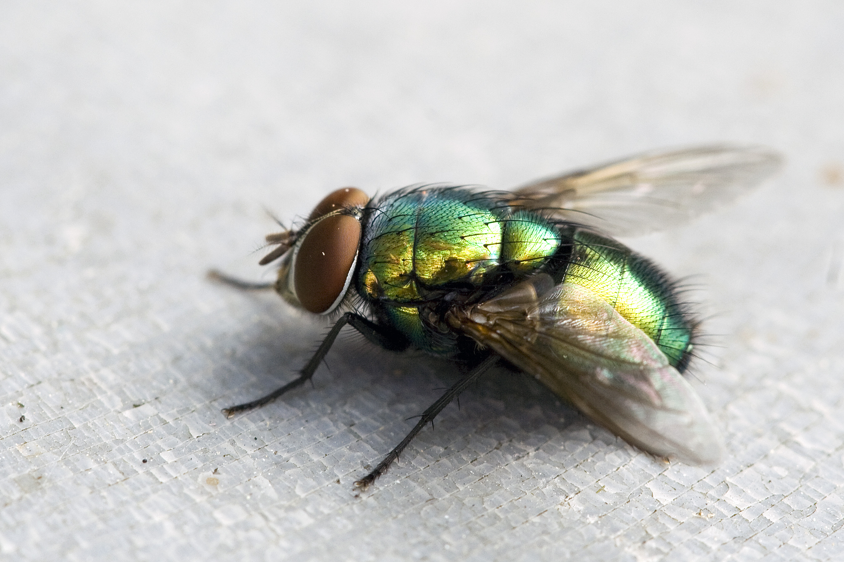
This way I can see how you deal with specific reference images, and I can check where your observational skills are not quite sharp enough.
Oh, also, as per your request, the hairy spider. When doing your own drawings, avoid shots like this that use a lot of depth of field techniques to obscure the focus from different parts of the subject. It definitely makes things a lot harder!
Uncomfortable in the post "LESSON 2: Organic Forms, Contour Lines, Dissections and Form Intersections"
2014-12-14 03:42
When answering another person's questions about form intersections, I wrote up another set of bonus notes that would definitely be of use to you. More of a step by step for approaching form intersections.
Uncomfortable in the post "LESSON 2: Organic Forms, Contour Lines, Dissections and Form Intersections"
2014-12-14 03:41
They're not looking particularly great, though you're on the right track. The problem isn't so much with your understanding of space and intersections, it's more how you're approaching them.
-
Don't draw them so small. In general, don't draw things tiny, it comes out really timid looking. Be confident! Drawing seems to be a lot like dating, now that I think about it...
-
Don't think about how your form's going to intersect with what's already on the page before you draw it. Draw the form (in full, draw THROUGH the form, don't worry about what gets blocked out and what doesn't) and then decide how it intersects with the other forms.
-
For now, avoid really long shapes (long tubes, long boxes, etc). They bring perspective too much into the mix, and it just complicates things.
-
One set per page. Draw a form, draw another form and connect them, then another and intersect those, and another, and another, until the page is full. No individual little segregated communities of forms in different school districts and racial barriers. Free, inclusive societies only! ... for 3D forms!
It's about time - I finally created a step by step explanation of how to deal with form intersections. It's one of the hardest things we deal with in these lessons, I should have done it sooner.
Also, as for your question - I didn't really know, to be honest. So, I did a bit of research (mostly googling) and came up with these cylinder/sphere intersections.
Uncomfortable in the post "LESSON 2: Organic Forms, Contour Lines, Dissections and Form Intersections"
2014-12-14 02:29
That is definitely looking WAY better. The forms look voluminous and full, like they swell into 3D space. Just a couple things to add to that - minor touches. First off, in page one you have an open hole in one of your dissections. When you do that, it's usually best to add a little bit of thickness around the edge of the hole. The way you've got it, it's looking paper thin - which you COULD be going after, but chances are you just meant for it to be a regular hole. A little bit of thickness usually looks far better anyway, since it helps the brain process how this form could exist. Were it paper thin, it probably couldn't support its own weight. The other thing is just that when you're putting in textures for the different dissected pieces, looking at reference imagery and just pulling out that sort of texture detail and embedding it into your image is a great way to push the believability and realism in your drawing. This applies all across the board, and this particular exercise is a great way to practice it.
Still, great improvement.
Next there's the form intersections. Again, I think you're getting overwhelmed. Usually at this stage I'd recommend skipping over to the 250 box challenge. The reason this has helped people is because it demystifies these forms. Really, all you're doing is drawing one individual form at a time - and then you draw another beside it. Worrying about how you're going to build them all and put them all together is troublesome, and pointless. Just attack it one at a time.
So, the challenge is probably a great place to start, since it's all about attacking one reasonably simple form from all sorts of different angles, each isolated and on its own. The challenge post also includes some extra notes that should help.
When you do end up going back to the form intersections though, avoid forms that stretch in one dimension. For example, long tubes, long boxes, etc. When you start stretching a lot, you throw in more emphasis on the perspective, and that's really not what we're interested in right now. Large, equilateral forms (like a cube in the context of a box - all the dimensions are equal in size), are our best bet. Like playing with big children's blocks. You start with drawing, say, a cube in the middle of your page. Then maybe you decide you're going to draw another cube beside it, but it just so happens they're overlapping (intersecting) a bit. That presents a problem, which you solve by investigating how they intersect with one another. Then you draw another form, and so on.
But yeah. Boxes first!
Uncomfortable in the post "LESSON 6: Hard Surface Objects"
2014-12-13 02:42
You need to be a lot more careful with your proportions. There's no shame in really, really closely looking at your reference, even drawing over it like this.
See the little silhouette drawing I did in the corner? It's very simple, but it's already got a lot of the major form blocked out in 2D. Once you have those relationships between the different components - the turrent, the body, the cannon, etc. the rest becomes easier. When things start feeling bigger in relation to one another than they should be, everything falls out of whack.
Uncomfortable in the post "LESSON 2: Organic Forms, Contour Lines, Dissections and Form Intersections"
2014-12-13 02:25
Okay, I'm kind of baffled. Your first two pages - the organic forms with contour lines - were really very good, especially the second page. You're getting the volumes, your line weights are interesting, your lines flow very nicely, etc. Then you move into the dissections - which are 90% the same exercise as the first, and it all falls apart. What you nailed in the first one is completely missing in the first part.
What happened? I'm thinking that you may have gotten overwhelmed with the idea of the exercise, perhaps the fact that you're drawing (somewhat) concrete objects rather than seemingly abstract forms. This sort of thing is what shuts the brain down, and is often the reason a lot of people find it difficult to draw.
It's also the main problem that these lessons try to target - stopping people from feeling overwhelmed.
Here's a few notes/overdrawings of your first page of organic forms. You did pretty well, but there's some issues with how you handle the end of the form, and sometimes you aren't quite wrapping the contour line around the form entirely.
I also did a quick demo of how you could turn one of your forms from exercise 1 into a dissection. Try doing another two pages of dissections, starting them off as the organic forms with contour lines, and then taking them further into dissections. Dealing with these things step by step - and not worrying beyond the step you're on - might help.
Your form intersections will need work as well, but don't worry about those right now. I'll tackle that critique once we've taken care of the dissections and increased your comfort level in that area.
Uncomfortable in the post "LESSON 6: Hard Surface Objects"
2014-12-12 23:35
I might be able to give you a little more advice if you show me the reference you've been working off of.
Uncomfortable in the post "LESSON 6: Hard Surface Objects"
2014-12-12 04:15
Always go big to small. For the majority of objects, this means starting off with a box, or similar form, that encompasses the whole thing. Subdividing it will let you find your landmarks, and allow you to start placing other significant, but smaller elements (like the wheels).
The wheels are a good measurement tool, though, so you'll likely have to work backwards a little to find what the appropriate wheel size will be, based on the box you've drawn. Once you find the wheel size that fits, you can use it along with the subdivision to help place other elements on the construction.
Uncomfortable in the post "LESSON 3: Drawing Plants"
2014-12-12 00:43
Nicely done! I did my own version of it last night, and yours matched up rather closely. I included some notes in mine - none of which are in direct response to yours, since I wrote them yesterday - but they still might be of value to you.
I really like the fact that you even threw in the contour lines over the bud in the centre of the petals. It shows that you're starting to understand the three-dimensionality of the various forms you're using.
Also, the quality on this scan is way better. Your lines have more character than the previous scans showed.
Since this one is definitely in the right direction, I'm going to mark your lesson 3 as complete. Feel free to move onto lesson 4 when you're ready, but remember the things you learned here about the lay-ins, they're just as important in later lessons.
Uncomfortable in the post "LESSON 6: Hard Surface Objects"
2014-12-11 03:07
Not... terrible. You're moving along the right track, that much is for sure. A lot of the issues I see will go away with practice. I did however scribble all over some of your drawings.
There's a few things that do come to mind, in terms of advice I can give you.
-
One thing that's very clear is that you're being a bit overwhelmed by the information in your reference image. When dealing with these, go back to the mental state you had when you did the form intersections. More than anything, those prepared you for this. Hard surface objects are just a collection of rudimentary forms. Maybe try doing lay-ins where you're just dealing with those rudimentary forms. Boxes are especially great - even the objects that have nice organic curves, like your truck, are boxy at heart. Boxes are a lot easier to work with since they're not as approximate as curves, especially when it comes to perspective. At the very end, you can start rounding off the boxy forms into nicer curves, but not until you've got all your form fleshed out.
-
You may want to try your hand at some simpler objects. Household objects can flex a similar range of mental-muscles as these larger vehicles, without as much visual information. In the past I've done studies of computer mice, I've seen people work with mugs, game controllers, all sorts of things like that. The scale also helps - big objects tends to throw our brains into panic mode.
-
Be mindful of your ellipses. This set of notes comes to mind. The degree (width) of an ellipse speaks to the angle of the circle it represents, in 3D space. The narrower the ellipse, the more extreme the angle at which we see the circle. This means your ellipses need to match the orientation of any other objects they're attached to.
I'm not gonna mark this one as complete for you, because I'm quite sure you can do much better. Do another set of eight pages - you're free to tackle any subject matter that seems related to this (like the household objects thing I mentioned, other vehicles, etc). We'll go from there.
Uncomfortable in the post "LESSON 3: Drawing Plants"
2014-12-11 02:33
The lay-ins at the top of page 1 are great. Lots of energy, nice variation in your line weights, and the shapes feel very flexible and organic. The top of page 3 is pretty nice too, though be careful with your line weights - the drawing will flatten out if you darken all the way around the shape, instead of just on one side.
Overall, with these and your previous submission, I think you're ready to move onto the next lesson.
Uncomfortable in the post "LESSON 3: Drawing Plants"
2014-12-11 02:30
Hm, this teaching approach isn't working too well, so I'll try something else.
One thing I'm seeing very much is that your lines are very wobbly and lack any semblance of confidence. You're being way too careful, like you're scared of making an incorrect mark. There are a lot of broken, dashed lines that undermine the solidity of what you're drawing. This goes hand-in-hand with why you're so good at detailing. You're definitely very observant and particular, but we need to work on your boldness and your willingness to get marks onto the page.
I wrote some notes on your latest submission, but as I said, we'll try taking this on from a different direction.
I'd like to see you do a lay-in - just a single drawing - using this picture of a flower as your subject.
Focus on:
-
capturing the major forms. what I see is a tube-like stem, a squashed ball in the centre of the petals, and a series of 2D shapes that radiate out from around it. Together those shapes seem to make a sort of ellipse, if you want to get really simple. The petals themselves curve through 3D space, but the shapes themselves are quite simple.
-
drawing with solid lines. no broken, dashed lines, if your lines are coming out wobbly (which they seem to be doing a lot) try and draw your lines a little quicker. wobbliness comes from being too careful.
Before you do this, do a few pages of the lines/ellipse exercises from lesson 1 as a warm-up, and only approach the lay-in once you feel comfortable and ready.
One last thing - I'm assuming you're using a scanner to upload your images. Something about the settings you're using is making it come out with a lot of contrast. See if you can scan it in as a photograph (usually this high contrast comes from settings associated with drawing presets). If you can't, then it may be better for you to take a photo of the drawing instead (a cellphone camera will do nicely). The high contrast is taking a lot of the character out of your lines, and it makes it a little harder to judge your work.
Uncomfortable in the post "LESSON 3: Drawing Plants"
2014-12-10 02:26
Here's a bit more of an explanation for you. The problem is that your lay-ins are more like speculative sketches, rather than solid constructions. You're looking very much at all of the detail - all the little shapes and bits. That helps you later on, because you clearly have a good eye for surface texture, but your drawings end up lacking a solid construction or base. As such, they end up looking flatter and less convincing.
Try and look at the big shapes, the big forms, the major rudimentary components that make up the object. For example, a maple tree is just a stretched ball (foliage) on a long tube (tree trunk). Don't look at all the leaves.
Again, two pages of lay-ins please!
Uncomfortable in the post "LESSON 2: Organic Forms, Contour Lines, Dissections and Form Intersections"
2014-12-09 23:55
Hahaha, yeah, I'd actually just gotten back from work and I finished critiquing one that had been submitted a few hours prior. By the time I was done, yours and another showed up in my inbox. The fuckers are multiplying!
Uncomfortable in the post "LESSON 2: Organic Forms, Contour Lines, Dissections and Form Intersections"
2014-12-09 23:44
Holy crap, those boxes are really good. It looks like it must have taken forever, considering the precision. I'd have almost thought you were using a ruler, if I hadn't taken a closer look. Very nice!
Also, don't worry about finding a scanner - the photos are perfect. Strangely enough, often the easiest to critique have been photos - often people who use scanners use the wrong settings and it ends up coming out almost looking digital. For me, these photos are ideal.
Okay, onto the lesson critique.
Your organic forms with contour lines are looking pretty good. Nice volumes, and for the most part your contour lines are curving around the edge of the form nicely. In a few instances they flatten out a bit around the edges though (mostly on page 4). The previous page is much, much better. So more of page 3, less of page 4. The rest of the organic forms are looking pretty good.
.. I'm still flipping through them. I honestly thought I'd reached the end, but.. they just keep going. My goodness you're thorough. Okay, I'm at the dissections now. It appears you might be somewhat disturbed. Good!
I like the variety of experiments. The forms and volumes are all good, and I'm glad to see thickness around the edges of the cuts. In the future though, you should look at photo reference whenever you try and put texture to a surface. Reason being, right now you're relying very heavily on your imagination, and the part of your imagination that stores visual information regarding the smaller details, isn't as developed as it eventually will be. We develop this part of our brain by pulling information from reference material. The more you do that, the less you'll have to rely on it - but most of the time we'll still look at a whole lot of reference, even if we don't necessarily need to.
Great work with the form intersections! I usually recommend that people stay away from the longer, stretched forms (long tubes, long boxes, etc) because they start bringing perspective into the mix. Still, despite that added complication, you pulled it off quite well.
Onwards, to lesson 3!
Uncomfortable in the post "LESSON 3: Drawing Plants"
2014-12-09 23:16
Your lay-ins are god-awful. Your full drawings, on the other hand, are actually really quite good. Some of them, anyways.
The bit about the lay-ins is more likely because you just misunderstood how to approach them. Once we correct that, I think it should reflect in your final drawings and make them even better.
-
The top right of page 3 is pretty good, though a little confusing as to the hierarchy of shapes. It's a little hard to tell what's in front of what. A better use of line weight should help with that.
-
The top right of page 4 is STUNNING. You have a very clear organization of detail - very dense in the centre, your focal point, and then it tapers out as you reach the outer petals. I'm not sure how much of that was from the flower itself and how much was conscious decision on your part, but that is definitely the sort of thing you should be aiming for. More variation on line weights to emphasize and clarify overlaps could be nice here too (when a line overlaps another, it is usually a little thicker - don't go overboard though).
-
The mushroom on the top right of page 6 is a prime example of where a stronger lay-in would have helped, largely because mushrooms are more clearly just a few basic forms thrown together (like the form intersections).
-
Top left of page 7's mushrooms are pretty nice. They're simple, and a little boring (line weights!) but they do an okay job of conveying form. They don't completely sell the illusion of solidity, but they're definitely going in that direction.
-
Bottom left of page 9 - another one of those flowers, you seem to be quite good with those overlapping petals. The leaves look pretty bad though, but the flower bit is fantastic. Usually I'd expect a person to end up drawing something that looks too confusing when there's that many little elements, but you pulled it off fairly well.
-
Nice texture study on the bottom of page 10, I like seeing little things like that. Shows me that you're thinking hard, analytically. That's the mindset you'll need to succeed at this sort of thing.
-
Page 11 in general is pretty nice. It's nothing special, but it does demonstrate the beginnings of an improved understanding of how these smaller shapes and forms make up a whole plant.
Having looked through these, I get the sense that you learned a lot through the process, and if you were to do the lay-ins right now, they'd probably come out better than the ones at the beginning. That said, since the example in the lesson honestly isn't that great, I created another one a while back for someone else, and included it in the notes. Take a look, see if it does a better job of explaining how to approach the process.
Your lay-ins should be composed of complete, solid forms and shapes. 3D forms are better for things like the mushrooms, where there's a lot of solid mass involved, 2d shapes can be applied for elements that are a little harder to pin down, or that are less solid - things like foliage, for example, that we like to bunch together into larger masses rather than dealing with them individually.
Anywho, I'd like to see another couple of pages of lay-ins, then you'll be good to go.
Uncomfortable in the post "LESSON 2: Organic Forms, Contour Lines, Dissections and Form Intersections"
2014-12-09 22:57
It's perfectly find to go over your lines to give them some extra weight, that's the way I generally approach it.
Your organic forms with contour lines are pretty solid. I like your line quality too, they flow quite nicely. Your dissections look pretty good too, though your surface textures were rather rushed. I like the orange/fruit quite a bit, and the dissection on the banana. Your snake skin's sloppy though - if you feel the need to rush through something, it's probably a good time to take a break. Leaving texture out might make something look a little bland, but rushing texture will make it look bad.
I did notice though that it looks like you may want to practice your circles/ellipses more. The globe came out badly shape-wise, but I'm really happy with the way you pushed through it and applied your texture and line weights without dwelling on the mistakes. Often people will try to correct something like that, and it usually just draws attention to the problem. The way you did it, it's noticeable, but it isn't shouting at me to look at it.
Now your form intersections... those things are bloody difficult, and they didn't go too well. I'm happy to see how many attempts you made on them - you're tenacious and persistent, qualities that will serve you well.
One major thing that I'd like to suggest is that you try not to work with objects that are "stretched". What I mean by this is long tubes, long boxes, things that feel like they've been stretched very much in one dimension. Instead, try to work with forms that are equal in size in all three dimensions - like a cube, or a sphere. When applying this to a cylinder, you'd end up with a somewhat fat looking cylinder.
In my mind, it reminds me of being a child and playing with oversized blocks, mashing them together to try and make something more complex. With forms like this, we don't end up worrying about the perspective we get when we make things too long. Instead we just draw a form on the page, on its own, then draw another beside it, and play with how they come together.
If you want to take a bit of a break from the form intersections, you may want to look at the 250 boxes challenge. I added the challenge specifically because people were having some trouble getting into the mindset of the form intersections, and it seems to have helped people out. The notes included in the challenge post are also quite relevant.
Once you feel ready to tackle it again, I'd like to see another two pages of form intersections. Good luck!
Uncomfortable in the post "Who Are You? Introduce Yourselves!"
2014-12-08 14:46
Welcome. I hope you'll put the lessons here to good use!
Uncomfortable in the post "LESSON 3: Drawing Plants"
2014-12-07 17:22
Hmm... You're right, they are rather stiff - but you're doing a lot that's good. One of the biggest things I'm noticing is that you're drawing complete, solid forms - something that a lot of people fail to do for their lay-ins, and something that helps a lot. So kudos for that.
The thing about plants is that they combine the two sections of Lesson 2 - dealing with organic shapes and turning them into 3D forms, and also the 3D form intersections (which are more rigid). You have to find the middle ground, a point where you can take those rigid, rudimentary 3D forms and instead of feeling like they're made out of wood, play with them as though they're made out of rubber, or putty. They have weight and mass to them, but if you have a sphere, you can squish and stretch it.
Something I noticed in your work is that at times you rush a little too much, on the later stages of the drawing. Your cross-hatching is very scribbly and half-assed. Notice how those hatching lines tend to hook around at their ends? That's because instead of drawing individual lines, you're almost drawing a single line that loops back and forth. That is indicative of looser, exploratory sketching - what we're after here is thoughtful, planned execution of the construction you understand in your mind.
I'm not sure if you saw this, but it might help a little since the example in the lesson isn't that great: here's another drawing example I did a few weeks ago.
I'd like to see two more pages of plants, keeping what I've said above in mind. Treat your forms as though they're more organic, and less mechanical. Don't rush, put thought and intent behind every mark you make.
Uncomfortable in the post "LESSON 2: Organic Forms, Contour Lines, Dissections and Form Intersections"
2014-12-07 17:11
Aside from the wobbliness you mentioned, these look much better! I can definitely see that you have improved your understanding of how these forms work in 3D space.
For the wobbliness, one thing that might help is to use what some people call 'ghosting' for your straight lines. You mark a point where you want the line to start, and another point where you want it to end. Then you go through the motion of drawing the line between them, but don't actually put your pen to the page. You ghost through that motion once, twice, however many times you need until you feel comfortable enough - then you lower the pen slightly to the page and follow through the same motion, making the mark.
Anyways, feel free to move onto the next lesson!
Uncomfortable in the post "Lesson 7: The Head and Face from the Front"
2014-12-06 20:17
Hm... More than anything, I think this submission shows me that you should complete the basics lessons (Lesson 1 and Lesson 2) which start getting you into the mindset of 'constructing' objects rather than simply drawing what you see. It's the difference between replicating a photograph (which is essentially a 2D image) and rebuilding the 3D scene you see in the photograph.
What I'm seeing here in your construction sketches is that you're drawing very loosely. A lot of half-drawn shapes and timid lines. The lessons on this subreddit - the basics, and especially dynamic sketching - try and encourage you to draw more boldly and confidently - even the lines like the circle we start off with, which wouldn't even appear in a proper, "final" image. We're not interested in final images right now.
Here's a bit of draw-over, but I definitely think you should go back to those basics lessons. Gotta work to unlearn what you know thus far, and work with a blank slate. It's difficult, but worth it.
Uncomfortable in the post "OPTIONAL CHALLENGE: 250 Boxes"
2014-12-06 03:32
I definitely see considerable improvement throughout the set! The latter half of the last page is looking especially sharp. Good work! Feel free to move onto lesson 2, and keep in mind what you've learned here for when you approach the form intersections assignment.
Uncomfortable in the post "OPTIONAL CHALLENGE: 250 Boxes"
2014-12-06 01:21
I'm not sure if I mentioned this to you, but 'ghosting' is a technique that might help you gain a bit more control over your hand. You mark the point where you want a line to start, and another where you want it to end. Then you 'ghost' over the line you want to draw - basically, you go through the motion of drawing it, but don't touch your pen to the page. You do this a few times, getting used to the motion before gently putting the pen to the page and following through the same motion once again.
Anyways, your boxes are still looking good!
Uncomfortable in the post "OPTIONAL CHALLENGE: 250 Boxes"
2014-12-04 02:21
..... >__> yeah, you're right. It's a matter of interpretation when the lines are uniform. My bad!
I really like what you've got going in 54. Also, 48 kind of gave me the same impression as 16, although I was able to tell how you intended it to be seen after a couple seconds. There really isn't anything wrong with the fact that the cubes can be interpreted incorrectly, because ultimately this is just an exercise. If the cubes are correct, then they're correct. My eyes are the real criminals here.
I suppose quickly shading in a face would help, though. You're short on time though so I don't mind if you continue going the way you have been thus far.
Uncomfortable in the post "LESSON 2: Organic Forms, Contour Lines, Dissections and Form Intersections"
2014-12-03 04:10
:D it worked! I'm glad to hear it, I kind of came up with that challenge as a, "well, if it doesn't work, it's not like I was the one who sat there drawing two hundred and fifty boxes. No skin off my back."
Uncomfortable in the post "LESSON 6: Hard Surface Objects"
2014-12-03 04:08
Oh no, that's not following any rule or anything. I basically just scribbled down a random wheel layout in profile view and then showed how to reproduce it (roughly, there are more accurate methods, but we all know how much I value accuracy) in perspective. Since things very rarely fall into nice little measurements, I drew something that was a little off.
In any other case, you'd look at your subject and try and estimate how its wheels are laid out. If you're looking at it in person, you have the benefit of looking it straight on from the side. If you're looking at photo reference, you might be able to find a side photo, or you'd have to resort to eyeballing it. It is important though to spend the time breaking the construction down and understanding it so you can reproduce it at different angles.
Uncomfortable in the post "LESSON 2: Organic Forms, Contour Lines, Dissections and Form Intersections"
2014-12-23 01:55
I think you're going in the right direction. There are some mistakes here and there, but I think overall you're getting the idea. I'll mark this lesson as complete.