25 Texture Challenge - fleshed out into an actual challenge for those of you struggling with how to render different materials
http://drawabox.com/lesson/texture
2016-07-06 12:48
Uncomfortable
[deleted]
2016-07-06 15:44
This is awesome. Although I realize the primary focus of your lessons is form, I always dread adding texture, because I feel like it ruins the beauty of the form itself (when I do it, anyway). Thanks for creating a lesson on texture! I will try to squeeze in this challenge as I'm completing the other lessons. It Will probably take me the rest of my life. Cheers!
[deleted]
2016-07-06 17:00
[deleted]
Uncomfortable
2016-07-06 17:09
One thing people don't often realize is that you should not expect to draw well when you first tackle these lessons. You should by no means hold onto your work until you stop being embarrassed by it. You're not submitting it just to boast about how beautiful your drawings are - you're submitting failure to help identify what is going wrong.
Those who swallow their fear and accept the inevitability of failure, and the necessity of that failure, are the ones that ultimately make progress.
[deleted]
2016-07-06 17:56
[deleted]
polygraf
2016-07-07 04:14
The only solution to that feeling of frustration is time. Keep at it and you will get better.
boothnat
2016-07-12 17:01
I don't understand the terminology. Do we have to draw 25 textures, 25 times EACH, or 25 textures , one time each?
Uncomfortable
2016-07-12 17:23
The first paragraph of the challenge description says as follows,
You'll have 25 rows (obviously broken up onto different pages), each row will be roughly 2.5 inches tall, starting with a square of that height and width on the left.
Each row pertains to a different texture, so you're dealing with 25 textures - but you're drawing each one twice. The bottom of the challenge description includes an example of a completed row. In the square on the left, you draw the texture trying to observe it as carefully as possible, packing in as much detail as you can manage. In the rectangle on the right, you try and use that texture as a tool to transition from dark to light.
These are two separate exercises, and the first part of each texture (the high-detail square) should be done for all 25 rows before starting any of the transitional ones.
katyaredfox
2016-07-15 04:23
Maybe this is a dumb question, but what kind of textures should I be drawing? Are there any essential textures? I always think of things that I feel are a bit beyond my skill level, like ice cubes or rust, and they just don't turn out well.
Uncomfortable, thank you so much for these lessons, they are amazing as usual xx
Uncomfortable
2016-07-15 16:34
The goal here is not to draw pretty things - so the fact that certain textures won't come out well isn't really a factor. In truth, there aren't really any textures that are easier than others, or more essential. Some may be a little more challenging to identify, but ultimately everything is just patterns made out by little shadows playing across the surface of an object.
Don't be afraid to fail, just jump right in and do the best that you can. You will fail, and you'll fail miserably, but it won't kill you to have done so - and most importantly, you'll learn from those failures.
JeffCLC
2016-07-16 14:26
Hi uncomfortable,
This is a small attempt just to test out if this is going in the correct direction. Box sizes are incorrect for now.
Couple of question regarding this challenge, do we take into the base color when we do gradient, for example if base color is black like the keyboard pillow do we make it less dark by increasing density of textures (since they are white and in this case inward cones) or do we increase the size of the texture (so there is more white area)?
Side note: the texture drawn was peacock feather, dry ground, wood, keyboard pillow (black colored) and short fur in case you can't read my "beautiful" handwriting.
Thanks in advance :)
Uncomfortable
2016-07-16 15:00
Colour is technically somewhat separate from texture, so you'd still want your keyboard pillow to transition to a pure white. The bar of pure black on the left, and the bar of pure white on the right should be completely unassailable and untouchable. It can be somewhat difficult in your mind to separate out the little shadows cast by the forms themselves, from the colour of the material, but do your best.
Aside from that, you're generally going in the right direction, although some of your textures (specifically the wood texture) feel a little sketchy and rough. Remember that your marks should be more deliberate, and that you should be doing this exercise with a felt tip pen.
JeffCLC
2016-07-19 12:11
Hi uncomfortable, after your advice in lesson 3 I decided to attempt the texture challenge. And yes it was defiantly one of the "funnest" lesson yet.
I feel like even though I completed the challenge, when encountering texture which are hard to describe or just annoying to draw (because of large amount of repetition in a very organize manner) I tend to fall back on random scribbles, this is especially true for furs as they are often made up of many layers.
Another area which I felt I was weak at was to smoothly transition from darker to lighter, often the transition was too quick or disproportionate to the entire rectangle.
Overall there are still quite a lot of areas for improvement but this is the best I can do for now. Thanks in advance uncomfortable.
Uncomfortable
2016-07-19 20:24
Generally you're showing improvement, though I'd say some of your choices of textures aren't necessarily that great, and reflect a few holes in your understanding of what denotes "texture". Perhaps a better word for it is "material". Think as though you are unwrapping a material from around an object, and flattening it out, or wrapping it around something else.
Fire is not a great choice, and it seems you were well aware of that yourself. Since you couldn't really understand how you'd apply it in terms of a material, you ended up thinking of it more as a flat pattern, which is not of much use to us. Then there's the bamboo - bamboo absolutely is a texture and a material, but on your detail study you actually drew a bamboo shoot, rather than filling the square with the bamboo material itself, as if you'd unwrapped it and laid it across that square on the page. Rooftop's quite similar, in that you drew objects, rather than focusing on the textures on the tiles themselves.
Here and there, your linework appears to be somewhat sketchy, and also a little impatient. This isn't always the case, but any situation where you're just mindlessly scratching lines onto the page is not of any use to you.
For the ironclad beetle's back, you focused more on the colour and pattern present on the shell, rather than the actual material of the shell itself. As I mentioned to you before, set aside colour and focus on the little bumps and scratches on the object itself, and how they cast small shadows.
You've got plenty of room to grow - as this is a challenge, the only requirement is completing the work, so I'll be marking it as complete. I mentioned this in the lesson - it takes a lot of time to do this challenge properly, so it's best to do it bit by bit while working on the other lessons at the same time.
JeffCLC
2016-07-19 22:55
Thanks uncomfortable your critique is absolutely spot on. I tried to gulp down the entire lesson in one go and grew slightly impatient and frustrated midway, maybe working on it simultaneously with other lessons was the better idea, like a warm up exercise. For the form itself it is still relatively hard for me to separate the color from the actual cast shadow, especially if they are black in base color. Any tips or advice on that front? Thanks.
Uncomfortable
2016-07-19 23:26
Unfortunately, no. It's a matter of practicing your observational skills.
stinfsg
2016-08-04 14:57
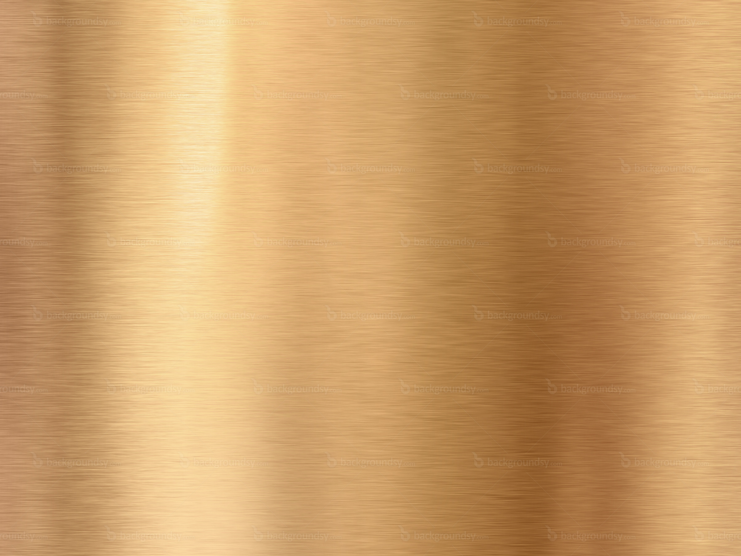
I'm having a really hard time drawing textures no matter what they are. For example, when I search for "bronze", I look at those and don't understand them : 1 2. It doesn't look like texture, I don't see light and shadow. It just looks like a big mess and I can't make anything out of it. It happens with other textures as well, I'm not sure where to go from here.
Uncomfortable
2016-08-04 16:23
Bronze is smooth - it doesn't have little forms that stick out and cast little shadows. What you can use to convey it however are the way light reflects off the surface - it does so in a very particular fashion. This is a really simplistic example, but I would generally approach depicting those kinds of smooth surfaces with really long, parallel lines like this: http://i.imgur.com/xE4Luw5.png.
All in all, smooth surfaces are painfully simple to approach - it's when things get bumpy and scratched and scuffed and mucked about with, that things get complicated - and frankly, fun. Always keep in mind that texture comes from shadows - it's perfectly valid for something to be smooth, and therefore have a distinct lack of texture. Surfaces can be blank - not everything needs to have detail drawn into it.
stinfsg
2016-08-04 16:31
That's it, I think I can't see shadows. And even if I do kind of understand how shadows work on a texture I'm looking at, I can't draw it. It looks like a mess no matter what I try.
Uncomfortable
2016-08-04 18:49
That's it, I think I can't see shadows.
That doesn't really make any sense - every mark you see, everything you might consider to be a line, is actually a shadow. Furthermore, it's inevitable that it's going to look like a mess right now - there's no trick to it that will allow you to draw beautiful, detailed renderings right now. You have to make a LOT of mistakes, and slowly learn from them. Approaching it with this attitude of "I can't" is not going to help you.
Get used to failing, as it's not only inevitable, it's an entirely necessary part of the path before you. That's why I don't simply ask people to show me their work after one or two. That little mileage does not give them the opportunity to make a plethora of mistakes, and ultimately learn from them.
stinfsg
2016-08-05 02:02
So you're saying I should do this a lot? Honestly I don't see how I'll manage to see shadows and draw them correctly no matter how much I try, I think that I just don't understand it (the first sentence you wrote, that every line is in fact a shadow, I don't get it too), but I'll keep trying I guess, I have nothing to lose.
Anyways, should I keep going on with the lessons then? Because from what I've seen the next lesson is drawing a leaf, which requires knowing how to draw texture.
Uncomfortable
2016-08-05 03:21
I've seen the next lesson is drawing a leaf, which requires knowing how to draw texture.
You are completely mistaken. Texture is the least important part of all of my lessons. Beginners tend to get this backwards, as they're entirely focused on detail and finished results. Infinitely more significant than texture and detail is construction, which is primarily what my exercises focus on. I've said this a lot in the past, though it's come up much less recently - you could go through all of the lessons without paying any attention to texture, focusing entirely on the construction and forms of your drawings, and you'd come out a significantly better artist. On the other hand, if you were to focus entirely on texture and detail, and not a lick on form and construction, you wouldn't be much better than when you started.
So yes, move onto lesson 3. Continue working on the texture challenge though, gradually. Don't try and rush through it all at once, spread it out over a long period. Certain things need time to stew before they'll click. It certainly seems like the idea that the texture of an object is made up of little bumps, which cast small visible shadows across its surface giving us all of the marks that make up our details, is one that will take time to settle in your mind. Don't let it discourage you. Instead, find a way to appreciate your every failure.
stinfsg
2016-08-05 12:21
Thanks, I really appreciate the help. I will continue to progress and at the same time I'll practice the things I'm lacking at.
blankdiploma
2016-08-06 01:26
I have to say, I'm kind of disappointed by this challenge. I was eagerly awaiting more detailed instructions from you about texture, because the related section in Lesson 2 felt like an impossible difficulty cliff, but... I'm not seeing a lot of new information here :(
I feel like all the step-by-step examples you've provided fall into a VERY narrow category of texture, which I would describe as "a collection of forms that are clearly distinguishable to the naked eye." Gravel, fur, scales: All things that are composed of some kind of discrete shape repeated over the whole surface, and more importantly, that cast shadows on each other. This makes it very easy to scale from dark to light, and I would say I'm moderately competent at it.
But what about everything else? Metal, asphalt, cloth, skin, brick, wood, water, bone - the vast majority of everyday textures are NOT made up of a bunch of shapes that are big enough to draw individually. This is where I struggle, and I really wish you had included examples that touched on these in some way. I feel like there's some fundamental language of cross-hatching/stippling/other shading methods used to convey subtle texture that I don't understand in the least, and I have no idea how to practice them. You made a couple minor comments about one type of cross-hatching (evenly-spaced parallel lines) in early lessons, but when I look at any of the really good student submissions they're clearly utilizing techniques that haven't even been discussed.
I can't shake the feeling that there's some kind of foundation of shading techniques that I'm totally lacking and should have been a requirement before attempting this challenge or lesson 2.
Uncomfortable
2016-08-06 02:51
Asphalt, cloth, skin, wood, bone all fall under the exact same category as the textures I've demonstrated here or in lesson 2. Each one has tiny - often invisible - forms that cast little shadows onto the surface, and these shadows are what your brain perceives as the lines that ultimately become a part of your drawing. You may not see the forms themselves, because they're so small, or the lighting in your reference blows them out, but they are there, still catching the light and casting their shadows.
Brick's misleading, because when people talk about brick they're more likely to talk about the pattern, which is not the kind of texture we're talking about. We are looking directly at each individual brick itself, its surface - all of the little pocks and pores in the baked mud/clay/whatever bricks are made of these days.
Metal is... different, but also not. Or at least, brushed, smooth, polished metal. Rusted, chipped, dented metal results in more little forms, and gets bumped up to the previous category. Smooth metal has no little forms, and therefore is characterized by a distinct lack of texture. Now, I have absolutely nothing against surfaces being left blank. This is one of the issues a lot of beginners (I'm looking directly at you) tend to have - they feel that if there's no detail somewhere, if a surface is empty, that it's wrong.
It's not wrong. If there is no additional visual information somewhere... you can't just make it up. If something is so ridiculously smooth that it has no bumps, no pits, nothing whatsoever, you can't add your own. Well, that's not true - you CAN, it's well within your rights, but that becomes a design decision (adding imperfections) and that is not what we're discussing right now.
Now, metal does have another quality, though this is technically not related to texture. Metal - brushed or polished metal, at least - is highly reflective. This applies to water too, but at this point you shouldn't even be thinking about water as it is far too complex.
The reflection you get on metal tends to organize itself into bars, though this varies on the form itself. So, an example of how to draw a smooth, metal cylinder could be something like this: http://i.imgur.com/PzkC5p8.png (excuse the sloppiness). You can actually see the same sort of bar pattern if you look at an actual brushed steel cylinder.
Now, all that said, there's a seriously problem in your general outlook on these lessons. You seem to perceive these things as an opportunity to show off what you know, and when you find yourself not understanding some things, you stop.
That is not the point, and it never has been. The point is not to show me what you know, but rather to show me exactly what you DON'T know, in a way far more accurate and descriptive than words could ever be. What you think you understand, and what you think you're missing is of absolutely no consequence to me. You're thinking too much, and showing me far too little. You come to me for lessons because you believe that I know better than you. You could very well be wrong, but that is a decision you have made, and faith you've entrusted (at least for the time being). You cannot be half-assed about that. You either trust what I say, follow my instructions, do the work and submit it for review regardless of how you feel about it, or you choose to discount my experience (which is just as valid an option).
You cannot tell me what you're moderately competent at, you must show me. If you struggle with something, that struggle should manifest in something. That something should be brought to me. If you believe you're struggling before your pen touches the page, then that is no struggle - that is paralysis.
I definitely get the feeling that you're looking for secrets - little techniques that'll unravel entire mysteries of how things are done, so that when you go into drawing them, you can do so with the confidence that you're not going to screw it up. The secret is that you have to screw it up over and over and over, and learn from those failures. You can't get through this without making a lot of mistakes along the way, and reflecting upon them by yourself or with help from someone else. That's where I come in. You've emailed me about this issue before, and I'm pretty sure I told you something similar to this.
In that email, you also included two pages of dissections, which you still haven't submitted as part of a completed lesson 2. I don't understand why - this was back in April, and those two pages were more than passable. There were plenty of reasonably well done textures and experimentation, and others that were less good. That's exactly what I'm expecting and hoping for, so I have no idea why you're so dissatisfied with your own understanding of things. Again, these are things that I mentioned to you before!
From what I can see, you're making these cliffs up for yourself. You're clearly capable of completing lesson 2, but you're convincing yourself that somehow you're supposed to be showing far more skill. I really don't know how many ways I can convey the same message to you.
Long story short: Stop describing your problems and show me an attempt at completing lesson 2.
blankdiploma
2016-08-06 07:30
Fair points all around. I actually forgot that I never submitted lesson 2 - the entire thing's been completed for months. It's been a rough summer at work; I wasn't hiding them out of shame or anything. Just got distracted by life.
I've posted them in the Lesson 2 thread. (https://www.reddit.com/r/ArtFundamentals/comments/486pvw/lesson_2_organic_forms_contour_lines_dissections/d66gk11)
My frustration is mostly related to the medium, I think. I do a lot of practicing digitally, but with nothing but a black pen and white paper I'm at a complete loss when I try to recreate anything without obvious edges. I miss my opacity slider.
You're right that I'm looking for "secrets", but to me it feels more like I'm being asked to solve algebra problems without first learning to count. Numbers aren't "secrets" in that sense - they're the most basic level of necessary knowledge required to move on to more advanced techniques, and that's what I feel like I'm missing with textures.
I'm not convinced that telling somebody "Yes, numbers exist, but i'm not going to tell you what they are. You have to invent base 10 arithmetic on your own," would be very effective, but I'll also concede that math and art clearly aren't the same thing. It's just an analogy to explain my frustration.
Uncomfortable
2016-08-06 16:34
I'm glad you submitted! I'm going to head over there and critique it in a second, but I did want to respond to this first.
Your analogy isn't correct - the secrets you're looking for aren't akin to the numbers themselves, but rather how those numbers interact with each other in specific ways in all possible equations. The information I'm trying to give you isn't a memorization table of 6x2 = 12, 6x3 = 18, 6x4 = 24, but rather a basic grasp of what it means to multiply.
At this point the analogy's wearing a little thin - basically, when it comes to texture there's two core elements that you need to understand before setting off on your work:
-
Texture is the result of those tiny form irregularities along the surface of a larger form. They can be so small that they're unnoticeable, and you won't necessarily be drawing the forms themselves, but rather the shadows that result from their presence.
-
The absolute basics of how light works - when a face is turned towards away from a light source, it is in shadow. When a face is turned towards a light source, but something partially blocks that light, a shadow shape is cast upon it. Beyond this, knowing how to work with light is more a matter of understanding how your forms sit in 3D space (rather than the 2D space of the page you're drawing on). That's why I purposely neglect to talk about shading, because it distracts people from truly understanding the forms in space, and which faces are oriented in which direction.
These are your numbers. Or more accurately, they're your tools. Of course, you're not really going to understand how to use them at first, which is why each lesson and challenge comes with such a wealth of homework. Take the 250 box challenge, for instance - I added it as a bit of an experiment at first, unsure of whether or not this idea of providing basic rules and tips followed by a huge amount of repetition would result in any real progress. What I saw from the students completing it was a lot of floundering for the first 100, even 150 boxes. I'm sure they were cursing my name at that point, convinced that what they were doing was a complete waste of time. But they continued, if only to reach the goal and prove me wrong. In the later leg of the challenge, however, it often (not always, mind you) becomes clear that the students start to grasp the idea of how each box sits in 3D space. Of how the angles between the lines relate - not in a describable, expressible fashion, but on a subconscious level. Through continually attempting to grasp the rules and repeat the exercise in different orientations and configurations, they begin to understand what a box is in their own personal language.
That's why you must be willing to dive head-first, and to put your trust in me, even when you feel that I have not yet given you enough. That said, it is possible that I haven't yet given you enough. Over the time the 250 box challenge has been around, I've made significant changes to how it has been laid out. The instructions have changed quite a few times. Ultimately this is all an experiment, and this 25 texture challenge is only in its first incarnation. I won't know how to change it until more people complete it, giving me data to work off of. But it is hard data and results that I need - not the views and opinions of those who haven't yet completed it.
At the end of the day, I am not a professional instructor. I am still a student myself, learning how best to teach this material. Based on the results we've had, this method is apparently considerably successful, but it will need constant tweaking. I can already see a hundred things I want to change in the lessons that are there right now. Hell, I want to rewrite the human figure material in its entirety. That will all happen, when I find the time. But for now, take advantage of what's given to you. 90% of the value here is not so much from the lessons, but from the individual critiques and direction, which is something you won't find anywhere else at this price point.
blankdiploma
2016-08-08 10:26
I'm absolutely willing to dive in head-first. It's after double-digit hours and still feeling like I haven't learned anything that I start getting frustrated, which is why these are such a stark contrast to all the other exercises. I can do form intersections for days and no matter how crappy the end result looks, I still feel like I got something out of it, because I can tell the difference between what I did and what's "correct". After that, it's just a matter of practice.
I dusted off my sketchbook to take a crack at a texture tonight. I'm using peanuts for reference.
Observations: Not a complicated texture. The actual shell material is mostly smooth with a little roughness. There's longitudinal and transverse ridges, and between them are shallow depressions that are usually rounded rectangles or triangles. On an actual peanut, the longitudinal ridges converge at the two poles. There are almost no sharp edges, just smooth rounded shapes and gentle tone transitions with occasional minor defects.
My attempt at the first square: http://i.imgur.com/TMEP3H0.jpg
So, clearly, I have no idea how to represent those smooth transitions in a way that looks remotely correct. I stippled the depressions, and it looks okay, I guess, but what the heck do I do with the ridges? You can see in the upper right of the square where I started trying to apply a similar texture to them... but it just seemed to be making things worse, so I stopped. Frankly, the texture doesn't really look right in the depressions, either, but I didn't know what else to do - I'm pretty sure cross-hatching would have been worse.
I tried a few variations on the right side. I don't think a single one of them looks close to correct, nor can I see any way to tweak them in a way that fits the reference better. This is what I'm talking about: I see the peanut. I see the bumps. I see the shadows made by the bumps. When it comes time to translate that information into solid black lines, I'm completely baffled. This feels like a basic skill that's just as important as the observational ones you listed above - isn't it the other half of the process? Understanding the texture is the input to my brain, but clearly I need to be able to output, also.
Uncomfortable
2016-08-08 13:43
I did a demo for you, if only to show you how shitty my attempt at that particular texture, with the restriction afforded by the medium (I worked digitally of course but in stark black and white with pressure set to size only). The medium naturally isn't suited for smooth transitions. Purely smooth (and therefore blank) surfaces are easy, but a smooth transition is extremely difficult.
Here's the demo: http://i.imgur.com/KEJRfjE.jpg
In doing this, I think that I've found the core of your discomfort - the medium itself. You're frustrated because we're drawing with ink, and ink is inherently getting in the way of actually producing beautiful end results. I mention this in the demo - none of these lessons has to do with learning how to draw with ink. I certainly don't cover it at all, because I don't know how to use ink as the medium for a finished piece, so I certainly can't teach it. Instead, we use it in the way a runner might use weights to increase resistance in all the right areas to make the exercises more effective and efficient. When you actually intend to compete, you take the weights off.
In the case of texture, being forced to try and tackle the challenge with a limited range of values and no colour to speak of, you're forced to think about it in a way you would not consider, were you to work with a fully gradated scale. This influences how you'll think about it when working with a more comprehensive toolset.
Of course, the limitations and challenges of working in ink are most noticeable when it comes to texture. They're present in construction as well, but it's much easier to come to terms with them in that regard. You're focusing very heavily on texture because it frustrates you, because you see it as a challenge you should be able to overcome, but can't. As I've mentioned before, this is paralyzing you in a way that I have not yet seen. It's like it's something you just can't bring yourself to set aside and go around.
I'll leave this entirely up to you, and won't force it upon you, but I do have one strong recommendation to make. Forget about texture. Stop drawing it completely. Go through lessons 3-7 without going into any detail at all, and focus 100% on construction. When you're done, you can revisit the lessons with texture and detail (if you wish), but for this first round, leave it out. Considering how much time you pour into getting your textures right, you should be able to complete the lessons much more quickly.
As I've mentioned before, construction is the focus of these lessons, not detail, and I'm worried that you stand to miss out on that if you continue to allow yourself to be so invested in this unimportant side aspect.
blankdiploma
2016-08-09 00:59
Haha, I suppose I should take it as sort of a compliment that I'm unnaturally pigheaded. I can't say that comes as a huge shock.
And yeah, the medium is absolutely the source of my frustration - I freakin' hate ink! But I'm trying to grin and bear it because of the emphasis you've put on physical media in your lessons. I feel like I should point out again that I don't care how nice my end result looks, I just hate the fact that I don't understand the process. I don't want you to think that I'm a primadonna who throws a tantrum when things aren't gorgeous on my first attempt. I have a variety of character defects, but that's not one of them :)
I really appreciate that you took the time to do a demo - it helps a lot. It's actually kind of reassuring that yours doesn't look THAT different from mine in terms of the overall approach; it's more just a question of line economy and overall drawing experience than something I'm fucking up on a fundamental level.
I'll try to de-emphasize texture going forwards, but I'm going to keep poking at it occasionally. It would drive me completely nuts to just give up on something like this.
Also, I'm going to shoot you some extra paypal moolah because I feel guilty about taking up so much of your time. Thanks again.
Uncomfortable
2016-08-09 01:05
Perhaps then do the last two pages or so with details/texture, and focus on construction for those before it - that should be a good balance, I think.
And thanks for the extra tip! I have to admit, knowing how much you've already given as a patron made it a little difficult for me to be as blunt and direct as I always try to be. Still, I figure it's in my students' best interest for me not to tip toe around things.
Oh, I do have one thing to mention - every six months, the homework threads get locked, requiring me to submit new ones, usually linking to the same lesson content as before. Generally once lesson 1 gets locked (which just happened), I end up resubmitting one each subsequent week.
Why's that relevant? Because I'm going to take the opportunity to revamp lessons 3 onwards (or at least as many as I can through August), updating the now outdated demos and swapping out the patron-only videos. So in the next couple of weeks, if all goes according to plan, expect some new content on those fronts.
blankdiploma
2016-08-09 01:39
Please, for God's sake, never tip-toe around anything. The entire reason I'm here is because you're blunt. It's refreshing. I'm perfectly comfortable with what a manic motherfucker I am - I'm not going to take my ball and go home just because you say it to my face :)
WaterWasCool
2016-08-15 04:15
Can I submit my homework even though I didn't submit any for the other lessons?
Uncomfortable
2016-08-15 13:17
The challenges (box/cylinder/texture) don't have any prerequisites. That said, I do recommend that for this challenge, you'd get the most bang for your buck if you completed it after finishing off lesson 2.
Regardless, if you submit work for this challenge (assuming it's done using ink), you will receive a critique.
Tis_Unfortunate
2016-09-12 05:20
Can confirm, you were not kidding about making us cry.
I gotta say, I've gone from being totally texture-happy in lesson 2 to mostly ignoring it in homework now, just because there's something really satisfying about a simple construction that works...but knowing how to use the skill better can't hurt, right?
Except my hand. That can hurt. And my eyes. And my poor weepy heart. xD
Uncomfortable
2016-09-12 20:12
Oh wow, you poor thing >__> You weren't actually supposed to do the challenge, it was just there like a scary story about the boogeyman to make all the children behave! Just kidding.
Mostly.
You did some pretty great work here - I'm loving the vast array of experimentation, and the wide variety of textures you've chosen. With 25 textures, I guess the well starts to run pretty dry, so I imagine it can get tricky to find more textures to draw. Overall you've done a good job, but there's a few minor points I want to mention.
Firstly, whenever you have an area that is meant to be solid black, always fill it completely - think about the actual shapes you're designing. There's only a few areas that I noticed this, but it's primarily those little unintentional white slivers amongst a sea of black that are very clearly unintentional. Basically the important thing to remember is that you want to convey intent - even if your particular approach to a texture is completely absurd, if it looks intentional, people will roll with it. Here and there you get a little scribbly, so that sense of intent diminishes (not uncommon, admittedly, after you've drawn a bazillion of these things).
The other thing I wanted to mention was that it's important to be aware of the tool you're using - it's a felt tip pen, and it draws in a certain way that is different from how, say, a pencil will behave. So applying the mindset one has when drawing with a pencil won't always work particularly well. The fish scales kind of came across to me as something that falls into this kind of category - they would have worked quite well had it been done with graphite, but having been done in ink, the execution felt a little less certain.
That said, sometimes it's unavoidable. There's a lot of textures that ink is really awful for. At the end of the day, it's a learning tool - you're forced to actually consider what those transitions are all about, forced to weigh the lights with the darks, and forced to draw things with much more intent than you might require when drawing with a pencil or with paint.
Anyway, you've done really well, and I can see that you've learned a fair bit. Keep up the good work, and consider this challenge complete.
Tis_Unfortunate
2016-09-13 01:10
Thanks, evil friend! It's kind of fascinating, figuring out how ink works (and doesn't). And it's a medium I'd really like to keep working on. I've always loved the look of ink drawings.
I notice you get a lot of questions from people about the shades of difference between texture and color and form, which is something I too was getting tangled up, so eventually I came up with a sort of rule of thumb. Maybe it'll help others:
-
Take your object and dip it in chocolate. That's it's form.
-
Take your object and magically turn it to stone. Now look at its surface. That's (the form aspect of) texture.
The exceptions, of course, are things that depend heavily on reflection, like metal or water... but it's a start!
Uncomfortable
2016-09-13 14:14
That's a really nice way of differentiating the two - I'll definitely use that in my future explanations to particularly confused little minions. And thanks for the extra donation by the way! It's much, much appreciated :D
disies
2016-10-22 19:43
took me months to finish.. :l
Uncomfortable
2016-10-23 22:35
I'm not surprised! It was well worth the time though. Over the set, I can see that your general grasp of how to approach textures in general, how to identify the play of light across the surfaces of your reference objects certainly matured. This is as much a product of the span of time over which you did this exercise, as the number of textures you explored. Sometimes it just takes time for concepts to start to bud in your mind.
One recommendation that I'd like to make as you move forward is to decrease your use of exploratory, sketchy lines and try and think more before each mark you make. It's very easy to get caught up in doing a lot of short, more random strokes, but this takes away an opportunity to really think and plan out every mark, and to convey a sense of deliberateness.
Still, great work. Congratulations on completing this challenge!
Fish_Face_Faeces
2016-11-04 15:45
Oh boy, it's finally done. Pardon the picture quality, it took me several attempts with my ole' phone and a bed lamp.
Uncomfortable
2016-11-04 20:02
Excellent work! I think what stands out the most here is that you're exhibiting a strong understanding of how forms can bleed into one another, and how while the distinction between different forms remains, the lines that define them in the drawing can disappear and reappear throughout. You've demonstrated a lot of patience and care, and have experimented with a broad range of textures with great results. Admittedly, my wrists ache a little from looking at this - I can't imagine how exhausted you must be.
Keep up the great work and consider this challenge complete. If you don't mind, I've marked this particular submission off on my spreadsheet as being particularly exemplary, so I may use some of the images in the future to show students what to aim towards.
darthsketcher
2016-07-06 17:56
I feel quite the opposite. I feel textures 'beautify' everything!
Thanks Umconfortable! Not sure if this is cheating but for those of us newbies here is an example on texture exercises from Dynamic Sketching classes:
http://img00.deviantart.net/1e51/i/2016/073/d/8/dynamic_sketch_texture_exercise_by_carmorafael-d9v4x7p.jpg
Uncomfortable
2016-07-06 18:14
I definitely took a lot from that exercise, although I always felt like it treated the matter of observation, detail, etc. as being far simpler than it really is. That said, the whole idea of moving from super dense to sparse is certainly taken from there.
darthsketcher
2016-07-06 18:23
I also learned it from Daniel Park from the Foundation Group's dynamic sketching classes.
I still need a lot of practice, maybe I'm over complicating things in my mind but I struggled a lot to try and texture some damn leafs in some plants. I still would be struggling if it weren't for your leaf example.
Uncomfortable
2016-07-06 18:30
The most important area that this particular dynamic sketching exercise fails to emphasize is the notion that what we're drawing are the little shadows cast by the small forms that make up the texture. It's very easy to miss the mark and get caught up in creating patterns (which are simply 2D designs) rather something more closely applicable to real materials. Patterns are certainly useful, but they steer you too much towards continuing to think in 2D instead of 3D.
darthsketcher
2016-07-06 18:46
Definitely. But I feel untextured stuff, say with only contour lines, doesn't looks as "nice". Clearly this is a matter of personal preference.
By the way, here's a link to a preview the sketching class from Daniel Park in case anyone wanted to see the process being demoed:
https://youtu.be/hyvVrZLlkAU
Uncomfortable
2016-07-06 19:00
Oh no, that's not what I meant. I mean thinking of the textures themselves in terms of being three dimensional - that the marks that capture the texture are actually shadows being cast by small forms. On the other hand, when you think in terms of just a pattern, it lacks the dynamism that you might get when you consider actual shadowplay.