Lesson 3: Applying Construction to Plants
5:18 AM, Saturday July 17th 2021
Hi, I love your course. I want to become a professional concept designer. I will appreciate anything you could say about that. Thanks.

Starting with your arrows, you've done a good job of drawing these with a good deal of confidence and fluidity, establishing how they move through the space they occupy. Just remember that as we look farther away from the viewer, the gaps between the zigzagging sections should be compressing as shown here.
Continuing onto the leaves, these are coming along very nicely. Not only are you carrying forward the same confidence and fluidity from the previous exercise to capture how they move through the space they occupy (instead of just appearing static and stiff in 3D space), you're also clearly building up your more complex edge detail with individual strokes, coming off the existing structure from the previous phase and returning to it smoothly and seamlessly. This maintains a very strong, believable result, where we carry the solidity from those early, simpler phases of construction all the way through as we build up to greater levels of complexity. You are also handling the more complex leaf structures well, with all the same strengths.
Moving onto the branches, these are looking good. You're maintaining an even, consistent width throughout the length of the structure, your ellipses are at least somewhat varying in degree corresponding to how the orientation of each cross-section changes relative to the viewer, and you're using the overlapping segment technique well, extending each one fully halfway to the next ellipse, to achieve a fairly smooth, seamless transition from one to the next.
This trend holds through your plant constructions. While there are a few little issues I'll point out, they're very minor. As a whole you're doing a great job of applying the principles from the lesson, patiently going through all of the leaf construction steps for every flower petal and leaf, and are capturing an excellent sense of fluidity and structure in your drawings.
Here are the main things I want you to keep in mind:
When it comes to line weight, it's important that you avoid tracking back over long chunks of an existing silhouette/line, primarily because it encourages us to hesitate in our strokes. For example, in 10.jpg, where you added line weight to the silhouette of the fruit, even though you did a pretty good job of it I could see that you were tracing more hesitantly along its edge, which caused the form to feel a little more uneven.
Line weight itself should actually be focused primarily on clarifying how forms overlap in specific, limited and localized areas. So in a case like this, the original linework should have been drawn confidently enough not to need additional weight - because that weight isn't doing much here other than perhaps correcting a line that was drawn too faintly originally. Clarifying overlaps is a more effective use of line weight, and allows us to ensure that we'll continue drawing those additional marks with confidence. Here's an example involving two overlapping leaves.
As an extension of the previous point, avoid drawing your earlier phases of construction to purposely be more faint. I did notice that in some drawings - like 15.jpg and 16.jpg - you definitely started working more using a two-phase "underdrawing" and "clean-up pass" approach, which should not be used for this course. It basically requires you to break the points I raised above, having you trace back over that linework and focus much more on how those lines run along the flat page, rather than how they represent edges moving through three dimensions of space. Instead, construction (as you've done more successfully throughout many of your other drawings) is about building up your drawing throughout every step - marks you put down at the very first step may well be the same marks that will define some of the final edges of your final result. Another thing that can help towards this is to purposely try to keep every phase of construction at the same line thickness (avoiding getting thicker for each phase), and definitely do not use different colours as you did in 24.jpg. I understand that drawing with all of these overlapping forms is difficult, and it's easy to get lost, but it will get easier as your brain gets used to it.
Anyway, I'll go ahead and mark this lesson as complete. Keep up the good work.
Next Steps:
Feel free to move onto lesson 4.

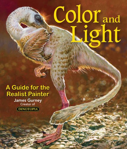
Some of you may remember James Gurney's breathtaking work in the Dinotopia series. This is easily my favourite book on the topic of colour and light, and comes highly recommended by any artist worth their salt. While it speaks from the perspective of a traditional painter, the information in this book is invaluable for work in any medium.
This website uses cookies. You can read more about what we do with them, read our privacy policy.