250 Box Challenge

12:33 AM, Monday August 8th 2022

Purplerains 250 Box Challenge - Album on Imgur

Direct Link: https://i.imgur.com/y9ZQqgJ.jpg

Find, rate and share the best memes and images. Discover the magic of th...

This took me much longer than I thought, because at the start doing a page a day was pretty fun. I see now many people also find somewhere in the middle painful, and my boxes are pretty bad there I regressed for sure. I did not always do a warm up everyday when I didn't draw, I had one or two dry spells of not foing this. So won't be surprised if I need to do some more. But I definitely see improvement and that is exciting.

I had been using Sakura, what I've used for years as my drawing pens, and then I tried the Staedtler. Yeah they were waaaay better for this.

All boxes started to look the same to me 0_o, I felt like rotation was just not real anymore. Also sorry for frequent perspective line errors, my add brain is just compelled to do the opposite sometimes...

I did better than L1 about doing free drawing/art time, but I think I am not quote at 50/50 and need to do that.

0 users agree
9:07 PM, Monday August 8th 2022

Hi there, I'll be handling your box challenge critique.

Not only does the challenge help deepen your understanding of important concepts but it shows your desire to learn as well. That being said I'll try to keep this critique fairly brief so you can get working on the next steps as soon as possible.

Things you did well:

  • You're doing a good job of drawing the lines constructing your boxes smoothly and confidently.

  • It's nice to see that you're taking the time to plan each of your hatching lines and space them evenly. This helps keep your boxes looking tidy rather than looking like they were rushed on to the page.

  • You're doing a great job of experimenting with orientations, and proportions. Experimenting is an important habit to build when learning any new skill, it helps form a more well rounded understanding. I hope you'll continue to display and nurture this habit in the future.

Things you can work on:

  • Line weight isn't a requirement of the challenge but I do recommend practicing it in your future attempts. It's an incredibly useful tool but one that people often require a fair bit of mileage before they feel comfortable applying it. The sooner you start to build up that mileage the sooner you'll see better results.

  • I'd like you to experiment with rates of foreshortening more. Currently you tend to keep your lines close to parallel and push your vanishing points far from your boxes. Try bringing your points in closer so that your lines have to converge more dramatically. Remember that experimentation is important.

  • At times you're placing your vanishing point between the viewer and your boxes (box 145 is an example of this). This leads to you extending your lines in the wrong direction and your boxes becoming distorted because your lines are actually diverging from where the vanishing point would actually be. Here's a guide I wrote that will hopefully help you place your vanishing points and line extensions more consistently. If you need some more examples you can find them here and a simplified guide below. Other times it may just be that you're extending in the wrong direction while zoning out, but this largely shouldn't occur and keeping in mind the advice mentioned there'll be less room to excuse yourself of it because it will be more obvious which direction the lines should be extending.

  • There are times when your lines converge in pairs or you attempt to keep your lines a bit too parallel which results in them diverging. This is an example of lines converging in pairs, and this shows the relation between each line in a set and their respective vanishing point. The inner pair of lines will be quite similar unless the box gets quite long and the outer pair can vary a lot depending on the location of the vanishing point. Move it further away and the lines become closer to parallel while moving it closer increases the rate of foreshortening.

The key things we want to remember from this exercise are that our lines should always converge as a set not in pairs, never diverge from the vanishing point and due to perspective they won't be completely parallel.

I won't be moving you on to the next lesson just yet, each lesson builds off concepts in the previous course material so if you move forward with un-addressed issues you end up just creating further issues on top of them.

I'd like you to draw 25 more boxes please. Focus on experimenting with rates of foreshortening as well as extending your lines in the correct direction. This is a good opportunity to practice applying line weight as well.

Once you've completed your boxes reply to this critique with a link to them, I'll address anything that needs to be worked on and once you've shown you're ready I'll move you on to the next lesson.

I know you can do this and look forward to seeing your work.

Next Steps:

25 more boxes please.

When finished, reply to this critique with your revisions.
5:05 AM, Wednesday August 24th 2022

Hello,

Sorry for such a delay, I got pretty sick, much better now. This was a good excercise. I also made sure to do the outlining/line weight.

https://imgur.com/a/1dBJhP8

Sorry its out of order, Imgur was being very strange.

Best wishes,

7:04 PM, Wednesday August 24th 2022

I'm glad to hear you're doing better.

These boxes look solid, you extended your lines in the correct direction and experimented quite a bit with different rates of foreshortening, great work. It's nice to see that you tried applying line weight as well.

I'll be marking your submission complete and move you on to the next lesson.

Keep pracitcing boxes and previous exercises as warm ups and best of luck in lesson 2.

Next Steps:

Move on to lesson 2.

This critique marks this lesson as complete.
12:26 AM, Thursday August 25th 2022

Thank you so much for all your feedback. I am very excited to start lesson 2!

The recommendation below is an advertisement. Most of the links here are part of Amazon's affiliate program (unless otherwise stated), which helps support this website. It's also more than that - it's a hand-picked recommendation of something I've used myself. If you're interested, here is a full list.
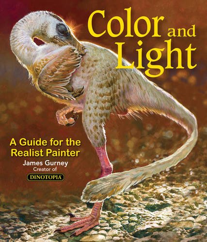
Color and Light by James Gurney

Color and Light by James Gurney

Some of you may remember James Gurney's breathtaking work in the Dinotopia series. This is easily my favourite book on the topic of colour and light, and comes highly recommended by any artist worth their salt. While it speaks from the perspective of a traditional painter, the information in this book is invaluable for work in any medium.

This website uses cookies. You can read more about what we do with them, read our privacy policy.