Lesson 3: Applying Construction to Plants
6:22 PM, Sunday December 13th 2020
I really enjoyed these assignments, and drawing plants are pretty cool. : )
Any feedback would be appreciated.
Thank you for your time and assistance!
NOTHINGUNIQUE45

Hi again NothingUnique45,
I've checked your submission,
Your organic arrows some look pretty good and others are pretty much the same, remember to make them smaller as they get further from the viewer and make bigger the spaces between turns bigger, as they get closer to the viewer. This two tricks are great to create a better illusion of depth. Also, remember that whenever you are applying line weight you have to be subtle, Here is a demo on how to approach line weight and shadows on organic arrows.
In your leaves I see that you are cutting into your own forms, avoid this as it is very difficult to mantain solid forms if we cut into them, always construct on top of your forms, Here is exactly what I mean, this principle is also applied to everything you construct, not only leaves. Also, Here is a demo that Uncomfortable himself made on how to approach complex leaves constructions.
Seeing your branches I've noticed that you are varying the degrees of your ellipses in some of them, in others you are doing it very shyly and in other you are just not doing it at all. This is a key element to create a solid illusion of depth. Also, take some time to ghost each line, remember that confidence comes with repetition of the ghosting method.
Now, having an overview of your plants I see that you've decided to do lots of them, which is not wrong, the issue that I see is that in most pages this decision caused that the quality of the individual constructions really went down.
Now, a thing that really caught my attention was your line quality ; you really have to up your game in that department, I'm seeing really wobbly lines like you didn't put some thought behind them. Remember that whenever you are making marks in this course you have to put your focus on confidence over accuracy, to achieve confidence you have to apply the ghosting method, the most important part of this is to really take your time to ghost your lines.
I know that a lot of this wobbly lines are caused by the fact that you are making really small constructions, but remember that with time and practice you will see improvement on your line quality.
I don't wanna repeat myself, but seeing your plants, I see that you are not varying the degrees of your ellipses at all. Using the advice I gave you earlier keep an eye on this because it's a very important element that you will be using from now on.
Talking about ellipses, every time you apply one, take your time to ghost them and to think where and why you want that ellipse there, after that, only go through them twice since more than this makes them look messy. Also focus on confidence over quality here.
Now, I'm gonna ask you to do two more pages more, but in these you are just gonna do one plant construction in each one. Try to make them big, read carefully my critique before you construct them.
Things I want you to focus on:
Confidence>Accuracy, ghost your lines and strive to make them as confidence as posible, show me the line quality of someone that has made it up to this lesson, I know you can.
Constructing on top of your forms, don't cut into your constructions.
Vary the degrees of your ellipses in your branches and everything that uses ellipses
Don't apply any texture, I want to see just construction, though you can use line weight since this is a tool of construction.
Next Steps:
I want you to make to more pages of construction, but in each page just do one plant of your choice where you focus in the following elements:
Confidence>Accuracy, ghost your lines and strive to make them as confidence as posible, show me the line quality of someone that has made it up to this lesson, I know you can.
Constructing on top of your forms, don't cut into your constructions.
Vary the degrees of your ellipses in your branches and everything that uses ellipses
Don't apply any texture, I want to see just construction, though you can use line weight since this is a tool of construction.
Good luck and take your time
Hello WEIJAK,
Thank you for the feedback. This feedback was very helpful, and I've gone back to work on the elements listed in your feedback.
I've also added the link with the two images focused more on the construction of the plant forms. Let me know if I should focus on anything else. I don't think I quite have the plant forms down, but I will continue to work on that in warm-ups and such.
Thanks again for the feedback.
Okay! Good job on those revisions, you are doing a better job on drawing confidently and you are respecting and building on top of your forms!
I'm gonna go ahead and mark this lesson as completed! Keep it up.
Also, if you want to get your work critiqued on future lessons, check out the #critique-exchange channel on discord!
Next Steps:
Feel free to move on to lesson 4.

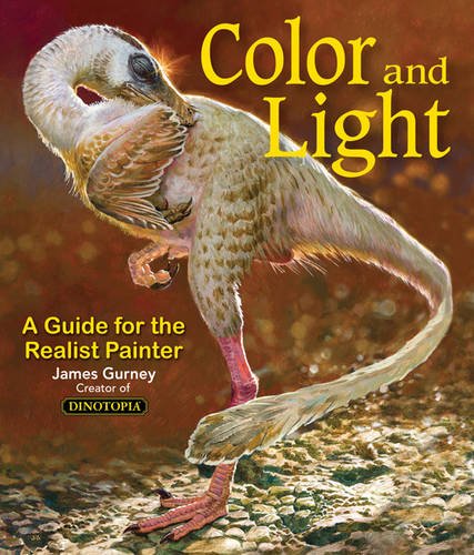
Some of you may remember James Gurney's breathtaking work in the Dinotopia series. This is easily my favourite book on the topic of colour and light, and comes highly recommended by any artist worth their salt. While it speaks from the perspective of a traditional painter, the information in this book is invaluable for work in any medium.
This website uses cookies. You can read more about what we do with them, read our privacy policy.