


10:59 AM, Wednesday March 2nd 2022
LALINCECHELANCIA
Hello, I'm going to review your work.
Starting with the organic intersections, these are largely looking good. There's a good sense of how these forms slump and sag over one another, and the cast shadows wrap around the surfaces which they're projected onto a single consistent light source. The only things to note is that some of these have pointy ends and the way you're being a bit careless when filling in the cast shadows as shown here.
Moving onto your animal constructions, I'm seeing some instances moving in the right direction but also a number of cases that calls for attention. I'll break these down to general construction, additional masses, leg construction, and head construction.
Starting with general construction, I'm glad to see you working through your forms additively rather than cutting into your forms, undermining their solidity for the most part. There are a couple of things I'd like to direct your attention to:
-
First off, the ribcage is too small, remember that the ribcage should take up about half the space and the pelvis should take up about a quarter of the space of the torso area, leaving the other half unoccupied by any solid mass as shown in this diagram. Remember that the sausage from should be sagging a little bit even if it doesn't appear that way in the reference initially.
-
There's a few instances of form shading and drawing in the stripes on the cat. This should be avoided as it serves no real purpose. Solid black shapes should be reserved strictly for cast shadows only and when applying texture (since texture is essentially a series of small bumps, cracks, or in this case, fur casting shadows).
Moving onto the additional masses, I noticed you have the tendency to overuse contour curves and as a result, placing them haphazardly and reducing their quality and effectiveness. We need to think about what the mark is meant to accomplish with each and every mark we make and if there are any other marks that are already accomplishing the same task as shown here. Going back to the point of contour lines, piling a ton of them isn't actually beneficial-they suffer from diminishing returns, so you're not really getting much out of them. But when do pile them on, we're more likely to be sloppy with it.
- The other points come from how you're approaching the additional masses. When it comes down to it, the way the silhouette is actually designed matters alot. It helps to think about how this mass would exist on its own in the void of empty space. Think about a ball of clay existing on its own.
Then as it presses against an existing structure, the silhouette of this form gets more complex, inward curves forming where it makes contact responding to the form that's present as shown in this diagram.
In your case though, its a mixed bag. Sometimes the forms wrap around nicely, and then there are other times here where the way you're piling them shows no correlation to how these forms should sit in 3d space.
Onto the topic of leg construction, you seem to be employing different strategies for the legs. While its not uncommon for students to be aware about the characteristics of the sausage method, but instead they decide not to adhere to them because the legs they're looking at don't actually look like a chain of sausages to them.
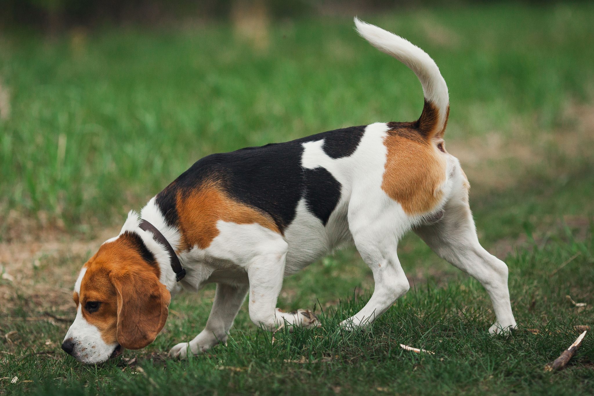
The sausage method as a base structure allows us to capture the solidity with the gestural nature of legs. Once in place, we can lay in additional masses as shown in this ant's leg and this dogs leg from lesson 5. I've drawn over your work to show how you could've used sausages for the legs on this deer.
Continuing onto the topic of head construction, Lesson 5 has a ton of different strategies in the informal demos section. Given how the course is developing new, more effective ways to construct heads so not all approaches are equal. As it stands, this tiger demo and this demo from the informal demos is whats generally more useful. This approach relies on a few key elements:
-
the specific pentagonal shape found in the eye sockets, which allows for a nice wedge in which to place the muzzle into as well as the flat area found in the forehead
-
this focuses heavily on everything fitting together-no arbitrary gaps or floating elements. This allows all the different pieces to feel grounded against one another like a three dimensional puzzle
-
we also have to be mindful as to how all the marks carve along the surface of this cranial ball, working on the individual strokes instead of using an ellipse for the eye socket.
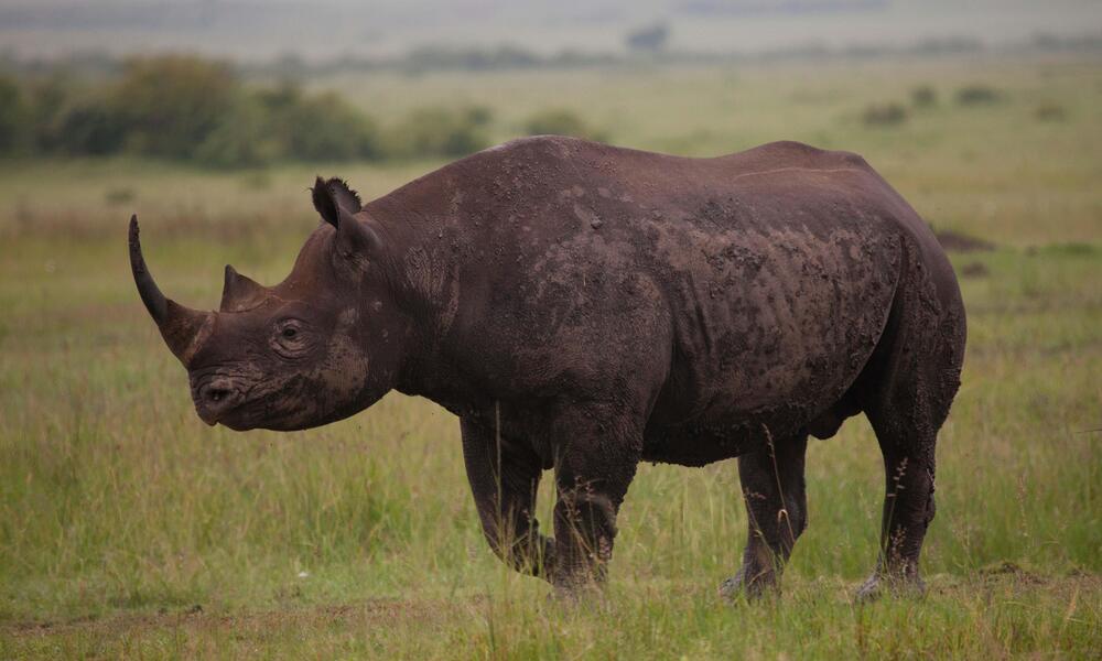
I will say that there are a few elements of this approach in your work but still need to see it applied a bit more directly. So try your best to follow this approach as closely as you can. It might seem like sometimes its not the best fit for certain heads but with a bit of tinkering it can be done. Just look at this example of how the most banana headed rhinoceros is done using this approach.
Another point if advice that may help a great deal is to draw the eyelids wrapping around the eyeball structure as shown here.
One last thing I'd like to point out that I'm noticing is the usage of lineweight on some of your drawings. Some of these get thick along the silhouettes of the forms. Keep in mind that of all the tools we use, those are tools more geared towards specific goals. But sometimes when approaching construction, we allow ourselves to apply line weight to tackle problems its not meant to address.
For example, some students use line weight to hide mistakes where they were off in a mark they made and decide to correct the mistake with another mark. Unfortunately, this is not a harmless decision as it draws the viewer's attention toward it although unintentionally. Instead of looking at it as "that's not a mistake, i meant to do that" you're saying "oops, i made a mistake. Let me call attention to it". Then we have the issue where one might try to apply line weight to reinforce the silhouette of the entire object. We risk running into bridging flat shapes, introducing 2d elements on what's meant to be purely 3 dimensional construction. Remember that line weight is a tool with a specific use, meant to be applied locally to clarify overlaps of one object over another. You can see this in play on these overlapping leaves.
In conclusion, I'm getting the impression that you're not giving ample time as a drawing requires. These exercises can be very time demanding and many students may not even consider that they may be rushing through their work. Sometimes, you may not be able to finish drawing one animal in one sitting, and that's okay. What's important is that you're constantly thinking about the spatial problems and how these forms interact with one another, doing these exercises to the best of your current ability. If that means taking a break in between, then so be it.
Next Steps:
I'm going to assign some revisions and i ask you to complete another 2 pages of animals (1 day minimum per animal). Once you're done, come back with your submission so i can review it.
2 pages of animals


