


Lesson 2: Contour Lines, Texture and Construction
11:19 PM, Friday November 25th 2022

Thank you
I'll be the TA handling your Lesson 2 critique.
You're making progress towards understanding the concepts introduced in this lesson and hopefully this critique will help you in your future attempts.
Starting off in the arrows section your lines are looking smoothly and confidently drawn. You're doing a good job maintaining a consistent width as your arrows widen while moving closer to the viewer and with more mileage you'll become more consistent. This is a good exercise to experiment with line weight but when applying it we want to make sure we do subtly to key areas like overlaps to give clarity to our forms. Here are some things to look out for when applying line weight, and here are some reminders on how to apply it subtly. I'd like you to experiment more with foreshortening in your future attempts, by utilizing it in both the arrows themselves as well as the negative space between their curves we can create a stronger illusion of an object moving through 3D space as demonstrated here.
Moving into the organic forms with contours exercise your forms are getting a bit too complex. We want to create our forms with both ends being the same size and to avoid any pinching, bloating, or stretching along the form's length as discussed here. You're keeping your line work confident here which is great, if you feel uncomfortable working with contours still don't stress, with more mileage it'll become more natural. Speaking of contours I'd like you to try and shift the degree of your contours more. The degree of a contour line basically represents the orientation of that cross-section in space, relative to the viewer, and as we slide along the sausage form, the cross section is either going to open up (allowing us to see more of it) or turn away from the viewer (allowing us to see less), as shown here.
In the texture exercises you're focusing largely on outlines, form shadows and negative space rather than cast shadows created by forms along the texture itself. This makes it difficult to create gradients with implied information which we could then use to create focal points in more complex pieces, by doing so we can prevent our viewers from being visually overwhelmed with too much detail. For more on the importance of focusing on cast shadows read here. I'd also like to quickly direct you to this image which shows that when we're working with thin line like textures if we outline and fill the shadow we will create a much more dynamic texture than simply drawing lines. You make use of a quite a bit of hatching throughout your attempts, as mentioned here you want to avoid doing so when tackling texture. If you can pick up a brush pen I would recommend doing so, it makes filling in large areas of ink a lot easier and will save you money on fineliners in the long run.
It's quite common for people to feel like they don't fully grasp the form intersections exercise, if you feel like you may fall into this category try not to stress too much. This exercise is just meant to get students to start thinking about how their forms relate to one another in 3D space, and how to define those relationships on the page. We'll be going over them more in the upcoming lessons.Your forms are looking quite solid here and they believably appear to belong in the same cohesive 3D space, good work.
While wrapping up your submission with the organic intersections exercise you show that you need a bit more time becoming comfortable with thinking of how these forms interact in 3D space and how they'd wrap around one another. I recommend trying to stack your forms perpendicularly rather than trying to keep them headed in the same direction to help make wrapping them around one another a smoother task. You're keeping your forms simple and easy to work with which is a good strategy to help produce good results. When it comes to your shadows you're pushing them enough so that they cast rather than just hugging the form that creates them which is a great start. It appears like your shadows aren't following a consistent light source, I recommend pushing your light source to the top left or right corner of the page to start with, it's easier than working with a light directly above your form pile.
Overall this was a solid submission, while you may have some things to work on I have no doubt you will improve with more mileage. I'll be marking your submission as complete and move you on to the next lesson.
Keep practicing previous exercises as warm ups and good luck in lesson 3!
Next Steps:
Keep practicing previous exercise as warm ups.
Move on to lesson 3.
thank you
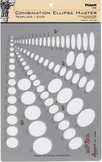
This recommendation is really just for those of you who've reached lesson 6 and onwards.
I haven't found the actual brand you buy to matter much, so you may want to shop around. This one is a "master" template, which will give you a broad range of ellipse degrees and sizes (this one ranges between 0.25 inches and 1.5 inches), and is a good place to start. You may end up finding that this range limits the kinds of ellipses you draw, forcing you to work within those bounds, but it may still be worth it as full sets of ellipse guides can run you quite a bit more, simply due to the sizes and degrees that need to be covered.
No matter which brand of ellipse guide you decide to pick up, make sure they have little markings for the minor axes.
This website uses cookies. You can read more about what we do with them, read our privacy policy.


