Lesson 2: Contour Lines, Texture and Construction
4:28 AM, Tuesday December 29th 2020
Lesson 2! Didn't have a brush pen, so some of the areas aren't as dark as they are supposed to be.

Hi there I'll be handling your lesson 2 critique.
Upon looking at your previous submission as well as your current one I noticed that you're resubmitting old work for your paid critiques. As instructed here you're only supposed to move on to the next lesson after receiving critique on your submission, this is because without critique people move on to the next lesson and carry on making mistakes that should be pointed out and addressed in earlier critiques (which is the case here). As well as the fact that in order for our critiques to be as helpful and focused as they can be we want to address mistakes that are important but if the work in your submission is old you may have addressed some of the mistakes on your own time, making the critique less relevant than it could be.
I will be overlooking this fact this one time and critiquing your work, even if it may no longer be relevant at all to your current skills. Know that in the future if you submit old work you'll be asked to redo the entire lesson.
In the arrows exercise you're starting to experiment with foreshortening which is great, be sure to keep experimenting and trying to keep your arrows flowing consistently. By utilizing foreshortening in the arrow itself as well as the space between the arrow's curves you can create a stronger illusion of an object moving through 3D space as shown here. The biggest issue I have with this exercise that also shows up consistently through all of your exercises is that your lines lack confidence which often leads to them appearing quite messy and wobbly.
Your organic forms with contours could be simplified more, remember that our goal here is to create simple forms where both ends are the same size and we avoid any pinching, bloating or stretching along the form's length as discussed here. Your line/ellipse quality here is quite stiff rather than smooth and confident as mentioned before. I'd also like you to experiment with shifting the degree of your contours more. The degree of a contour line basically represents the orientation of that cross-section in space, relative to the viewer, and as we slide along the sausage form, the cross section is either going to open up (allowing us to see more of it) or turn away from the viewer (allowing us to see less), as shown here.
In the texture exercises you're focusing largely on outlines and negative space rather than cast shadows created by forms along the texture itself. This makes it difficult to create gradients with implied information which we could then use to create focal points in more complex pieces, by doing so we can prevent our viewers from being visually overwhelmed with too much detail. For more on the importance of focusing on cast shadows read here, I'd also like to quickly direct you to this image which shows that when we're working with thin line like textures if we outline and fill the shadow we will create a much more dynamic texture than simply drawing lines.
If you feel like you don't fully grasp form intersections just yet don't worry, you're on the right track but right now this exercise is just meant to get students to start thinking about how their forms relate to one another in 3D space, and how to define those relationships on the page. We'll be going over them more in the upcoming lessons. Your forms here aren't bad but some could definitely use a bit more time in the planning stage before you execute your lines confidently.
Your organic intersections exercise shows that your sense of 3D space is building which is great. Besides the stiff contours/lines which I've pointed out enough by this point the suggestion I have for you here is relevant to your shadows. Your shadows often hug the form creating them rather than being cast on to the forms below and they don't always behave as if they have a consistent light source. I'd recommend pushing your light source to the top left or right corner to start with as it's often easier than directly above. This is a great exercise to experiment with in order to build your sense of 3D space as well as your understanding of light and shadow so be sure to keep practicing it in your warm ups.
While you have things to work on, and this may not be the best representation of your current abilities I'll be marking your submission as complete with the hope that you've been practicing and improving over the past 6 months since you originally posted this submission.
Keep doing previous exercises as warm ups, and good luck in lesson 3. (Remember that you need to submit work representative of your current abilities not an old submission.)
Next Steps:
Do previous exercises as warm ups.
Move on to lesson 3.
Thanks for the help!

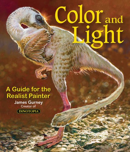
Some of you may remember James Gurney's breathtaking work in the Dinotopia series. This is easily my favourite book on the topic of colour and light, and comes highly recommended by any artist worth their salt. While it speaks from the perspective of a traditional painter, the information in this book is invaluable for work in any medium.
This website uses cookies. You can read more about what we do with them, read our privacy policy.