


Lesson 2: Contour Lines, Texture and Construction
6:12 AM, Wednesday September 30th 2020

Took me 16 months to complete this lol. Dissections was just way too difficult to deal with.
Starting with your arrows, you're doing a pretty good job of capturing how these flow through space. I'm pleased to see that you're not only thinking about how foreshortening applies to the arrows themselves, but that you're also applying them to the gaps in between the zigzagging sections. Keep exaggerating this and pushing it farther, and it'll help you establish a really strong sense of depth in the scene.
I did notice that on some of these, when you add line weight you tend to get really scratchy. It's important to take more care in planning and preparing for those marks, and executing them confidently (all with the ghosting method). That confidence in the execution is what allows our lines to taper gently and blend more seamlessly into the existing stroke as shown here.
Moving onto your organic forms with contour ellipses, one thing that stands out a fair bit is that you haven't really attempted to stick to the [characteristics of simple sausage forms]() as listed in the instructions. It's really important that we maintain equally sized, circular/spherical ends (avoiding the tendency to have them stretch out more, or get overly flattened), and to keep the midsection consistent in its width, without any pinching or swelling. While you're not that far off from any of these, it does appear to me as though you weren't necessarily all that focused on it.
Of course, this work was done back in 2019, so it is definitely more than a little out of date, and may not represent where you are right now. But it's all we've got.
The contour ellipses themselves are honestly kind of sloppily executed - they appear to be drawn more from your wrist rather than your shoulder, which tends to result in that kind of uneven execution. Be sure to execute each ellipse using the ghosting method, from your shoulder in order to maintain a consistent, even shape.
The contour curves are generally much better, although you appear to be maintaining the same degree along the full length of the given form. The degree of a contour line basically represents the orientation of that cross-section in space, relative to the viewer, and as we slide along the sausage form, the cross section is either going to open up (allowing us to see more of it) or turn away from the viewer (allowing us to see less), as shown here.
Lastly, don't forget to add the little contour ellipse at the tip of your sausages - even for the page of contour curves. Contour curves are the same as any other contour ellipse, except that we're only drawing the portion that we'd logically be able to see without x-ray vision. When the tip of a sausage is pointed towards us as shown here, we'd be able to see the whole way around that end, and so we'd see the whole ellipse.
Moving onto your texture analyses, I'll tell you upfront that I'm not going to have you redo these. Texture is not the focus of this course, and while we introduce these concepts here and I fully expect students to gradually work to understand them, we're just providing an introduction to them with the texture analyses and dissections. Therefore it's totally normal for students to struggle a great deal.
The texture analyses have three main focuses:
Understand the forms that are actually present ono the surface of a given object
Attempt to imply the presence of those forms without outlining them explicitly, instead by relying on implicit drawing techniques to suggest their presence, mainly by capturing the shadow shapes they cast on their surroundings.
Using those shadow shapes to control the density of your texture in a gradient from left to right.
Arguably you didn't really do any of these. The biggest issue is that you first focused on outlining the forms. Then instead of drawing the shadows cast by those forms, you filled in the "negative space" between them. One of the big strengths of using the shadows cast by the textural forms themselves is that when a form casts a shadow onto a different surface, that shadow gives us a lot of 3D information about the relationship between the form and the surface. Since you didn't draw shadows, there wasn't any 3D information to be had, so we just ended up understanding what you'd drawn as being a flat 2D pattern.
Now, I will point out that in your defense, the date on this page in particular comes before I fully overhauled the texture section of lesson 2, and moving forward, your dissections definitely show a much better understanding of this. You rely less on outlines (although you're still somewhat dependent on them in certain areas, so I recommend you read through these notes in particular) but overall you've shown a fair bit of growth. That's not to say there isn't still plenty of room for improvement, and I strongly encourage you to go through those texture materials (both the 2nd page of the lesson itself and the videos/instructions for the texture analysis exercise) to better understand what it means to imply the presence of a form (by casting its shadow), as opposed to explicitly establishing its presence.
One thing that can actually help force you to avoid outlining your textural forms is to purposely draw every textural mark as shown here. This two step process involves first outlining the shape you intend to draw, and then filling it in. It doesn't allow you to draw any normal outlines (that won't be filled), or any one-off strokes that don't create a shape. Forcing yourself to work in this manner will make it much easier to constantly think in terms of cast shadows.
Moving forward, your work on the form intersections is coming along fairly well. Your lines are well executed using the ghosting method, and you've constructed the forms such that they feel cohesive and consistent within the same space. I did notice however that you appear to have missed the warning against using any forms that are stretched in one dimension - like longer cylinders, longer cones, etc.
You have definitely got a good start on the intersections themselves - this is one of those things, like the textures, which we are just introducing here. It's about presenting students with the fact that these kinds of spatial problems exist, and to have them try their hand at them a few times so moving forward the gears in their brain will continue to turn, pushing to think about these relationships between forms and how those relationships can be defined on the page. This is something we'll continue to explore a great deal through the entirety of this course, throughout a number of constructional problems. As it stands, you're off to a good start.
Lastly, your organic intersections are okay. To start, the forms themselves aren't adhering to the principles of simple sausages again, so they're having trouble maintaining their own individual illusions of solidity. Additionally, while I can see some thought going into how these forms are actually resting against one another in 3D, their general rigidity makes it seem more like they were drawn in isolation, pasted on top of one another, and then cast shadows were used to try and make them feel like they belonged together. This is definitely something I think we can improve upon.
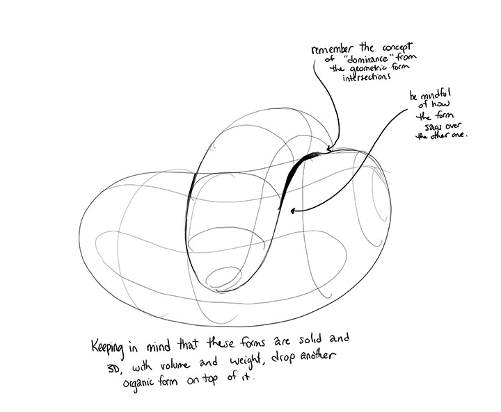
When drawing each individual form's silhouette/outline, I want you to think specifically about that form as being a filled water balloon. It's full to bursting, so forms aren't going to be able to move its internal volume around much, but if you rest it across something, it'll try and droop a great deal along either side. This is what I want you to focus on - how that silhouette is going to actually capture the sagging and the slumping of that form as gravity pushes down upon it.
Also, try to lay the forms across one another perpendicularly as shown here so you can really push that sense of drooping.
Before I mark this lesson as complete, there are a few additional pages I'd like you to do, all focusing on those organic forms. I'll assign them below.
Next Steps:
Please submit the following:
1 page of organic forms with contour ellipses
1 page of organic forms with contour curves
1 page of organic intersections
Hey. Thanks a lot for the critique. I know it has been quite a while again but, I have come back with the additional pages that you have asked.
I have also pledged again on patreon since the credit has already expired long time ago.
This time around, I spent much longer with several retries to get organic intersections right.
But somehow its pretty difficult for me to imagine placing one sausage over other and then putting it down on paper. This was the best attempt so far. Hope this works?
Additional pages submission Link: https://imgur.com/a/4M9Rkbi
If not, let me know if I should re do something again.
original submission for reference: https://imgur.com/a/Xth2OWn
These are definitely an improvement. Just a couple things to keep in mind:
When drawing the sausage forms, keep working on keeping the ends circular - you're very close, but they do tend to get a little stretched out. This is pretty normal for this stage, and it'll get better with practice as long as you're conscious of it.
When drawing the cast shadows for the organic intersections (or for anything), first outline them, then fill them in. Here it looks like you tried to 'paint' them on stroke by stroke with no clear boundaries, leading to a more jagged edge.
I'll go ahead and mark this lesson as complete.
Next Steps:
Feel free to move onto lesson 3 - but of course, considering just how long you've been away from Drawabox, make sure you're keeping up with the exercises from lessons you've completed as part of your regular warmup routine.

A lot of my students use these. The last time I used them was when I was in high school, and at the time I felt that they dried out pretty quickly, though I may have simply been mishandling them. As with all pens, make sure you're capping them when they're not in use, and try not to apply too much pressure. You really only need to be touching the page, not mashing your pen into it.
In terms of line weight, the sizes are pretty weird. 08 corresponds to 0.5mm, which is what I recommend for the drawabox lessons, whereas 05 corresponds to 0.45mm, which is pretty close and can also be used.
This website uses cookies. You can read more about what we do with them, read our privacy policy.


