View Full Submission View Parent Comment
2 users agree
3:19 PM, Wednesday June 17th 2020

Hey Greeny o/

I can see you started to use pen for other work, which is great. Now, onto the review:

Arrows

What pops up the most here is the shadows, sometimes they are not on the right places and its probably due to the fact you lose track of which line is which, especially in the first page, most bottom arrow, since it crosses like an 'x'. I suggest you add a few arrows to your practice pages, be mindful of: the shadow, which lines are on top of which, and also try to bend them mroe than twice, try and do a really long line that bends more. Otherwise, width is consistently changing, lines are confident, and you've done a good job overall.

Contour Ellipses/Curves

You've done a great job at maintaining consistent widths and making confident strokes, both in the outlines and the contours. Some curves wobble a bit, make sure youre ghosting and doing them in one line, better to miss but be confident than accurate but messy.

Textures

In the analysis, i can see two issues: One is the transition between light-dark, There is not that much of a difference from the very black to the other side. And also, you may be focusing too much on lines rather than shapes.

To fix those, i recommend you focus on making a transition, you can start from the middle with a texture similar to the one in your picture, and accentuate it the more you get to the dark, and less when you get to the white. Kinda like the second texture, herehttps://i.imgur.com/WltEEOw.jpg . And also, be mindful on something like crumpled paper, the edges are not always straight, nor on wood, so watch out for all the bumps and curves that might be in your texture.

Dissections now: they're good, you're wrapping them around the form, and it shows your knowledge of 3d. Same as above, on some there may be too many lines. On these ones, you can focus on the cast shadows, and, for example, the shadows each of the corn bits cast on the one below it.

Form Intersections

These ones look great actually, you seem to have understood them really well. Especially on the intersections on the forms that are behind others, very nice. The only little things i can see is some lines drawn when the shapes arent intersecting, keep in mind, the area in which two shapes are sharing space is where the intersection happens, so where you draw your lines, not outside of it. Dont worry about there being too many on the page.https://cdn.foxybots.xyz/tvA1Rw .

Organic Intersections

Gravity, Shadows and Space.

Make sure all of the shapes aren't floating, and they have gravity applied to them. This i mean on the very top shape on the first page, and the second page, the small shape in the middle, it looks like its floating rather than staying on the big shape below. The contour of the shapes is not their shadow, the shadow you should be drawing is what's being cast on the ones below it, if you want to reinforce the shape, ghost lines on its outline to show its in front. Give all your shapes some space. Middle bottom on the first one, it looks like the flat shape is squished together, and on the second page, the 3 popping up are squished by the two staying on the bottom. You can fix this by drawing your whole shape, and your contours of it. If the space is occupied by a shape, try and intersect the shapes about as much as you did in the exercise above. Dont make it so a shape is within a shape basically.

Your actual shapes are good though, none are too big or complex, and those mistakes^ didn't happen at every corner, you can improve them quickly.

As for the chicken scratches, the more you progress with the lessons and do practice of shapes and other exercises on the side, the less you'll have to worry about it. The textures exercise takes a lot of time and in that time you get used to using your wrist instead of your shoulder again, which tends to make that happen. It wont be like that forever.

Wish you luck on the next lessons!

Next Steps:

You're very close to doing it, almost there. I'd suggest you do the following:

  • One page of arrows

  • One page of texture analysis, but only two textures, you can most likely do paper again and something else that has more clear depth/cast shadows

  • One page of organic intersections

That should be enough to get you going to the next lesson, great job overall!

When finished, reply to this critique with your revisions.
5:10 PM, Saturday June 20th 2020
edited at 5:17 PM, Jun 20th 2020

Here is the imgur link to the homework -> https://imgur.com/a/ZyuRl86

Another lesson, another instance of me getting more thing wrong than right; of which im not surprised about, doesnt make it any less demoralising to read/to have pointed out to me. Never the less, which each one of these reviews i will try not to let such fact stop me too much.

Arrows - Genereally, taking more time with them, but not losing the confidence of the lines, helped a lot, and in the homework i tried to get all my arrows to have 3 or more bends more often than not. IDK actions speak louder than words so just look for yourself.

Contour ellipses/Curves - Confidence was and still is a huge issue, and even when i ghost its hard to stay to what i ghosted. I cant just ghost 1 or 2 times then just put a mark down as quickly as i was ghosting, because if i do, it will either be far too exaggerated and when i realise it is i stop doing the line, thus i've done it wrong. Likely just a time/practice issue.

Textures - If im gonna be honest with you here, i just had no idea what i was doing at ANY point, and the same can be said for this homework, i really do mean that. The separation from not focussing on the contour of everything to just cast shadows is and still is a hard separation to make. I dont quite understand how one is supposed to make cast shadows WITHOUT drawing the contour of whatever the texture is. I know how the fade from dark to light is supposed to work, and i did TRY to do it in the original submission, and if you couldnt tell well its because im bad. (Sorry for doing the sandstone in the wrong place.) This whole part of the lesson was exhausting and i still dont know what you were doing to end up with a better submission than i was, idk what you're doing right and what im doing wrong, and revisiting the videos and lessons did little to close that gap. (https://imgur.com/a/rC5tK1f Yours vs mine like ¯_(?)_/¯) Again, same can be said for the dissections, i pretty much threw the objective of there supposed to be a distinction of light and dark part on them because that was one thing that was making it extreamly difficult. Even then that didnt really help in me doing them "right". I think i did better in the homework but you can see for yourself.

Form intersections - Again another example of me not really knowing how these work, i think i began to grasp the idea on the last page but even then, the fact that only small sections of each form were actually intersecting didnt happen by chance, which in hindsight was a bad thing to do as it lead me to show shapes intesecting when they actually aren't. oh and you were only supposed to have a limit of forms per page, whoever that was did wayyyyy too many

Organic Intersections - Another example of getting things more wrong than right, and another where again, i didnt really know what i was doing (Hopefully the homework one is better). I think when i was actually doing this back in May, the last thing i was thinking about was treating them as actual objects in space and not just lines on a piece of paper, so while i should have thought about Gravity, it didnt really apply to me, as i was more worried about getting the forms themselves right (which took more time than id like to admit, many pages were thrown in the trash on that day, the shapes are only good because that was about the 8th attempt of getting them "right"). Hopefully in these new ones you can see that i did think about gravity at least partially.

Shadows, i dont think i did them wrong in this new page, the ends of each form is hard to do imo, taking into consideration the position of the light source and the form itself. Either way i think i did them better...

Space - IDK if i even did fix this one, i think i did.

Getting better at drawing goes far beyond just what drawabox tells me to do; and its only a small step to getting to where i want to get to they say without knowing where they want to get to.

Thanks for the review~

edited at 5:17 PM, Jun 20th 2020
7:26 AM, Sunday June 21st 2020

You're quick on your feet ;p Good job on working through each!

You'll see imperfections in any drawing at any level, some are harder to tell apart because you just didnt reach that level yet. What's important is you make sure you can overcome one problem at a time, no matter how bad it makes your drawings look like.

For your extra work:

Arrows - Definitely better, the only two tiny mistakes i see is a wrong spot of shadows and a little trouble trying to make the arrow bigger the longer it goes https://cdn.foxybots.xyz/4l5pfn but great improvement overall!

Textures - I see improvement. Granted its been some time so its tough to get back into it again. You mentioned "how one is supposed to make cast shadows WITHOUT drawing the contour of whatever the texture is". Just like a computer does it, if you lower all the hues to black, white and gray, you'll see spots of the image be lighter than others, and some darker, and your focus should be on the dark spots. Its observation and its going to improve over time. There still are a bit too many lines for my liking, you'll see that a lot of shadows arent quite as straight as you like, rather curvy and with thin stripes of light that get bigger the more light there is. But i do see shapes being used more than previously. You'll have plenty more practice on this later (esp 25 texture challenge), you dont need to nail it down perfectly right now. Good work.

Organic Intersections: Yes, there are key differences in this one compared to the last. Shadows are much more visible, Forms have their weight, and they look more solid too. However that isnt to say its perfect and thats something you'll have to work on. Don't overdo the shadows either, you can reduce the "pool" of black to half its thickness on most, and remember the light is cast onto other forms, so unless your form on the left, behind the two big ones, was a lot taller, its too short to cast anything, its on the same level as the other. For gravity, im just a little worried the two top forms may fall as i dont see the form theyre standing on to be large enough to support the two, so that's something to keep in mind. When you put two sausages oriented in the same direction on top of each other, they may very well fall as they roll on each other. And space, not really any problem, other than the bottom middle form may be a little squished.

As for some extra notes:

"had no idea what i was doing at ANY point" - Im glad you didn't, because you weren't supposed to either. To put it in Uncomfy's words directly, read herehttps://drawabox.com/faq/notpretty from "Additionally, it is important to realize..." A little bit of info will be explained more and more when you progress, through lessons, videos, others' critique and your own work. You're not supposed to do it any other way, so you're doing it right.

Contour ellipses - Do more of them, ghost as many times as you feel like before you feel like its too many. Then put the strokes down and loop once. The only way you ghost faster and you do them faster, and better, is by practice. No shortcuts there.

My textures - I can ask the same "Why's yours better" to other people, but quite frankly, i think we'd both have a hard time explaining. Ultimately, id say you're better off finding answers to things you will be able to use, so getting reviews on your work, as the other question may never really have 1 exact answer that will benefit you in any way.

Form intersection - You didn't know yet it still eneded up just fine, so there's nothing to worry about. Add it to your practice session if anything.

All that being said, id say youre done with this one, and ready to tackle lesson 3 in all its glory. Good luck, and don't work in a bubble, better to have 8 pages of bad drawings than none so you cant get the advice you need.

This community member feels the lesson should be marked as complete, and 2 others agree. The student has earned their completion badge for this lesson and should feel confident in moving onto the next lesson.
The recommendation below is an advertisement. Most of the links here are part of Amazon's affiliate program (unless otherwise stated), which helps support this website. It's also more than that - it's a hand-picked recommendation of something I've used myself. If you're interested, here is a full list.
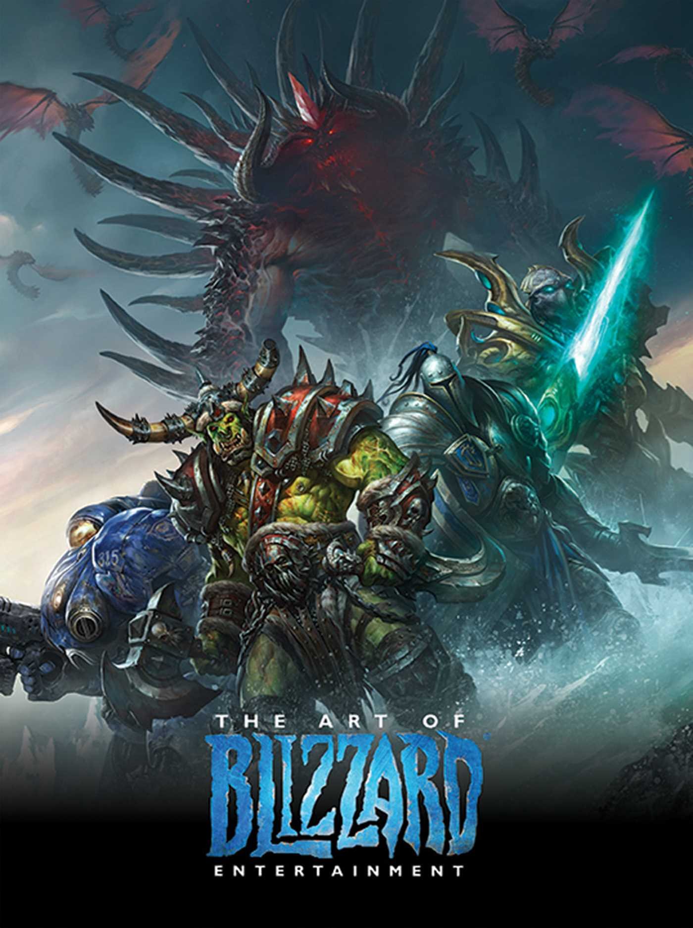
The Art of Blizzard Entertainment

The Art of Blizzard Entertainment

While I have a massive library of non-instructional art books I've collected over the years, there's only a handful that are actually important to me. This is one of them - so much so that I jammed my copy into my overstuffed backpack when flying back from my parents' house just so I could have it at my apartment. My back's been sore for a week.

The reason I hold this book in such high esteem is because of how it puts the relatively new field of game art into perspective, showing how concept art really just started off as crude sketches intended to communicate ideas to storytellers, designers and 3D modelers. How all of this focus on beautiful illustrations is really secondary to the core of a concept artist's job. A real eye-opener.

This website uses cookies. You can read more about what we do with them, read our privacy policy.