


Lesson 1: Lines, Ellipses and Boxes
4:59 AM, Wednesday August 4th 2021

Some of these exercise were definitely a struggle, but I appreciate any and all feedback!
Welcome to drawabox! I’ll be taking a look at your lesson 1 submission today.
Starting with your superimposed lines, these look good, and show some improvement over the set. There’s a number of issues with them, though. At first, they struggle to maintain a consistent trajectory. This is likely due to you intentionally (or unintentionally) course-correcting as you draw. This is the case later, too, but this time, seems to be caused by you drawing a little faster than you need to. My recommendation for you is to take some time, and experiment with a number of different speeds, in an effort to find the one that works best (it’ll be the one that gives you the most accurate, though still confident, lines). The ghosted lines/planes suffer from this issue, also, so this advice extends to them, too. In regards to your speed, make sure that, at the very least, it’s consistent throughout. In some of these lines, I notice that you’ll slow down, as you approach the end point, in an effort to not stop short of it, or overshoot. This is not something we encourage, because 1, it causes your line to become wobbly, and 2, accuracy is not something we’re concerned with, anyway, especially if it comes at the cost of confidence.
The table of ellipses exercise suffers from a similar issue, most evident from the unevenness of your ellipses, and the tails at the end of them. (For the latter issue, be sure to lift your pen off the page at the end of your rotations, not flick it.) The solution here is similar to the one in the lines section, but in addition to that, you may consider drawing some free-form ellipses (ellipses without a frame), as that’ll give you some hints as to what that ideal speed might be. On top of all this, the ellipses in planes seem to have been ghosted too little. Remember that, rather than ghosting each ellipse an arbitrary number of times, you need to ghost until you feel comfortable with the built-up motion, then commit. That said, that initial stiffness doesn’t seem to have harmed their roundness, so at least your priorities are in the right place. Quite a few of your ellipses in the funnels exercise overshoot the frame by a considerable amount, so some more ghosting would’ve helped here, too. Also, now that you’ve gotten your feet wet, consider starting off with a small-degree ellipse, and increasing it as it moves away from the center of the funnel.
The plotted perspective exercise looks solid.
The rough perspective exercise is mostly good. You’ve been careful so that your back lines are parallel/perpendicular to the horizon, and your convergences are good, more often than not. Of course, to fix those occasional issues, continue checking, and rechecking a line, until you’re satisfied with it. One thing that might help you – help you tell whether your box is correct or not, I mean – is to look at its planes. Because of the rules of 1-point perspective, the far plane of your box (the one you’re plotting for), needs to be identical in shape to the near plane (the initial one). If your points suggest that it’s not (like, for example, in page 2, frame 3, the bottom left box), then your points are incorrect, so consider giving them another look.
The rotated boxes exercise looks great. It’s big (huge positive!), the boxes are snug, and they rotate comfortably. The hatching is a little sloppy, so I’ll remind you that hatching lines are, for one, optional, so don’t commit to them if you don’t have the patience for them, but also, they’re lines that require the same amount of pre-work as any others you draw for this course – the only difference being that you don’t plot start/end points for them. In regards to the boxes themselves, the issues are to do with their construction (flat far planes, diverging depth lines), but these are not only expected, they’re things that we address in your next step – the 250 box challenge – so hold on until then.
The plotted perspective exercise looks really good. The linework issues persist (you slow down at the end), but the boxes look solid, and their size, and foreshortening, do a good job of communicating the illusion we’re after. Some extreme scale, and some lineweight to clarify overlaps would’ve really taken them to the next level, but that’s alright.
Next Steps:
Now, though I’ve pointed out a lot of things that need work here, none of them are things worth holding you here over. So I’m moving you to the box challenge, but I’m trusting that you’ll work on these things in your own time – a little bit every day, in your warmups. So!, consider this lesson complete, and good luck in the challenge!
This recommendation is really just for those of you who've reached lesson 6 and onwards.
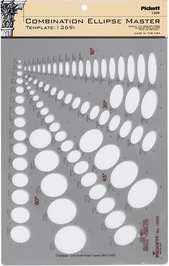
I haven't found the actual brand you buy to matter much, so you may want to shop around. This one is a "master" template, which will give you a broad range of ellipse degrees and sizes (this one ranges between 0.25 inches and 1.5 inches), and is a good place to start. You may end up finding that this range limits the kinds of ellipses you draw, forcing you to work within those bounds, but it may still be worth it as full sets of ellipse guides can run you quite a bit more, simply due to the sizes and degrees that need to be covered.
No matter which brand of ellipse guide you decide to pick up, make sure they have little markings for the minor axes.
This website uses cookies. You can read more about what we do with them, read our privacy policy.


