Lesson 7: Applying Construction to Vehicles

9:58 AM, Friday April 22nd 2022

Lesson 7 Submission! - Album on Imgur

Direct Link: https://i.imgur.com/iRQTREW.jpg

Find, rate and share the best memes and images. Discover the magic of th...

"Phew, I've finally beat these 2 bad bo- OMG WHY ARE THERE 8 BOSSES IN A DUNGEON" Seriously, when you said it was going to be harder, you mean it.. quite literally. There's a lot things I choked on but surely, I am excited to see your critique on this one, cheers!

0 users agree
9:37 PM, Monday April 25th 2022

Hahaha, Comfy doesn't mess around! But neither does the wily Crayfish, as you've done a pretty fantastic job here.

Starting with your form intersections, you've demonstrated a very strong, well developed understanding of how these forms relate to one another in space. Each intersection line runs along the surface of both forms simultaneously, taking into account some really complex kinds of relationships (including the difficult curved-on-curved ones). I'm also noticing that while this can stand to be improved further, you're making a concerted effort to control your use of line weight to focus on establishing the overlaps between forms, and you're making progress in getting that line weight to blend seamlessly back into the existing line weight - though that's the main point where it'll still improve yet further with practice.

Continuing onto the cylinders in boxes, you're continuing to check your line extensions correctly, and honestly your instincts here in terms of proportion have continued to develop very nicely. Your simple form-instruction-vehicle-constructions are coming along very well nicely as well - you're demonstrating a clear grasp of how these structures are made up of simple pieces at their core, and that these are the most important elements. You've also captured a fair bit of subtler nuance - like the three main box structures that make up the front portion of your scooter. One might have represented that with just one tall box if they got a little too caught up in the idea that primitive forms = simple, but you rightly split them up into separate forms - still simply primitives, but ones that capture a better sense of the desired structure.

I do see that the front wheel on the scooter ended up pretty far out of whack, but we all make mistakes. It's good that you did not attempt to correct it or redraw the ellipse.

Moving finally onto the actual boss fights, I have a few suggestions to call out, but as a whole, you have done a magnificent job, and I am very pleased to see that as a whole you're demonstrating a good grasp of the principles from the lesson, and an excellent use of the concepts covered in the course as a whole. You have certainly met Drawabox's goal for you - to really flesh out your understanding of how the objects you draw on a flat page exist in a three dimensional space.

So, let's look at the few points I wanted to mention:

  • Firstly, I did notice that there did appear to be a couple distinct pens used in at least some of your drawings - it appears that you may have used a ballpoint for the initial scaffolding, but then switched to a darker, richer pen (probably a fineliner) to draw the vehicle itself. Keep in mind that as discussed here in the lesson, students should be sticking to just one pen for the entire drawing. You can of course use a fineliner or brush pen to fill in shadow areas, but that may not look all that great if the rest of the drawing is ballpoint.

  • Additionally, when it comes to those filled areas of solid black, it is easy to get confused between where they might be used for cast shadows, and where they might be used for something more similar to form shading. Cast shadows define their own distinct shape, which helps to define its relationship with the actual form casting it. Form shading however, is generally more when a surface is defined as light or dark based on its orientation in space, and it's easy to end up with that when you start picking pre-existing shapes in your drawing to fill in. For example, the wheel wells on this fire engine. While it's not exactly form shading, it is close to it in principle (and of course as discussed here, form shading should not be included in our drawings for this course). Instead, always ensure that when you're putting down a filled area of solid black, that it's in a shape you've specifically designed for that purpose (using whatever pen you were using for the rest of the linework/scaffolding), and in designing it, alway ensure that its shape is specifically based on the form that is meant to cast it.

  • Also, when it comes to line weight, don't be too inclined to overuse it. Always focus its use (in the context of this course - what you do outside of it is entirely up to your own judgment) in clarifying how different forms overlap one another in the localized areas where they occur. While these drawings do get especially dense and "forest-like", overusing line weight can result in things becoming harder to distinguish, rather than easier. And in case you've been caught up in adding line weight throughout the process, leave it instead for the end of a drawing.

  • This is not a criticism - your work on the Lockheed P38 is friggin' incredible. Excellent work not only on working through the steps with high precision at all times, but also in just keeping track of your lines and subdivisions!

  • So this is primarily more notable in your last one (ALSO IS THAT AN ELDEN RING UI LOL), but always remember that the way we're drawing here - specifically avoiding actual vanishing points and such - is all because vanishing points are frequently farther out than our page would allow. This also means that everything of the object being drawn - meaning the whole car in this case - constitutes the entirety of what you're going to need to put down on the page. So in this case, you did end up limiting how much space you had available to you, and probably could have worked about 2x as large, giving you way more room to keep track of which line is which, and generally work through the spatial problem with more comfort.

And that about covers it! As I've already mentioned, fantastic work. I'll go ahead and mark this lesson - and the course as a whole - as complete. Congratulations! You have every right to be proud of what you've accomplished here.

This critique marks this lesson as complete.
12:12 AM, Tuesday April 26th 2022

Thanks comfy! This course have been fantastic! Your critique and your TAs' are very informative, never regret joining the official critique. I'm very pleased to know that you liked my work on these last two lessons (because they're both my favorite lessons in terms of construction.) This really steps up my baby dream of becoming a concept artist.. idk I'm still 14 but anyway. Thanks again for this course, comfy!

The recommendation below is an advertisement. Most of the links here are part of Amazon's affiliate program (unless otherwise stated), which helps support this website. It's also more than that - it's a hand-picked recommendation of something I've used myself. If you're interested, here is a full list.
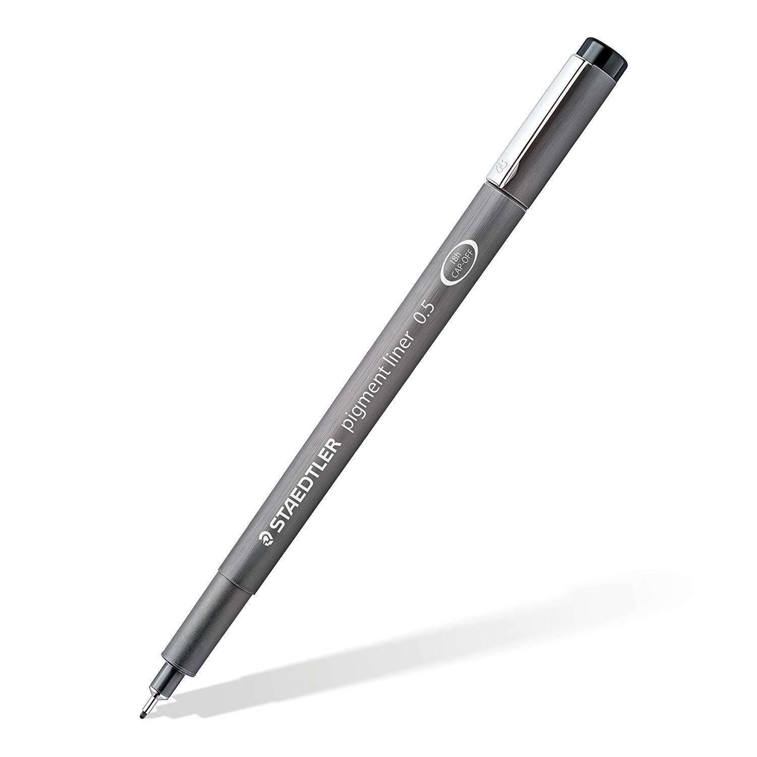
Staedtler Pigment Liners

Staedtler Pigment Liners

These are what I use when doing these exercises. They usually run somewhere in the middle of the price/quality range, and are often sold in sets of different line weights - remember that for the Drawabox lessons, we only really use the 0.5s, so try and find sets that sell only one size.

Alternatively, if at all possible, going to an art supply store and buying the pens in person is often better because they'll generally sell them individually and allow you to test them out before you buy (to weed out any duds).

This website uses cookies. You can read more about what we do with them, read our privacy policy.