View Full Submission View Parent Comment
2 users agree
1:09 AM, Wednesday June 1st 2022

Hi, Vennaya! I’ve broken down the homework critique below:

Lines

Superimposed Lines: Most of the lines look pretty good. The longer ones have slight arches on them, so take care to draw from your shoulder, not your elbow.

Ghosted Lines: These look pretty good.

Ghosted Planes: These look pretty good. There is some slight arching, but nothing too major.

Ellipses:

Tables of ellipses: In Tables of ellipses #1, some of the ellipses don’t fit snugly in the frame. In Tables of ellipses #2, the smaller ellipses tend to overlap the bigger ones. Whenever you do this exercise again, aim to keep all ellipses nice and snug in the frames, but not overlapping each other.

Ellipses in planes: Pretty good–the lines are mostly confident and the ellipses have been drawn through the appropriate amount of times. However, as with the table of ellipses, some of the ellipses don’t fit snugly within the planes.

Funnels Exercise: Pretty good. Some of the bigger ellipses on the edges are either overlapping or not fit snugly inside the funnel. And some of them have only been drawn through once, like the one on the edge on the bottom right.

Boxes:

Plotted Perspective: Nice work, but it may be beneficial to have more boxes in each frame. Is there a reason the middle frame’s boxes have hatching on different sides?

Rough Perspective: It’s normal for this exercise to come out looking a little rough, no worries. Just make sure that when plotting the lines back to the vanishing point, they should only extend TO the horizon line and not PAST it. Also, take care not to redraw a line even if it comes out wonky (frame on the right).

Rotated Boxes: As Uncomfortable says, he knows this exercise is above a lesson 1 student’s level so he doesn’t expect perfection. The boxes look pretty good here, but would benefit from hatching as Uncomfortable’s example homework displays.

Organic Perspective: Take advantage of the line weight in the big swoopy line, to help the viewer know which part of the line is closest to them; perhaps extending that line so it fills the frame would provide more space for boxes, so there’s a gradual shift from big to small boxes. To encourage the illusion of close/far boxes, perhaps draw some that have been cut off from the frame, like in the second frame of the first page. Don't worry too much about perspective, you'll have the chance to practice that in the 250 box challenge.

Trust in the process-there's a reason for everything Uncomfortable puts on the website. Hope this critique is helpful!!

Next Steps:

One page of Rough Perspective: Try making the boxes smaller so more can fit in a frame. Remember not to redraw lines and to only plot the lines back to the horizon line and no further.

One page of Tables of Ellipses: Make sure the ellipses fit snugly in their frames and don't overlap each other.

When finished, reply to this critique with your revisions.
8:45 PM, Wednesday June 1st 2022

Hey AbeanBerry! Thanks for the response!

Here is the link to the imgr for the two revisions you suggested i complete: Link

I certainly feel like i managed to not make the ellipses overlap as much, but i still can't get them snug in to the space. Any tips would be appreciated!

As for the Rough perspective, i managed to get some more in but i definately struggle with the smaller boxes. I feel like the bigger the box is, the more control and accuracy i have over it.

Superimposed Lines: Most of the lines look pretty good. The longer ones have slight arches on them, so take care to draw from your shoulder, not your elbow.

I'm fairly certain i was but i will try and be more concious of it in the future.

And some of them have only been drawn through once, like the one on the edge on the bottom right.

I'm pretty sure that was a fluke. I'm fairly confident i drew through it twice but evidently the indent on the paper from the first stroke guided the second pass. But i will keep that in mind in the future.

Plotted Perspective: Nice work, but it may be beneficial to have more boxes in each frame. Is there a reason the middle frame’s boxes have hatching on different sides?

The hatching was mostly a mistake. I wanted to have the hatching on different faces for each segment, to better differentiate between them but i quickly realised that would not be feasible as the box in the middle did not have its top face visible.

As for the having more boxes...I will try. However, i feel like splitting the page in to thirds gives me much less space to work with, it feels like im drawing on a scrap of paper instead of an actual page. As a result, i just try and get a few moderately sized ones in. I also did not want to make it messy if i was going to hatch one of the faces, as i feel like what was suggested i do would leave me with a confusing mess, but i will endevour to put in some more in the future like what i did in my revised Rough perspective i linked above.

Rotated Boxes: As Uncomfortable says, he knows this exercise is above a lesson 1 student’s level so he doesn’t expect perfection. The boxes look pretty good here, but would benefit from hatching as Uncomfortable’s example homework displays.

I did want to apply some hatching but by the end of it, i barely even knew where half of the faces were or which face they were supposed to be, as it was just a mess of lines owing to the fact, i think, that the drawing itself was too small as i did not have a proper frame of reference for scale as the video did it on a digital canvas. Until i started drawing it, i barely even knew what the boxes on the outside were for as i felt it was poorly explained, so that certainly did not help. I will endevour to make it a little bigger the next time i do it, and to apply some hatching.

Organic Perspective: Take advantage of the line weight in the big swoopy line, to help the viewer know which part of the line is closest to them; perhaps extending that line so it fills the frame would provide more space for boxes, so there’s a gradual shift from big to small boxes. To encourage the illusion of close/far boxes, perhaps draw some that have been cut off from the frame, like in the second frame of the first page. Don't worry too much about perspective, you'll have the chance to practice that in the 250 box challenge.

I tried to apply line weight. At its heaviest, i was pushing down on the page pretty hard and let go of pressure as i went before finally lifting it off the page instead of stopping. However...I don't know whether its becuase the pen is using has bad ink flow or if i was holding it at too steep an angle, but as you said, the line weight barely changed. I did honestly try - I just don't know how or why it turned out like it did.


Your critique was most helpful, yes! Thank you very much for taking the time to review my work!

If you have any further feedback about my revised exercises i linked above, i would welcome it!

Thanks again!

1:48 AM, Thursday June 2nd 2022

Looking better! As for tips on overlapping, I can only suggest ghosting, ghosting, ghosting. With practice, accuracy will come over time.

Next Steps:

I would suggest moving on to the 250 Box Challenge - this will definitely help with boxes and perspectives. In addition, make sure to practice the Tables of Ellipses sometimes in your warmups; doesn't have to be a full page, just so you get more comfortable drawing ellipses in confined spaces. This is just advice ofc, not something you have to do :)

This community member feels the lesson should be marked as complete, and 2 others agree. The student has earned their completion badge for this lesson and should feel confident in moving onto the next lesson.
The recommendation below is an advertisement. Most of the links here are part of Amazon's affiliate program (unless otherwise stated), which helps support this website. It's also more than that - it's a hand-picked recommendation of something I've used myself. If you're interested, here is a full list.
PureRef

PureRef

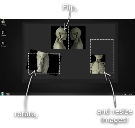
This is another one of those things that aren't sold through Amazon, so I don't get a commission on it - but it's just too good to leave out. PureRef is a fantastic piece of software that is both Windows and Mac compatible. It's used for collecting reference and compiling them into a moodboard. You can move them around freely, have them automatically arranged, zoom in/out and even scale/flip/rotate images as you please. If needed, you can also add little text notes.

When starting on a project, I'll often open it up and start dragging reference images off the internet onto the board. When I'm done, I'll save out a '.pur' file, which embeds all the images. They can get pretty big, but are way more convenient than hauling around folders full of separate images.

Did I mention you can get it for free? The developer allows you to pay whatever amount you want for it. They recommend $5, but they'll allow you to take it for nothing. Really though, with software this versatile and polished, you really should throw them a few bucks if you pick it up. It's more than worth it.

This website uses cookies. You can read more about what we do with them, read our privacy policy.