View Full Submission View Parent Comment
12:12 PM, Saturday February 19th 2022

Wow, in my head I imagined the ant cranium sphere being much larger, but that large sphere would only make everything harder. Thanks for all the answers.

Here are my revisions.

Notes:

I know the top sausage curves are a bit too same-y. In the top right sausage, I intentionally made the middle contour curve flatter since I wanted to make the sausage go like this: facing us -> facing away from us -> facing us again. Same with the bottom left sausage. Not saying I succeeded, just explaining my thought process. I tried to copy what Uncomfortable did in this vid (7:47), but now that I look at it again this pattern might just have been an inconsistency. I probably overcomplicated it.

I failed the cast shadow of the first insect. Adding contour curves on the tiny bumps on the back might have been a mistake, but without them the shapes looked flat (I hope they aren't considered detail). Thoughts? I also had trouble representing the bottom part of the abdomen in a 3D way, so I just added a contour curve.

Same on the second insect, the (shell?) had no natural contour curves so I added mine to describe the form. The two circles in the front are probably overkill.

Feel free to assign me additional exercises if you think it's necessary. Also, don't hold back on pointing out repeated mistakes.

4:36 PM, Saturday February 19th 2022

Hi! Overall, everything looks way better than it did before. On the sausages, the idea of turning the ellipses is fine, but what plays against you is that there are too many curves. A lot of times, you can say the same with less curves. Watch out for the flow on your curves too, I know that's a difficult balance to maintain, accuracy vs confidence, but you'll get there.

On the first insect: yeah, the cast shadow failed, but if you were to fill it with black, you could fix it, so no big deal. The contour on the bumps is a good idea, but it works better on the abdomen; on the thorax, they're so little that just making the form like does the job.

I would've tackled those forms differently, especially the top one: like a soft mass that engulfs the shell (trying to replicate the linked forms present in the reference) instead of a "hard" one that just sticks out of it, but the important thing is that yours still read as a three dimensional form, so good job nonetheless.

What you did on the belly is fine, you broke it down into those plates, and they follow the contour of the form they're placed upon, so great.

There are a couple of things more on that first insect. On the front legs, you have some forms missing that are present in the back legs too, but there you just broke the silhouette instead of building forms on top of the sausage. It looks fine from an aesthetic point of view, but is a wasted opportunity to work more on construction.

The point in which the front leg joins with the thorax is also weird. The way it's drawn suggest that it is just a subdivision of the shell, but looking at the reference, it is it's own separate form. That would be the coxa, I think. The way I usually work with those forms, is by making a sphere/sausage hybrid that connects the rest of the leg with the body, and then adding forms on top of it. Something like this, but you know, more accurate.

The eye is fine, but it could be better with softer edges, like, those corners are less angular, in the end, it's still a sphere. There's no need to draw the entire thing, but try to follow the surface the same way as you would with any other form.

Onto the second insect. The contour line on the shell is great, that's the thing, we make lines when we need to reinforce the 3D illusion. We should take advantage of the natural contour lines, but if there are none, then we make our own.

You're right, the two circles at the front are overkill, with just the little one it's understood that those are different masses, and how they intersect. The big one could've worked, but the little one also reinforces the feeling of the whole shell as a single form.

That being said, I'd like to suggest an alternative that, I feel, can work better. We divide the shell between the horn, the upper thorax and the lower thorax and abdomen. I feel that this can work better, because there are planes on the thorax section that we're not fully accounting for in your drawing. You'll notice that it's not a big stretch, just a couple of extra lines. And maybe we can reinforce the horn with contour lines similar to those of a cactus in Lesson 3, to really drive home the fact that there are different planes to it.

Something like this

If you notice, I added a bit of shell on the belly, a section you didn't really consider that much. I treated the contour lines on the shell in the same way as the horn, suggesting the existence of a line that divides the planes on the body. And I cheated, because, if you notice, there are a lot of little masses on the bottom that I didn't account for (you did it better than me). That's more of a problem with the picture really, if you zoom in, you can't really see what's happening there clearly. Try to work with HD pictures, or as big as you can.

And of course, that's just an alternative; your drawing felt solid and three dimensional enough, I just wanted to try a different path, to see if we could make it more accurate.

Beyond that, your eye has a similar problem to the first insect: if you look really close, you can see that it isn't really a circle, it has a couple of corners that define how it is placed in relation with the rest of forms. The legs look a lot better; an intersection on the place where they join the body would've helped even more.

Finally, it would be great that you could use a bit more lineweight, especially on the legs. Don't go overboard with it, but those sections need more clarity to distinguish which forms are on top of which.

As you can see, they're all minor corrections; you clearly have grasped the concepts of Lesson 4. And so, I recommend that you move on to Lesson 5 :) Well done!

Next Steps:

  • Feel free to move on to Lesson 5
This community member feels the lesson should be marked as complete, and 2 others agree. The student has earned their completion badge for this lesson and should feel confident in moving onto the next lesson.
10:15 PM, Sunday February 20th 2022

I feel silly saying thank you after every comment, but you really helped me a lot (especially the diagrams). I'll be returning to this comment when I eventually have trouble in future lessons. The contour lines indicating hard plane changes is my favorite critique! I remember when that was said in the lessons, but I forgot to apply it (also I failed to observe the different planes in the reference).

1:48 AM, Monday February 21st 2022

Glad to be of help! it happens a lot, sometimes we forget about things from past lessons that become so useful later. In Lesson 5 you'll have plenty of opportunities to observe your planes, that will help to incorporate that aspect into your drawings :)

The recommendation below is an advertisement. Most of the links here are part of Amazon's affiliate program (unless otherwise stated), which helps support this website. It's also more than that - it's a hand-picked recommendation of something I've used myself. If you're interested, here is a full list.
PureRef

PureRef

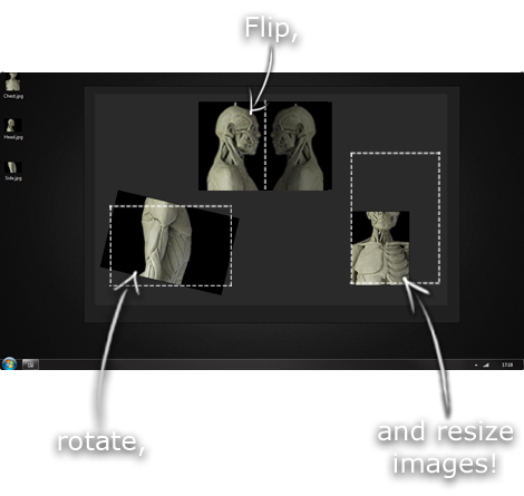
This is another one of those things that aren't sold through Amazon, so I don't get a commission on it - but it's just too good to leave out. PureRef is a fantastic piece of software that is both Windows and Mac compatible. It's used for collecting reference and compiling them into a moodboard. You can move them around freely, have them automatically arranged, zoom in/out and even scale/flip/rotate images as you please. If needed, you can also add little text notes.

When starting on a project, I'll often open it up and start dragging reference images off the internet onto the board. When I'm done, I'll save out a '.pur' file, which embeds all the images. They can get pretty big, but are way more convenient than hauling around folders full of separate images.

Did I mention you can get it for free? The developer allows you to pay whatever amount you want for it. They recommend $5, but they'll allow you to take it for nothing. Really though, with software this versatile and polished, you really should throw them a few bucks if you pick it up. It's more than worth it.

This website uses cookies. You can read more about what we do with them, read our privacy policy.