View Full Submission View Parent Comment
5:40 PM, Thursday February 17th 2022

Thank you very much for the long critique! Before I move onto the revisions, I want to ask a few questions. I understand everything because you explained it so eloquently, this is just to be 100% certain on some things.

  • How would you go about constructing the two bumps on the head of the ant when making the cranium into a sphere? I assume the answer is not cutting into the form, as that would undermine the construction. I also assume the correct answer would be to just build them up from the cranium, however that requires 2 very accurate long curves.

A thing I see constantly is that your base forms lack: 1. curves that reinforce the 3D feel

  • Been a while since I've read the lesson, but if I remember correctly it was said that "we should use natural contour curves instead of forced ones where it's possible" (for example shells). Is that also outdated or should I use both of them always? Btw regardless of your answer, I do see a lot of areas where I should have used them, like the back of the ant for example.

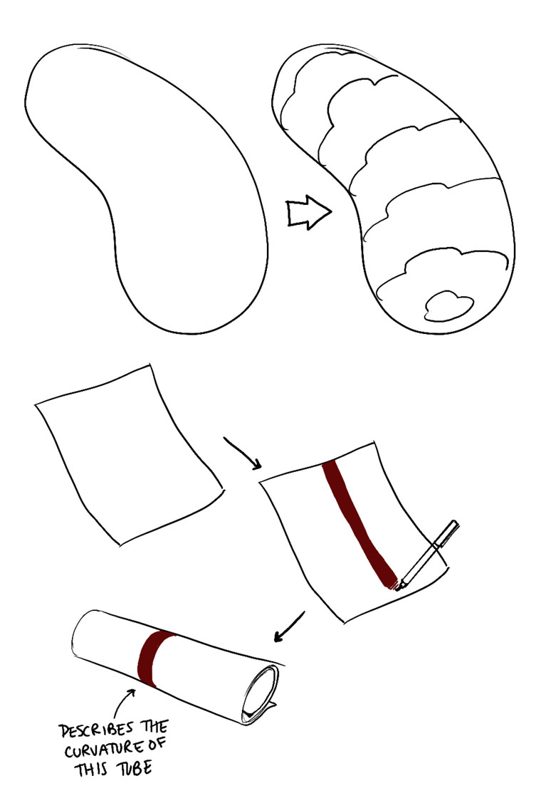
The flat line that goes over the abdomen really demolishes the 3D illusion

  • What should we do with the contour curve if we're looking at the insect from perfect side view? I remember that being the question in my head when I was constructing that one, I didn't see it mentioned anywhere.

This question is unrelated to your critique: Do you know why we're supposed to use only one pen? I think it would help me a lot if I could use both a 0.1 and 0.5 fineliner (.1 for base construction, .5 for refinement and line weight). Some of the smaller areas of insects get really messy for me. I know they're supposed to be messy, but it gets to the point where even I can't tell what's going on anymore.

3:17 AM, Friday February 18th 2022
edited at 3:21 AM, Feb 18th 2022

Hi! Glad I could be of help. Regarding your questions:

I also assume the correct answer would be to just build them up from the cranium, however that requires 2 very accurate long curves.

Yeah, that's the idea. You would make a cranium and then add up the two forms on it (that comes back hard on Lesson 5). I'd handle it like this. Keep in mind that I made the lines with Paint, so your version should accelerate more the lines as they go around the sphere, following its surface.

About the accuracy, remember that it's not about that, our insects don't have to look exactly like the picture. But a good way of improving that is to establish the distance your hand has to reach with little dots, as we did on the boxes. That way, when you make those curves, you have some points of reference. Don't forget to ghost your lines as well.

Been a while since I've read the lesson, but if I remember correctly it was said that "we should use natural contour curves instead of forced ones where it's possible" (for example shells). Is that also outdated or should I use both of them always? Btw regardless of your answer, I do see a lot of areas where I should have used them, like the back of the ant for example.

That's right, but my criticism was pointed towards your basic construction, that's the cranium, thorax and abdomen, those usually lack the contour curves we worked on. You don't have to overdo them, but is a good thing to make those contour lines at the beginning, that way our brain can remember that those are indeed solid, 3D forms, and so, as you build your masses, shells, etc, you can react to the way those forms interact with your base construction.

Like on the louse, you can see that those little lines that align the forms help to define the 3D feel, as well as drawing the intersections between head, thorax and abdomen. Take a look at this for a little reminder.

Of course, we should take advantage of every natural contour curve present in our reference, and don't forget that less is more in these things. A line or two usually do the job just fine.

What should we do with the contour curve if we're looking at the insect from perfect side view? I remember that being the question in my head when I was constructing that one, I didn't see it mentioned anywhere.

Here's an example of the necessity of the contour lines on the basic construction. If you notice, the line that you made ends just where the edge of your original construction ends. Maybe it's just a mistake, and it was a line of the shell that got too far, but since you didn't have any reinforcement on the illusion of 3D form for those underlying shapes, that straight line flattens everything instantly. It's like thepaper example on Lesson 2. Again, my lines are from Paint, yours should accelerate a lot more when approaching the edges.

So, even if you're looking at the insect from a perfect side view, our underlying construction is still an elongated sphere, and so, we can imagine that contour line going over it and following it's curvature just as we would with any point of view.

Something like this (sorry for the stupid cut). I didn't draw any alignment line, because we're looking at the bug from a perfect side view, however, since our basic forms are semi-spherical, we can see those contour lines from any point of view. The blue lines are the intersections, and that more or less would cement the sensation that those are solid, three dimensional forms. With better lines, of course.

And finally, I think that the 0.5 thing is so that we learn to give more relevance to lines just by using lineweight. If we used thinner pens, we wouldn't work on our lineweight at all, and would lose a lot of valuable work on things such as accuracy and the ability of discern what lines go above others in situations like these. I think it's that, you can ask other people too to know their opinions :P

Anyway, that's it! Hope it helps you

edited at 3:21 AM, Feb 18th 2022
12:12 PM, Saturday February 19th 2022

Wow, in my head I imagined the ant cranium sphere being much larger, but that large sphere would only make everything harder. Thanks for all the answers.

Here are my revisions.

Notes:

I know the top sausage curves are a bit too same-y. In the top right sausage, I intentionally made the middle contour curve flatter since I wanted to make the sausage go like this: facing us -> facing away from us -> facing us again. Same with the bottom left sausage. Not saying I succeeded, just explaining my thought process. I tried to copy what Uncomfortable did in this vid (7:47), but now that I look at it again this pattern might just have been an inconsistency. I probably overcomplicated it.

I failed the cast shadow of the first insect. Adding contour curves on the tiny bumps on the back might have been a mistake, but without them the shapes looked flat (I hope they aren't considered detail). Thoughts? I also had trouble representing the bottom part of the abdomen in a 3D way, so I just added a contour curve.

Same on the second insect, the (shell?) had no natural contour curves so I added mine to describe the form. The two circles in the front are probably overkill.

Feel free to assign me additional exercises if you think it's necessary. Also, don't hold back on pointing out repeated mistakes.

4:36 PM, Saturday February 19th 2022

Hi! Overall, everything looks way better than it did before. On the sausages, the idea of turning the ellipses is fine, but what plays against you is that there are too many curves. A lot of times, you can say the same with less curves. Watch out for the flow on your curves too, I know that's a difficult balance to maintain, accuracy vs confidence, but you'll get there.

On the first insect: yeah, the cast shadow failed, but if you were to fill it with black, you could fix it, so no big deal. The contour on the bumps is a good idea, but it works better on the abdomen; on the thorax, they're so little that just making the form like does the job.

I would've tackled those forms differently, especially the top one: like a soft mass that engulfs the shell (trying to replicate the linked forms present in the reference) instead of a "hard" one that just sticks out of it, but the important thing is that yours still read as a three dimensional form, so good job nonetheless.

What you did on the belly is fine, you broke it down into those plates, and they follow the contour of the form they're placed upon, so great.

There are a couple of things more on that first insect. On the front legs, you have some forms missing that are present in the back legs too, but there you just broke the silhouette instead of building forms on top of the sausage. It looks fine from an aesthetic point of view, but is a wasted opportunity to work more on construction.

The point in which the front leg joins with the thorax is also weird. The way it's drawn suggest that it is just a subdivision of the shell, but looking at the reference, it is it's own separate form. That would be the coxa, I think. The way I usually work with those forms, is by making a sphere/sausage hybrid that connects the rest of the leg with the body, and then adding forms on top of it. Something like this, but you know, more accurate.

The eye is fine, but it could be better with softer edges, like, those corners are less angular, in the end, it's still a sphere. There's no need to draw the entire thing, but try to follow the surface the same way as you would with any other form.

Onto the second insect. The contour line on the shell is great, that's the thing, we make lines when we need to reinforce the 3D illusion. We should take advantage of the natural contour lines, but if there are none, then we make our own.

You're right, the two circles at the front are overkill, with just the little one it's understood that those are different masses, and how they intersect. The big one could've worked, but the little one also reinforces the feeling of the whole shell as a single form.

That being said, I'd like to suggest an alternative that, I feel, can work better. We divide the shell between the horn, the upper thorax and the lower thorax and abdomen. I feel that this can work better, because there are planes on the thorax section that we're not fully accounting for in your drawing. You'll notice that it's not a big stretch, just a couple of extra lines. And maybe we can reinforce the horn with contour lines similar to those of a cactus in Lesson 3, to really drive home the fact that there are different planes to it.

Something like this

If you notice, I added a bit of shell on the belly, a section you didn't really consider that much. I treated the contour lines on the shell in the same way as the horn, suggesting the existence of a line that divides the planes on the body. And I cheated, because, if you notice, there are a lot of little masses on the bottom that I didn't account for (you did it better than me). That's more of a problem with the picture really, if you zoom in, you can't really see what's happening there clearly. Try to work with HD pictures, or as big as you can.

And of course, that's just an alternative; your drawing felt solid and three dimensional enough, I just wanted to try a different path, to see if we could make it more accurate.

Beyond that, your eye has a similar problem to the first insect: if you look really close, you can see that it isn't really a circle, it has a couple of corners that define how it is placed in relation with the rest of forms. The legs look a lot better; an intersection on the place where they join the body would've helped even more.

Finally, it would be great that you could use a bit more lineweight, especially on the legs. Don't go overboard with it, but those sections need more clarity to distinguish which forms are on top of which.

As you can see, they're all minor corrections; you clearly have grasped the concepts of Lesson 4. And so, I recommend that you move on to Lesson 5 :) Well done!

Next Steps:

  • Feel free to move on to Lesson 5
This community member feels the lesson should be marked as complete, and 2 others agree. The student has earned their completion badge for this lesson and should feel confident in moving onto the next lesson.
View more comments in this thread
The recommendation below is an advertisement. Most of the links here are part of Amazon's affiliate program (unless otherwise stated), which helps support this website. It's also more than that - it's a hand-picked recommendation of something I've used myself. If you're interested, here is a full list.
Drawabox-Tested Fineliners (Pack of 10, $17.50 USD)

Drawabox-Tested Fineliners (Pack of 10, $17.50 USD)

Let's be real here for a second: fineliners can get pricey. It varies from brand to brand, store to store, and country to country, but good fineliners like the Staedtler Pigment Liner (my personal brand favourite) can cost an arm and a leg. I remember finding them being sold individually at a Michael's for $4-$5 each. That's highway robbery right there.

Now, we're not a big company ourselves or anything, but we have been in a position to periodically import large batches of pens that we've sourced ourselves - using the wholesale route to keep costs down, and then to split the savings between getting pens to you for cheaper, and setting some aside to one day produce our own.

These pens are each hand-tested (on a little card we include in the package) to avoid sending out any duds (another problem with pens sold in stores). We also checked out a handful of different options before settling on this supplier - mainly looking for pens that were as close to the Staedtler Pigment Liner. If I'm being honest, I think these might even perform a little better, at least for our use case in this course.

We've also tested their longevity. We've found that if we're reasonably gentle with them, we can get through all of Lesson 1, and halfway through the box challenge. We actually had ScyllaStew test them while recording realtime videos of her working through the lesson work, which you can check out here, along with a variety of reviews of other brands.

Now, I will say this - we're only really in a position to make this an attractive offer for those in the continental United States (where we can offer shipping for free). We do ship internationally, but between the shipping prices and shipping times, it's probably not the best offer you can find - though this may depend. We also straight up can't ship to the UK, thanks to some fairly new restrictions they've put into place relating to their Brexit transition. I know that's a bummer - I'm Canadian myself - but hopefully one day we can expand things more meaningfully to the rest of the world.

This website uses cookies. You can read more about what we do with them, read our privacy policy.