


Lesson 2: Contour Lines, Texture and Construction
6:30 AM, Monday November 1st 2021

Some of the texture dissections contain elements of my introductory anthropology class.
I welcome any feedback. : )
I'll be the TA handling your Lesson 2 critique.
You're making progress towards understanding the concepts introduced in this lesson and hopefully this critique will help you in your future attempts.
Starting off in the arrows section your lines are looking smoothly and confidently drawn. You're doing a good job maintaining a consistent width as your arrows widen while moving closer to the viewer and with more mileage you'll become more consistent. It's good to see that you're trying to implement line weight, just remember that you want to keep your applications subtle and you'll become consistent with mileage. here are some things to look out for when applying it. I'd like you to experiment more with foreshortening in your future attempts, by utilizing it in both the arrows themselves as well as the negative space between their curves we can create a stronger illusion of an object moving through 3D space as demonstrated here.
Moving into the organic forms with contours exercise you're doing a good job keeping your forms simple, plenty of people tend to over-complicate them. You're keeping your line work confident here which is great, if you feel uncomfortable working with contours still don't stress with more mileage it'll become more natural. Speaking of contours I'd like you to try and shift the degree of your contours more. The degree of a contour line basically represents the orientation of that cross-section in space, relative to the viewer, and as we slide along the sausage form, the cross section is either going to open up (allowing us to see more of it) or turn away from the viewer (allowing us to see less), as shown here.
In the texture exercises you're focusing largely on outlines and negative space rather than cast shadows created by forms along the texture itself. This makes it difficult to create gradients with implied information which we could then use to create focal points in more complex pieces, by doing so we can prevent our viewers from being visually overwhelmed with too much detail. For more on the importance of focusing on cast shadows read here. I'd also like to quickly direct you to this image which shows that when we're working with thin line like textures if we outline and fill the shadow we will create a much more dynamic texture than simply drawing lines.
It's quite common for people to feel like they don't fully grasp the form intersections exercise, if you feel like you may fall into this category try not to stress too much. This exercise is just meant to get students to start thinking about how their forms relate to one another in 3D space, and how to define those relationships on the page. We'll be going over them more in the upcoming lessons.Your forms are looking quite solid here and they believably appear to belong in the same cohesive 3D space, good work.
While wrapping up your submission with the organic intersections exercise you do a great job demonstrating that your sense of 3D space is developing as your forms begin to wrap around each other believably. You're keeping your forms simple and easy to work with which is a good strategy to help produce good results. I will quickly mention that the small ellipse on the end is a contour ellipse as well, so drawing them too small doesn't provide the user with much information. When it comes to your shadows you're pushing them enough so that they cast rather than just hugging the form that creates them which is a great start. Your shadows appear to be following a consistent light source, be sure to experiment with different angles and intensities when trying this exercise again in the future. I recommend pushing your light source to the top left or right corner of the page to start with, it's easier than working with a light directly above your form pile.
Overall this was a solid submission, while you may have some things to work on I have no doubt you will improve with more mileage. I'll be marking your submission as complete and moving you on to the next lesson.
Keep practicing previous exercises as warm ups and good luck in lesson 3!
Next Steps:
Keep practicing previous exercise as warm ups.
Move on to lesson 3.
Thank you for the feedback!
Just a quick question. Often the outline seems analogous to the cast shadow - e.g., if I have a rock wall with many crevices, the outlines of the shapes are physical depressions with their open respective shadows (e.g., similar to what I drew on the 2nd drawing of the texture analysis). In a case like this, how would we draw just the cast shadows without causing too much visual information to clutter the scene?
Texture is at tricky concept to explain unless I explain the entire process so I'm going to include an explanation I wrote on it previously. Hopefully it helps explain the goals of the exercises and addresses your confusion. If not however feel free to just reply to this and let me know and I'll take another crack at it.
First things first, open up this leaf texture picture, I find leaves are a good example and a texture that people are often drawn to and do incorrectly.
The first thing you may notice is that this image isn't in colour and instead in black and white, this is helpful because people often get distracted by shifts in colour and will try to darken an area in their drawing if the colour happens to be darker. We shouldn't rely on converting images to black and white but it is helpful and something you may want to consider when practicing.
Now if I handed a student this image and told them to use it for their texture exercises there are two typical outcomes I would expect.
The first is that they would draw all of the veins (or many of them if they aren't extremely patient), and this would be an example of focusing on outlines.
The second result that I would expect is that instead of drawing the veins themselves they would either fill the veins in completely with black or they would fill in everything but the veins completely with ink, and this would be them focusing on negative space.
This is where students get a bit confused at the start, they feel like they're looking at the image and drawing what they see but it comes out wrong. I should clarify that it's not necessarily incorrect, there is a time and place when obsessing over small details can be helpful but this is largely an exercise about learning how to imply information and thinking in 3D space. Remember that what we're learning here isn't observational drawing, it's constructional and while observation is definitely a part of the construction method there's an extra step that people tend to neglect in the beginning.
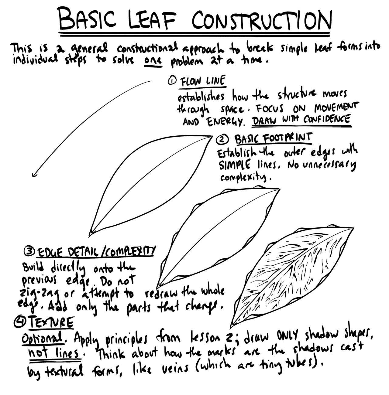
With that in mind let's go over the correct way to tackle these problems, bring up the leaf image (it's here if you closed it) and let's break down what we're working with. What people tend to neglect is that we're trying to think about the 3D space of the image we're observing and drawing. If we look at this leaf the veins are really just long organic forms, or cylinders if they're particularly rigid. The fleshy bit of the leaf could be thought of as either a plane or a thin box, and due to gravity's effect it will likely curve a bit (we don't need to think too much about it curving in this case because we're working so close up, but it's good to think of how the environment can have an effect).
To put it simply, a leaf is just organic forms that are intersecting with each other and a plane/box, just like the forms we practiced with in the form intersections exercise. With all of these forms in mind we can place a light source and depending on it's position and intensity we can create cast shadows much like we did in the organic intersections exercise.
An example of this can actually be seen in the picture itself. Let's just focus on the large main vein as well as the branching vein on the left. You'll notice that if you look along the bottom edge of the main vein there's a cast shadow, and on the right of the branching vein there's a shadow. From this information we can assume that the light affecting the leaf the most is somewhere to the upper left of the image and it's creating the cast shadows we want to draw.
This is an example of what drawing cast shadows might look like, it comes up early on in lesson 3 when Uncomfortable shows the process of drawing a leaf. You can see that he's not actually drawing the veins themselves, and instead just implying that they exist by creating cast shadows. Keep in mind that this leaf is fairly evenly lit and the point of the texture exercise is to work with light gradients but regardless it's a good example of what we're trying to achieve. There are times where capturing shadows doesn't immediately give the impression of what you're attempting to draw but it's just a single tool that you can use. You may not think that drawn leaf looks like a leaf, but if it was green, had a stem, and was attached to something that resembled a plant your brain would begin fill in the gaps until it goes "oh that's a leaf".
Implying information helps both the creator as well as the viewer, it saves the creator time from having to obsessively capture every tiny detail and it prevents the image from becoming too visually noisy and overwhelming for the viewer.
Craig Mullins is a painter whose work I appreciate a lot and I feel does an amazing job of implying information through shadow, colour and brush strokes. I highly recommend looking up some of his work if you'd like some examples of just how powerful implied information can be.
When it comes to your textures in some cases you're focusing on outlines like in your arowana and rose petals, sometimes you're focusing on negative space like in your swiss cheese (this was probably just a bad texture idea for this exercise to be fair, cheese is mostly smooth so it's difficult) and in some cases you're getting closer to the right idea like in your raspberry attempt. One thing to notice is that your textures don't transition smoothly in terms of their gradients, when you tackle cobblestone for example you focus on outlines and then when you get to the light section all outlines just stop, thinking about how you place your light and cast shadows can help smoothen and make this shift more gradual.
Hopefully that helps, if not feel free to ask more questions.
No way to thumbs up - but I have to say: thank you! I'll take your advice to heart

These are what I use when doing these exercises. They usually run somewhere in the middle of the price/quality range, and are often sold in sets of different line weights - remember that for the Drawabox lessons, we only really use the 0.5s, so try and find sets that sell only one size.
Alternatively, if at all possible, going to an art supply store and buying the pens in person is often better because they'll generally sell them individually and allow you to test them out before you buy (to weed out any duds).
This website uses cookies. You can read more about what we do with them, read our privacy policy.


