View Full Submission View Parent Comment
0 users agree
8:45 PM, Friday July 10th 2020

Your work throughout this lesson is, in a lot of ways, demonstrative of a good grasp of how the forms you've constructed exist in 3D space, and how they fit together to create more complex objects. As a whole, you're showing that you certainly know how to draw animals. There are however a great many places where your adherence to the principles of Drawabox, and the focus on actually treating these drawings as exercises (rather than just opportunities to draw nice things). You're pretty inconsistent in terms of how much you're willing to actually build out your forms - sometimes you do it really well, going through each and every steps, sometimes your lines are sketchy and more instinctual rather than planned and purposeful, and other times you toss construction out the window entirely.

This is actually not an entirely uncommon issue - animals are fun to draw, and hitting this lesson sometimes triggers a switch that causes people to suddenly focus more on that rather than actually adhering to the lesson itself. I'm going to point out what you did right, and where you dropped the ball, and then we're going to have you draw a few more to ensure that you do continue to stick to the instructions through the rest of the course.

Starting with these birds, some of the pieces are definitely in place, but there are a number of issues I'd like to call out:

  • You tend to put down a lot of contour lines that aren't necessarily drawn with that much care (they don't really wrap around the form all that well and tend to be a bit shallow in some cases, and are generally just half-drawn). This often results in you putting down way more than you would otherwise need to.

  • You're not entirely consistent in terms of drawing through your ellipses.

  • You jump back and forth between building up this construction through the addition of 3D forms and the addition of 2D elements - for example, when you draw the wings, you're often just bridging the spaces between what appear to be individual feather shapes. Instead, it's best to build the whole wing as a solid 3D mass, and then pile feathers on top of it as shown here.

  • In general, you're not really taking the time to actually make each form feel three dimensional. You are definitely capable of doing so, that just doesn't appear to be your goal here, and as 3D form, solidity, spatial relationships and all that are at the very core of this course, it should be at the core of what you mean to achieve with these drawings.

Skipping ahead, a lot of your drawings really are quite nice, and you are demonstrating that you understand how many of the components of the birds' bodies actually exist in 3D space, but you've gotten caught up in creating nice drawings, not in actually doing the lesson as it is laid out in the instructions.

Moving on from the birds, you some some progress when you start redrawing the demonstrations. This wolf's legs are definitely more corgi-like, but the construction feels a lot more solid, and elements fit together much better than they have in the past. You're also employing the sausage method for your legs more consistently. My only complaint here is one line that you've drawn bridging across the mass along the wolf's shoulder, and the wolf's hips. I've circled it for you here. The issue is that in order to constantly reinforce the illusion that what we're creating here is something three dimensional, we need to ensure that every component we add onto our construction is itself, a complete 3D form. When we add elements as simple lines, or flat 2D shapes, especially when bridging across existing forms, it may seem like something that is entirely fine, but it can serve to undermine the illusion we're trying to create. I demonstrate this on the bottom of this diagram.

Now, as you continue working through the various demonstrations, you show your willingness to actually adhere to construction, to draw your lines a little more purposefully, and to focus on the idea of building everything out from individual forms - but there are a few areas that still show some issues. For example, if we look at the tapir head, while at its surface you've followed all the steps outlined in the demonstration, something about it feels less solid than the original demo you're following. The reason is because it feels more like a loose arrangement of lines - with plenty of little gaps between them where they ought to actually meet and touch.

The understanding of your own that you're actually adding solid, three dimensional forms to your construction is something I really cannot stress enough. You're not just putting marks down on a page, and when you do that, it comes across to the viewer. They may not be able to tell you why it feels off, but they'll have a sense of it in the back of their heads. You need to respect the idea that every form is being added as something real. It's just not lines on a flat page, and you need to believe it.

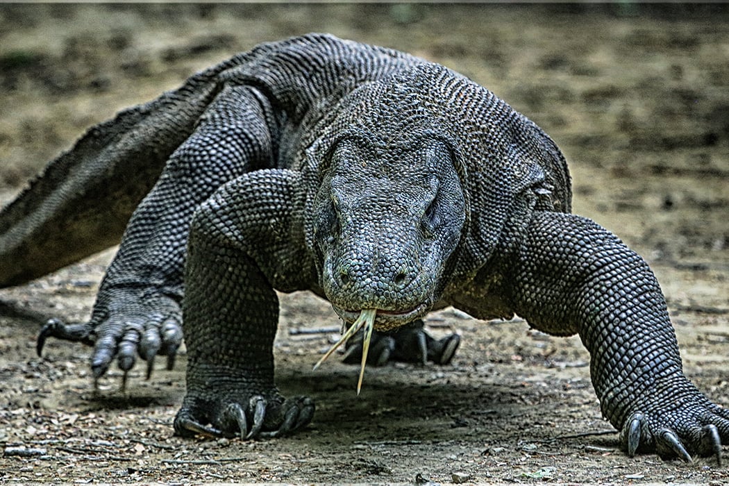
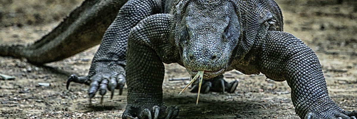
Continuing on to the last few drawings, once you stopped reproducing the demos, you went back into the previous habits of half-construction (or in the case of the komodo dragon, no construction at all). There are some cases where some construction is present, but it's just faint (your scanner settings are definitely ramping up the contrast, so be sure not to use "drawing" presets, "photo" presets will do a much better job of capturing all the nuance in your drawings). All the same, you should not be going out of y our way to hide or reduce the presence of your construction lines - they are what's important, not the detail.

So, as I mentioned at the beginning, I'm going to assign additional pages for you to demonstrate the use of the techniques covered in this lesson and throughout this course up to this point. I get that you're enthusiastic and probably had a lot of fun with this - that's great - but I really cannot emphasize enough the fact that this course is about working through specific exercises, not just drawing nice pictures.

Next Steps:

Please submit 6 more pages of animal drawings.

When finished, reply to this critique with your revisions.
7:09 PM, Saturday July 11th 2020

Revisions located here:

https://imgur.com/a/cG9o6cQ

I also attached a screen shot of my scanner settings. I think I was drawing too lightly in the last submission.

Going forward, I think I am going to leverage the community half-way or take a step back. I def. lost sight of what the lessons were trying to teach me and got caught up in flow.

Lastly, need to meditate on finding a balance between the fun/love of drawing and "Doing the work". I am trying to master the fundamentals currently and that means "Doing the work". As always thank you for your feedback, patience and critique.

Alan

11:39 PM, Saturday July 11th 2020

I have to admit that while there is definitely improvement all in the right direction here, coming back with 6 individual drawings in under 24 hours is always a red flag that the student may not have put in as much time and effort into each individual drawing as they could have. Additionally, while I did not restrict you from including draw-alongs with demonstrations in these revisions, it is certainly something I'm taking note of. I do have some information to share about how to look at the demonstrations, but I'm going to focus my critique on the one drawing you did at the end on your own.

So, the thing about the informal demos is that those at the top of the list are newer than those further down. Because of how the course itself is continually being updated and altered (the process of critiquing students brings to light ways in which I can explain concepts more effectively, and also allows me to develop more successful techniques for how to approach these exercises), there are going to be areas where older demos don't reflect certain techniques that are stressed in later ones. The demos are there because they're still valuable, and serve an important role until I can actually find the time to create a more succinct, up-to-date collection of demonstrations (which I should be able to start getting to soon, as I've put in notice at my day job).

That said, if you look at, say, the elephant demo, you'll notice that the leg constructions don't apply the sausage method, which I stress in more recent ones. That is for the simple reason that I hadn't developed that methodology at that point.

This is basically just something to keep in mind when digesting the demonstrations - you still do need to think critically about what you've learned in the lesson thus far, and identify where those newer techniques override the ones presented in older demonstrations.

So, looking at your komodo dragon drawing, this is certainly moving more in the right direction in a number of ways. Your marks, while still not as confident and "complete" (in terms of drawing entire closed forms without gaps), are visibly less tailored towards keeping things clean and hidden away. You're also pushing the use of the sausage method much further. There are of course issues which I've outlined here. Since I've written a lot of notes there, I'll outline them a bit more cleanly below:

  • One thing to keep in mind is that no mark should be drawn without considering precisely what its purpose is, whether it is the best stroke to accomplish that task, and whether any other mark is currently attempting to accomplish the same task. Specifically here this relates to your tendency to draw more contour lines than are really necessary. Contour lines tend to suffer from diminishing returns, where the first will have a more significant impact, but your second will have less of one, your third will be even less, and so on. Furthermore, different kinds of contour lines will be more effective overall - like the contour lines that define the relationship between different forms in 3D are always, by their very nature in defining those relationships, more effective at creating the illusion that the forms are three dimensional, than the contour curves that wrap around the surface of a single form. In most cases you can actually get away with just the contour lines that define those connections/relationships.

  • Your forms tend to still have gaps, which immediately undermine the illusion that they're actually solid. If you look at the drawing of the komodo dragon's leg in the bottom left there, you'll see how every single form I've drawn is complete. I'm not being timid or tentative here - I decide a particular form needs to exist, and I draw it in its entirety, fully enclosed, within the space. My focus is on giving the impression that this form first and foremost is solid and 3D, and then thinking about how it relates to the forms around it.

  • When adding additional forms, don't give them artificially sharp corners. Think of those masses like chunks of meat - meat itself, without actually being cut, doesn't come to its own sharp corners - it's more malleable with gentle curves that will wrap around whatever it's placed upon, whilst maintaining its own volume.

  • Your head construction doesn't really reflect the kind of specific structure shown in the tapir head demo, where we establish the different components as though they're pieces of a 3D puzzle that fit together. The eye sockets ought to be buttressed on its various sides by other components such as the muzzle, the brow ridge, the cheekbone, etc. Having them fit together in this specific manner is key to making the head feel solid, and having all those pieces feel grounded.

  • To take this point further, I drew my own approach at this head construction here. There are no additional notes, but the key comes down to how every component is clearly defined, enclosed, and drawn with confidence and purpose. I'm not timidly putting down subtle suggestions - I'm clear and direct in every constructional choice, focusing on how each form or addition exists in 3D space. Also for the tongue, I've approached it constructionally as well, similarly to how we tackled the leaves in lesson 3.

One point I didn't mention in the redline notes is that I went looking for a komodo dragon reference from which to do my head drawing, and I believe I found one that appears to match yours' pose pretty accurately, here. I also noticed that there were no larger images of this aside from this one, which is somewhat cropped. I'm not sure if you were able to find your own high resolution image, but resolution is pretty important - there's a lot going on, especially with the scaly texture of its skin that can make it quite a bit more difficult to identify all that's going on. Definitely be sure to work from high resolution images - even the size of the larger, cropped one I found is the bare minimum of what I'd generally want to work with. Given that I have more experience with what to look for, I can work a little better with low resolution images, but I would by no means ask that of you at this stage.

You are indeed making progress, but I'm going to assign 4 more pages with a few more restrictions, which I'll list below. I am definitely expecting that my critique on your next set will be a simple "much better", rather than another lengthy critique.

As a side note about the whole balance between the finding a balance between fun and improvement, that is certainly something all must struggle with - however, not within the context of this course. The drawings you do for this course are specifically just exercises we're doing to help develop your skills. The stuff you do for fun, which is extremely important, should be entirely separate, as described back here in Lesson 0.

Next Steps:

Submit 4 additional animal drawings, adhering to the following restrictions:

  • I only want you to do one such drawing per day. This is specifically so you're not put in any position where you might be inclined to focus on the completion of many in a given sitting, which can even subconsciously cause you to spend less time on a given drawing than you otherwise could.

  • All of these drawings should be your own - none of them should be done from the available demonstrations.

  • Do not employ any contour lines that rest on the surface of a single form (like the komodo dragon's tail). You are absolutely allowed and encouraged to include contour lines that define the connection between different forms, however.

When finished, reply to this critique with your revisions.
3:36 AM, Saturday August 1st 2020

Second round of revisions can be found here. https://imgur.com/a/p82bmJM

I took some time off in between and did one a day. I am not confident about these at all to be honest. I feel like I am going backwards. I understand if I need to do a third round of revisions.

Alan

View more comments in this thread
The recommendation below is an advertisement. Most of the links here are part of Amazon's affiliate program (unless otherwise stated), which helps support this website. It's also more than that - it's a hand-picked recommendation of something I've used myself. If you're interested, here is a full list.
Staedtler Pigment Liners

Staedtler Pigment Liners

These are what I use when doing these exercises. They usually run somewhere in the middle of the price/quality range, and are often sold in sets of different line weights - remember that for the Drawabox lessons, we only really use the 0.5s, so try and find sets that sell only one size.

Alternatively, if at all possible, going to an art supply store and buying the pens in person is often better because they'll generally sell them individually and allow you to test them out before you buy (to weed out any duds).

This website uses cookies. You can read more about what we do with them, read our privacy policy.