250 Box Challenge

9:13 PM, Friday December 4th 2020

Imgur: The magic of the Internet

Direct Link: https://i.imgur.com/ZeFkPL7 .jpg

Post with 9 views.

re-submitted for official critique.

I have already completed lesson two but but now I'm going back and resubmitting everything.

I am aware that I've doubled up some lines and hope that it's not too frequent.

Out of all the draw a box challenges so far the hardest was arranging the pages in order (It's been at least an hour).

Thank you for taking a look!

0 users agree
9:43 PM, Friday December 4th 2020

Congratulations for completing the 250 Box Challenge!

You did a pretty good job on the challenge overall. When I compare your early boxes to your later ones, I can see a good improvement to the quality of your mark making. Your lines steadily look straighter and more confident. You have a good variety of orientations and foreshortening as well. You also do a better job of getting your sets of parallel lines to converge more consistently towards their shared vanishing points!

One thing I notice about your boxes is that you were not always applying your extra line weight correctly. When you go to add weight to a line it is important that you treat the added weight the same way you would a brand new line. That means taking your time to plan and ghost through your mark so that when you go to execute it the mark blends seamlessly with your original mark. This will allow you to create more subtle and clean looking weight to your lines that reinforces the illusion of solidity in your boxes/forms. I recommend that you try adding your extra line weight in no more than 1-2 pases.

Extra line weight should never be used to correct or hide mistakes. You can also read more about this here. Something to keep in mind as well, when you are working through Drawabox you should be employing the ghosting method for every mark you make. This includes the hatching that we sometimes use for our boxes.

Finally while your converges do improve overall I think this diagram will help you further develop that skill as you continue through Drawabox. So, when you are looking at your sets of lines you want to be focusing only on the lines that share a vanishing point. This does not include lines that share a corner or a plane, only lines that converge towards the same vanishing point. Now when you think of those lines, including those that have not been drawn, you can think about the angles from which they leave the vanishing point. Usually the middle lines have a small angle between them, and this angle will become negligible by the time they reach the box. This can serve as a useful hint.

Congrats again and good luck with lesson 2!

Next Steps:

Continue to lesson 2!

This critique marks this lesson as complete.
11:08 AM, Sunday December 6th 2020

Thank you!

The recommendation below is an advertisement. Most of the links here are part of Amazon's affiliate program (unless otherwise stated), which helps support this website. It's also more than that - it's a hand-picked recommendation of something I've used myself. If you're interested, here is a full list.
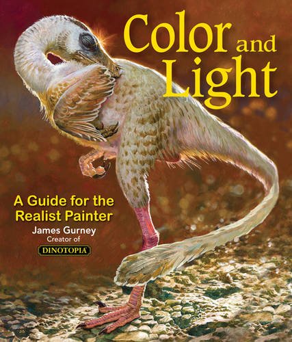
Color and Light by James Gurney

Color and Light by James Gurney

Some of you may remember James Gurney's breathtaking work in the Dinotopia series. This is easily my favourite book on the topic of colour and light, and comes highly recommended by any artist worth their salt. While it speaks from the perspective of a traditional painter, the information in this book is invaluable for work in any medium.

This website uses cookies. You can read more about what we do with them, read our privacy policy.