


Lesson 3: Applying Construction to Plants
2:33 PM, Thursday October 15th 2020

Now this is starting to get interesting, already feeling an improved sense of spacial awareness! Any feedback would be highly appreciated :D
First of all you should use a wider pen. You're using a pilot pen which is great but not recommended for these exercises.
your leaves look fine, even tho some are way too wavy which is i guess still a good training. The branches are alright even tho you should work on keeping a consistant width.
The first page of plants is good even tho the mushroom in the middle looks very rushed and the flower on the top left has some haphazard shadowing that is very confusing instead of using lineweight which would have worked a lot better.
Second page is pretty bad. You should draw your plants a lot bigger because some branches are just a single line which doesnt provide any learning effect. This is more of a leaf exercise instead of plants.
third page is better, the leaves flow nicely except the ones in the back, maybe watch out for them a bit more. The flower in the top left corner is way to small to judge properly but generally still not enough use of lineweight.
fourth page you stopped drawing through your ellipses in the cactus and I dont know whats going on with the petals of the flower in the middle but the weird dark line you have in the middle doesnt do anything. The branch next to it is also not consistent at all.
Fifth page is decent, but you could have applied some more shadow information on the left one and the top right one. And again not enough line weight in the bottom right one.
There is a lot going on in the next image. To start off with the plant on the left: the branches look good and the leaves are generally nicely flowing but you didnt use any shadowing or lineweight which makes them hard to read and you should also do some leaves that move in the back.
The plant on the top right is very messy because youve drawn through your ellipses way too often, two times is generally enough and again no lineweight and a very light pen. Nothing to say about the one in the bottom right.
The strawberry on the next page is good but think back to the texture lesson before, that the indents on the bottom cast more shadow than the ones on the top and also think about where they cast a shadow and dont do it arbitrarily like on the very top. And you didnt draw through your ellipses on the strawberry and the pear and the branches here are also off.
The final page is probably the best one. It has a good sense of spacial awareness but the same issues as before with the linweight and shadows and not drawing through the ellipses. And final addition: watch out for the leaf on the top left, the lines going off from the middle look kind of stiff and not matching to the leaf.
Next Steps:
Redo the plants I mentioned as too small on a bigger canvas and you can go over or also redo some with bad lineweight and shadows.
At least 2 big ones with Texture and shadow
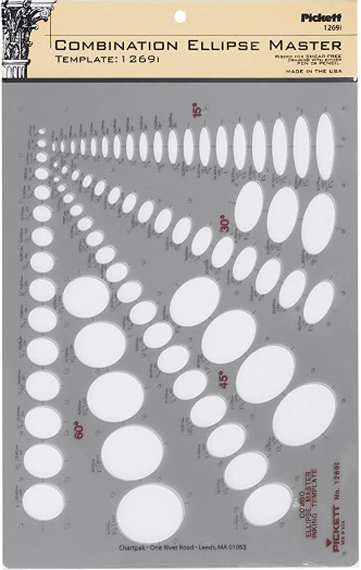
This recommendation is really just for those of you who've reached lesson 6 and onwards.
I haven't found the actual brand you buy to matter much, so you may want to shop around. This one is a "master" template, which will give you a broad range of ellipse degrees and sizes (this one ranges between 0.25 inches and 1.5 inches), and is a good place to start. You may end up finding that this range limits the kinds of ellipses you draw, forcing you to work within those bounds, but it may still be worth it as full sets of ellipse guides can run you quite a bit more, simply due to the sizes and degrees that need to be covered.
No matter which brand of ellipse guide you decide to pick up, make sure they have little markings for the minor axes.
This website uses cookies. You can read more about what we do with them, read our privacy policy.


