Tofu

Dimensional Dominator

Joined 3 years ago

686150 Reputation

tofu's Sketchbook

  • Sharing the Knowledge
  • Dimensional Dominator
  • The Relentless
  • Basics Brawler
    0 users agree
    8:44 PM, Monday April 15th 2024

    Hi there, I'll be handling your box challenge critique.

    Congratulations on completing the box challenge, it's definitely a lot more work than most people expect. Not only does it help deepen your understanding of important concepts but it shows your desire to learn as well. Be proud of what you've accomplished and that desire you've shown. That being said I'll try to keep this critique fairly brief so you can get working on the next steps as soon as possible.

    Things you did well:

    • You're doing a good job of drawing the lines constructing your boxes smoothly and confidently.

    • It's nice to see that you're taking the time to plan each of your hatching lines and space them evenly. This helps keep your boxes looking tidy rather than looking like they were rushed on to the page.

    • You're doing a great job of experimenting with orientations, proportions and rates of foreshortening in your final 150 boxes. Experimenting is an important habit to build when learning any new skill, it helps form a more well rounded understanding. I hope you'll continue to display and nurture this habit in the future.

    Things you can work on:

    • You tend to draw fairly small, I'd like you to draw larger in the future. Drawing large will help you become more comfortable working from the shoulder and allow you to see any mistakes you've made more clearly.

    • There are times when your lines converge in pairs or you attempt to keep your lines a bit too parallel which results in them diverging. This is an example of lines converging in pairs, and this shows the relation between each line in a set and their respective vanishing point. The inner pair of lines will be quite similar unless the box gets quite long and the outer pair can vary a lot depending on the location of the vanishing point. Move it further away and the lines become closer to parallel while moving it closer increases the rate of foreshortening.

    The key things we want to remember from this exercise are that our lines should always converge as a set not in pairs, never diverge from the vanishing point and due to perspective they won't be completely parallel.

    While I've noted a few things you can work on in the critique above, you've completed quite the daunting challenge. Overall your boxes are looking really solid and your lines are tidy, good work.

    That being said I'll be marking your submission as complete and move you on to lesson 2.

    Keep practicing previous exercises and boxes as warm ups, and good luck.

    Next Steps:

    Move on to lesson 2.

    This critique marks this lesson as complete.
    0 users agree
    8:21 PM, Monday April 15th 2024

    I'll be the TA handling your Lesson 2 critique.

    You're making progress towards understanding the concepts introduced in this lesson and hopefully this critique will help you in your future attempts.

    • Starting off in the arrows section your lines are looking smoothly and confidently drawn. You're doing a good job maintaining a consistent width as your arrows widen while moving closer to the viewer and with more mileage you'll become more consistent. It's good to see that you're trying to implement line weight, just remember that you want to keep your applications subtle and you'll become consistent with mileage. here are some things to look out for when applying it. I'd like you to experiment more with foreshortening in your future attempts, by utilizing it in both the arrows themselves as well as the negative space between their curves we can create a stronger illusion of an object moving through 3D space as demonstrated here.

    • Moving into the organic forms with contours exercise a couple of your forms are getting a bit too complex. We want to create our forms with both ends being the same size and to avoid any pinching, bloating, or stretching along the form's length as discussed here. You're keeping your line work confident here which is great, if you feel uncomfortable working with contours still don't stress with more mileage it'll become more natural. Speaking of contours I'd like you to try and shift the degree of your contours more. The degree of a contour line basically represents the orientation of that cross-section in space, relative to the viewer, and as we slide along the sausage form, the cross section is either going to open up (allowing us to see more of it) or turn away from the viewer (allowing us to see less), as shown here.

    • In the texture exercises you're focusing largely on outlines and negative space rather than cast shadows created by forms along the texture itself. This makes it difficult to create gradients with implied information which we could then use to create focal points in more complex pieces, by doing so we can prevent our viewers from being visually overwhelmed with too much detail. For more on the importance of focusing on cast shadows read here. I'd also like to quickly direct you to this image which shows that when we're working with thin line like textures if we outline and fill the shadow we will create a much more dynamic texture than simply drawing lines.

    • It's quite common for people to feel like they don't fully grasp the form intersections exercise, if you feel like you may fall into this category try not to stress too much. This exercise is just meant to get students to start thinking about how their forms relate to one another in 3D space, and how to define those relationships on the page. We'll be going over them more in the upcoming lessons. Your forms are looking quite solid here and they believably appear to belong in the same cohesive 3D space, good work.

    • While wrapping up your submission with the organic intersections exercise you do a great job demonstrating that your sense of 3D space is developing as your forms begin to wrap around each other believably. You're keeping your forms simple and easy to work with which is a good strategy to help produce good results. When it comes to your shadows you're pushing them enough so that they cast rather than just hugging the form that creates them which is a great start. Your shadows appear to be following a consistent light source, be sure to experiment with different angles and intensities when trying this exercise again in the future. I recommend pushing your light source to the top left or right corner of the page to start with, it's easier than working with a light directly above your form pile.

    Overall this was a solid submission, while you may have some things to work on I have no doubt you will improve with more mileage. Know that texture is something we expect students to struggle with at this point. It's all about thinking about how the forms created by the texture exist in 3D space and how to use the shadows those forms create imply information. It'll hopefully be easier as you progress through the course and develop your understanding of 3D space, but if you feel like you need more of an explanation now to move on comfortably just let me know (it's too lengthy to include in a critique). I'll be marking your submission as complete and move you on to the next lesson.

    Keep practicing previous exercises as warm ups and good luck in lesson 3!

    Next Steps:

    Keep practicing previous exercises as warm ups.

    Move on to lesson 3.

    This critique marks this lesson as complete.
    8:02 PM, Monday April 15th 2024

    While there's still room to keep improving these are heading in the right direction and your lines are looking better.

    I'll be marking your submission complete and move you on to lesson 3.

    Keep practicing previous exercises as warmups and best of luck.

    Next Steps:

    Move on to lesson 3.

    This critique marks this lesson as complete.
    0 users agree
    9:29 PM, Sunday April 14th 2024

    I'll be the TA handling your Lesson 2 critique.

    I've removed your other submission to tidy up your sketchbook and hope you're feeling better health wise.

    You're making progress towards understanding the concepts introduced in this lesson and hopefully this critique will help you in your future attempts.

    • Starting off in the arrows section your lines are looking smoothly and confidently drawn. You're doing a good job maintaining a consistent width as your arrows widen while moving closer to the viewer and with more mileage you'll become more consistent. It's good to see that you're trying to implement line weight, just remember that you want to keep your applications subtle and you'll become consistent with mileage. here are some things to look out for when applying it. I'd like you to experiment more with foreshortening in your future attempts, by utilizing it in both the arrows themselves as well as the negative space between their curves we can create a stronger illusion of an object moving through 3D space as demonstrated here.

    • Moving into the organic forms with contours exercise some of your forms are getting a bit too complex. We want to create our forms with both ends being the same size and to avoid any pinching, bloating, or stretching along the form's length as discussed here. You're keeping your line work confident here which is great, if you feel uncomfortable working with contours still don't stress with more mileage it'll become more natural. Speaking of contours, be sure to draw through all of your ellipses including your small contour ellipses on the ends of your forms. You're also placing these small ellipses on the opposite ends of your forms at times (if your ellipse is this O and your curves are this C, you want the ellipse to be on the open end of your ellipse like so CO rather than the closed end OC). You're doing a good job trying to shift the degree of your contours so far, be sure to keep experimenting. The degree of a contour line basically represents the orientation of that cross-section in space, relative to the viewer, and as we slide along the sausage form, the cross section is either going to open up (allowing us to see more of it) or turn away from the viewer (allowing us to see less), as shown here.

    • In the texture exercises you're focusing largely on outlines, form shadows, and negative space rather than cast shadows created by forms along the texture itself. This makes it difficult to create gradients with implied information which we could then use to create focal points in more complex pieces, by doing so we can prevent our viewers from being visually overwhelmed with too much detail. For more on the importance of focusing on cast shadows read here. I'd also like to quickly direct you to this image which shows that when we're working with thin line like textures if we outline and fill the shadow we will create a much more dynamic texture than simply drawing lines.

    • It's quite common for people to feel like they don't fully grasp the form intersections exercise, if you feel like you may fall into this category try not to stress too much. This exercise is just meant to get students to start thinking about how their forms relate to one another in 3D space, and how to define those relationships on the page. We'll be going over them more in the upcoming lessons.Your forms are looking quite solid here and they believably appear to belong in the same cohesive 3D space, good work.

    • While wrapping up your submission with the organic intersections exercise you do a great job demonstrating that your sense of 3D space is developing as your forms begin to wrap around each other believably. You're keeping your forms simple and easy to work with which is a good strategy to help produce good results. I'd like you to draw through all of your forms when attempting this exercise again in the future, it will help reinforce your understanding of the 3D space you're creating. When it comes to your shadows you're pushing them enough so that they cast rather than just hugging the form that creates them which is a great start. Your shadows appear to be following a consistent light source, be sure to experiment with different angles and intensities when trying this exercise again in the future. I recommend pushing your light source to the top left or right corner of the page to start with, it's easier than working with a light directly above your form pile.

    Overall this was a solid submission, while you may have some things to work on I have no doubt you will improve with more mileage. I'll be marking your submission as complete and move you on to the next lesson.

    Keep practicing previous exercises as warm ups and good luck in lesson 3!

    Next Steps:

    Keep practicing previous exercises as warm ups.

    Move on to lesson 3.

    This critique marks this lesson as complete.
    0 users agree
    9:23 PM, Sunday April 14th 2024

    I'll be handling your lesson 2 critique.

    Seems like you've only submitted 1 attempt at the texture dissections exercise when you were asked to submit 2 pages.

    Reply to this comment with a link to the rest of your pages and I'll take a look when I can.

    Next Steps:

    Submit the rest of your work please.

    When finished, reply to this critique with your revisions.
    0 users agree
    8:56 PM, Sunday April 14th 2024

    I'll be the TA handling your Lesson 2 critique.

    You're making progress towards understanding the concepts introduced in this lesson and hopefully this critique will help you in your future attempts.

    • Starting off in the arrows section your lines are looking smoothly and confidently drawn. You're doing a good job maintaining a consistent width as your arrows widen while moving closer to the viewer and with more mileage you'll become more consistent. It's good to see that you're trying to implement line weight, just remember that you want to keep your applications subtle and you'll become consistent with mileage. here are some things to look out for when applying it. I'd like you to experiment more with foreshortening in your future attempts, by utilizing it in both the arrows themselves as well as the negative space between their curves we can create a stronger illusion of an object moving through 3D space as demonstrated here.

    • Moving into the organic forms with contours exercise you're doing a good job keeping your forms simple, plenty of people tend to over-complicate them. You're keeping your line work confident here which is great, if you feel uncomfortable working with contours still don't stress with more mileage it'll become more natural. Speaking of contours I'd like you to try and shift the degree of your contours more. The degree of a contour line basically represents the orientation of that cross-section in space, relative to the viewer, and as we slide along the sausage form, the cross section is either going to open up (allowing us to see more of it) or turn away from the viewer (allowing us to see less), as shown here.

    • In the texture section you're demonstrating good observational skills by being able to separate and clearly focus on the cast shadows formed along your reference. You're doing a good job of transitioning your gradients from dark to light as well rather than having sudden changes. Before moving on to the next section I'd like to quickly point you to this image which shows that when working with thin line like textures we benefit from outlining and filling the shadow's shape rather than just drawing a line. We get much more dynamic and interesting results this way. Remember that each texture is it's own challenge so be sure to experiment with different types when practicing this exercise in the future.

    • It's quite common for people to feel like they don't fully grasp the form intersections exercise, if you feel like you may fall into this category try not to stress too much. This exercise is just meant to get students to start thinking about how their forms relate to one another in 3D space, and how to define those relationships on the page. We'll be going over them more in the upcoming lessons.Your forms are looking quite solid here and they believably appear to belong in the same cohesive 3D space, good work.

    • While wrapping up your submission with the organic intersections exercise you do a great job demonstrating that your sense of 3D space is developing as your forms begin to wrap around each other believably. You're keeping your forms simple and easy to work with which is a good strategy to help produce good results. When it comes to your shadows you're pushing them enough so that they cast rather than just hugging the form that creates them which is a great start. Your shadows appear to be following a consistent light source, be sure to experiment with different angles and intensities when trying this exercise again in the future. I recommend pushing your light source to the top left or right corner of the page to start with, it's easier than working with a light directly above your form pile.

    Overall this was a very solid submission, great work. I'll be marking your submission as complete and move you on to the next lesson.

    Keep practicing previous exercises as warm ups and good luck in lesson 3!

    Next Steps:

    Keep practicing previous exercises as warm ups.

    Move on to lesson 3.

    This critique marks this lesson as complete.
    0 users agree
    9:07 PM, Saturday April 13th 2024

    I'll be the TA handling your Lesson 2 critique.

    You're making progress towards understanding the concepts introduced in this lesson and hopefully this critique will help you in your future attempts.

    • Starting off in the arrows section your lines are looking smoothly and confidently drawn. You're doing a good job maintaining a consistent width as your arrows widen while moving closer to the viewer and with more mileage you'll become more consistent. It's good to see that you're trying to implement line weight, just remember that you want to keep your applications subtle and you'll become consistent with mileage. here are some things to look out for when applying it. I'd like you to experiment more with foreshortening in your future attempts, by utilizing it in both the arrows themselves as well as the negative space between their curves we can create a stronger illusion of an object moving through 3D space as demonstrated here.

    • Moving into the organic forms with contours exercise you're doing a good job keeping your forms simple, plenty of people tend to over-complicate them. You're keeping your line work confident here which is great, if you feel uncomfortable working with contours still don't stress with more mileage it'll become more natural. Speaking of contours I'd like you to try and shift the degree of your contours more. The degree of a contour line basically represents the orientation of that cross-section in space, relative to the viewer, and as we slide along the sausage form, the cross section is either going to open up (allowing us to see more of it) or turn away from the viewer (allowing us to see less), as shown here.

    • In the texture exercises you're focusing largely on outlines and negative space rather than cast shadows created by forms along the texture itself. This makes it difficult to create gradients with implied information which we could then use to create focal points in more complex pieces, by doing so we can prevent our viewers from being visually overwhelmed with too much detail. For more on the importance of focusing on cast shadows read here. I'd also like to quickly direct you to this image which shows that when we're working with thin line like textures if we outline and fill the shadow we will create a much more dynamic texture than simply drawing lines.

    • It's quite common for people to feel like they don't fully grasp the form intersections exercise, if you feel like you may fall into this category try not to stress too much. This exercise is just meant to get students to start thinking about how their forms relate to one another in 3D space, and how to define those relationships on the page. We'll be going over them more in the upcoming lessons. Your forms are looking quite solid here and they believably appear to belong in the same cohesive 3D space, good work.

    • While wrapping up your submission with the organic intersections exercise you do a great job demonstrating that your sense of 3D space is developing as your forms begin to wrap around each other believably. You're keeping your forms simple and easy to work with which is a good strategy to help produce good results. I'd like you to draw through all of your forms when attempting this exercise again in the future, it will help reinforce your understanding of the 3D space you're creating. When it comes to your shadows you're pushing them enough so that they cast rather than just hugging the form that creates them which is a great start. Your shadows appear to be following a consistent light source, be sure to experiment with different angles and intensities when trying this exercise again in the future. I recommend pushing your light source to the top left or right corner of the page to start with, it's easier than working with a light directly above your form pile. Quick final reminder before wrapping up, remember to draw through all of your ellipses, you neglect the small ones on the ends of your forms here.

    Overall this was a solid submission, while you may have some things to work on I have no doubt you will improve with more mileage. I'll be marking your submission as complete and move you on to the next lesson.

    Keep practicing previous exercises as warm ups and good luck in lesson 3!

    Next Steps:

    Keep practicing previous exercises as warm ups.

    Move on to lesson 3.

    This critique marks this lesson as complete.
    0 users agree
    8:22 PM, Saturday April 13th 2024

    I'll be the TA handling your Lesson 2 critique.

    You're making progress towards understanding the concepts introduced in this lesson and hopefully this critique will help you in your future attempts.

    • Starting off in the arrows section your lines are looking smoothly and confidently drawn. There are spots where your arrows bulge/narrow suddenly, this is an issue because it gives the impression that your arrows are stretching which hurts their solidity. Remember that as our arrows move closer to the viewer we want them to widen consistently. It's good to see that you're trying to implement line weight, just remember that you want to keep your applications subtle and you'll become consistent with mileage. here are some things to look out for when applying it. I'd like you to experiment more with foreshortening in your future attempts, by utilizing it in both the arrows themselves as well as the negative space between their curves we can create a stronger illusion of an object moving through 3D space as demonstrated here.

    • Moving into the organic forms with contours exercise some of your forms are getting a bit too complex. We want to create our forms with both ends being the same size and to avoid any pinching, bloating, or stretching along the form's length as discussed here. You're keeping your line work confident here which is great, if you feel uncomfortable working with contours still don't stress with more mileage it'll become more natural. Speaking of contours I'd like you to try and shift the degree of your contours more as well as push them so they hook back into the form more as discussed here. The degree of a contour line basically represents the orientation of that cross-section in space, relative to the viewer, and as we slide along the sausage form, the cross section is either going to open up (allowing us to see more of it) or turn away from the viewer (allowing us to see less), as shown here. Quick reminder before moving on that you should be drawing through all of your ellipses, you neglect the small contour ellipses on the ends of your forms here.

    • In the texture exercises you're focusing largely on outlines and negative space rather than cast shadows created by forms along the texture itself. This makes it difficult to create gradients with implied information which we could then use to create focal points in more complex pieces, by doing so we can prevent our viewers from being visually overwhelmed with too much detail. You also show that you're drawing from memory at times rather than giving yourself enough time to focus on your reference. Most of our time when doing exercises like this will be spent observing our reference and looking away for a quick second to add something to our page. For more on the importance of focusing on cast shadows read here. I'd also like to quickly direct you to this image which shows that when we're working with thin line like textures if we outline and fill the shadow we will create a much more dynamic texture than simply drawing lines.

    • It's quite common for people to feel like they don't fully grasp the form intersections exercise, if you feel like you may fall into this category try not to stress too much. This exercise is just meant to get students to start thinking about how their forms relate to one another in 3D space, and how to define those relationships on the page. We'll be going over them more in the upcoming lessons. Your forms here appear a bit hastily done, it looks like you needed more time planning them before drawing them. There are spots where your lines are diverging from vanishing points, or you just don't draw through all of your boxes. Remember that whether our goal is to draw 1 form or 100, we want to be giving each line the same amount of time planning/ghosting before drawing it.

    • While wrapping up your submission with the organic intersections exercise you do a great job demonstrating that your sense of 3D space is developing as your forms begin to wrap around each other believably. You're keeping your forms simple and easy to work with which is a good strategy to help produce good results. I'd like you to draw through all of your forms when attempting this exercise again in the future, it will help reinforce your understanding of the 3D space you're creating. When it comes to your shadows you're pushing them enough so that they cast rather than just hugging the form that creates them which is a great start. Your shadows appear to be following a consistent light source, be sure to experiment with different angles and intensities when trying this exercise again in the future. I recommend pushing your light source to the top left or right corner of the page to start with, it's easier than working with a light directly above your form pile. I will quickly comment that you only submitted one page here instead of the 2 that were assigned to you, it's the only page that's missing so I'm trusting that it was just an error in your upload process, try to be more mindful of your pages in the future though.

    Overall this was a solid submission, while you may have some things to work on I have no doubt you will improve with more mileage. I'll be marking your submission as complete and move you on to the next lesson.

    Keep practicing previous exercises as warm ups and good luck in lesson 3!

    Next Steps:

    Keep practicing previous exercises as warm ups.

    Move on to lesson 3.

    This critique marks this lesson as complete.
    0 users agree
    8:09 PM, Saturday April 13th 2024

    Hi there, I'll be handling your box challenge critique.

    Not only does the challenge help deepen your understanding of important concepts but it shows your desire to learn as well. That being said I'll try to keep this critique fairly brief so you can get working on the next steps as soon as possible.

    Things you did well:

    • You're doing a good job of drawing the lines constructing your boxes smoothly and confidently.

    • It's nice to see that you're taking the time to plan each of your hatching lines and space them evenly. This helps keep your boxes looking tidy rather than looking like they were rushed on to the page.

    Things you can work on:

    Unfortunately it seems you needed to spend a bit more time reading/watching the instructions as you've missed or incorrectly completed a few important instructions.

    • In the first 50 boxes you're not extending your lines, instead your picking the corners closest to the viewer and then extending lines from them to the vanishing points. This means you don't actually see how far off your lines were from the vanishing point or how they converged in relation to one another.

    • In the rest of your boxes you're frequently extending your lines in the wrong direction (boxes 246, 248, and 250 are just a few examples of this). As shown and discussed in the challenge videos we can use our starting Y to consistently extend our lines in the correct direction, there shouldn't be any guesswork.

    • In your final 150 boxes you rarely bring your vanishing points in closer to your boxes and instead leave them quite far away and try to make your lines as parallel as you can. As instructed you should be experimenting in this section, not doing so is the result of a choice rather than a technical limitation (you've shown you can in the first 50).

    • There are times when your lines converge in pairs or you attempt to keep your lines a bit too parallel which results in them diverging. This is an example of lines converging in pairs, and this shows the relation between each line in a set and their respective vanishing point. The inner pair of lines will be quite similar unless the box gets quite long and the outer pair can vary a lot depending on the location of the vanishing point. Move it further away and the lines become closer to parallel while moving it closer increases the rate of foreshortening.

    The key things we want to remember from this exercise are that our lines should always converge as a set not in pairs, never diverge from the vanishing point and due to perspective they won't be completely parallel.

    I won't be moving you on to the next lesson just yet, each lesson builds off concepts in the previous course material so if you move forward with un-addressed issues you end up just creating further issues on top of them.

    It appears like you needed to spend more time working through the instruction as well as the challenge itself. Even by submitting your work incorrectly it gives the impression that you may just be tackling things too quickly and not giving yourself the time you need to properly address everything.

    I'll be asking you to draw an additional 75 boxes, 25 from each section. Be sure to read/watch through all of the instructions again to make sure you clarify any misunderstandings you may still have.

    Once you've completed your boxes reply to this critique with a link to them, I'll address anything that needs to be worked on and once you've shown you're ready I'll move you on to the next lesson.

    I know you can do this and look forward to seeing your work.

    Next Steps:

    75 boxes additional boxes, 25 from each section.

    When finished, reply to this critique with your revisions.
    0 users agree
    12:47 AM, Saturday April 13th 2024

    I'll be the TA handling your Lesson 2 critique.

    You're making progress towards understanding the concepts introduced in this lesson and hopefully this critique will help you in your future attempts.

    Before getting started I'll quickly note that you have a habit of drawing quite small, we encourage students to draw larger for a few reasons. One being that the large motions are easier for your shoulder which builds up muscle memory when drawing from your shoulder as well as reducing the likelihood of you relying on your wrist. It encourages patience because you'll be making fewer but larger attempts, there's less opportunities for you to redeem yourself in the next attempt so you need to make each one count and plan accordingly. It gives your work enough room that it's easier to see what is going on and makes your mistakes more noticeable rather than having everything cluttered together too tightly.

    In the future try to draw larger please.

    • Starting off with the arrows section you want to be making sure you're drawing confidently to keep your arrows as smooth as possible (currently there's quite a bit of wobbling), accuracy will come with mileage. There are spots where your arrows bulge/narrow suddenly, this is an issue because it gives the impression that your arrows are stretching which hurts their solidity. Remember that as our arrows move closer to the viewer we want them to widen consistently. This is a good exercise to experiment with line weight but when applying it we want to make sure we do subtly to key areas like overlaps to give clarity to our forms. Here are some things to look out for when applying line weight, and here are some reminders on how to apply it subtly. I'd like you to experiment more with foreshortening in your future attempts, by utilizing it in both the arrows themselves as well as the negative space between their curves we can create a stronger illusion of an object moving through 3D space as demonstrated here.

    • Moving into the organic forms with contours exercise your forms are getting a bit too complex. We want to create our forms with both ends being the same size and to avoid any pinching, bloating, or stretching along the form's length as discussed here. You're keeping your line work mostly confident here which is good (there are some stiff curves that could be smoother), if you feel uncomfortable working with contours still don't stress with more mileage it'll become more natural. Speaking of contours, your small contour ellipses should only be on the viewer facing end of your forms, rather than always on both ends. I'd also like you to try and shift the degree of your contours more. The degree of a contour line basically represents the orientation of that cross-section in space, relative to the viewer, and as we slide along the sausage form, the cross section is either going to open up (allowing us to see more of it) or turn away from the viewer (allowing us to see less), as shown here.

    • In the texture exercises you're focusing largely on outlines and negative space rather than cast shadows created by forms along the texture itself. This makes it difficult to create gradients with implied information which we could then use to create focal points in more complex pieces, by doing so we can prevent our viewers from being visually overwhelmed with too much detail. You also show that you're drawing from memory at times rather than giving yourself enough time to focus on your reference. Most of our time when doing exercises like this will be spent observing our reference and looking away for a quick second to add something to our page. For more on the importance of focusing on cast shadows read here. I'd also like to quickly direct you to this image which shows that when we're working with thin line like textures if we outline and fill the shadow we will create a much more dynamic texture than simply drawing lines.

    • It's quite common for people to feel like they don't fully grasp the form intersections exercise, if you feel like you may fall into this category try not to stress too much. This exercise is just meant to get students to start thinking about how their forms relate to one another in 3D space, and how to define those relationships on the page. We'll be going over them more in the upcoming lessons. Your forms here appear a bit hastily done at times, it looks like you needed more time planning them before drawing them. Remember that whether our goal is to draw 1 form or 100, we want to be giving each line the same amount of time planning/ghosting before drawing it. Your first 2 pages are examples of things being more difficult because you're drawing so small as well.

    • While wrapping up your submission with the organic intersections exercise you show that you need a bit more time becoming comfortable with thinking of how these forms interact in 3D space and how they'd wrap around one another. Currently your forms are mostly drawn over one another rather than wrapping believably around the forms below. You're keeping your forms relatively simple and easy to work with which is a good strategy to help produce good results. When it comes to your shadows you're pushing them enough so that they cast rather than just hugging the form that creates them which is a great start. Your shadows appear to be following a consistent light source, be sure to experiment with different angles and intensities when trying this exercise again in the future. I recommend pushing your light source to the top left or right corner of the page to start with, it's easier than working with a light directly above your form pile.

    I won't be moving you on to the next lesson just yet, each lesson builds upon each other and I'd like to make sure you understand a few of these concepts a bit more before potentially creating more problems down the road.

    With that being said I'd like you to please re-read and complete:

    • 1 page of the arrows exercise

    • 1 page of the organic forms with contour curves exercise

    • 1 page of the form intersections exercise

    Take your time to plan eacn mark, draw larger and focus on drawing confidently to reduce the amount of wobbling occurring.

    Once you've completed the pages mentioned above reply to this critique with a link to them, I'll go over them and address anything that needs to be worked on and once you've shown you're ready for the next lesson I'll move you on.

    I look forward to seeing your work.

    Next Steps:

    • 1 page of the arrows exercise

    • 1 page of the organic forms with contour curves exercise

    • 1 page of the form intersections exercise

    When finished, reply to this critique with your revisions.
The recommendation below is an advertisement. Most of the links here are part of Amazon's affiliate program (unless otherwise stated), which helps support this website. It's also more than that - it's a hand-picked recommendation of something I've used myself. If you're interested, here is a full list.
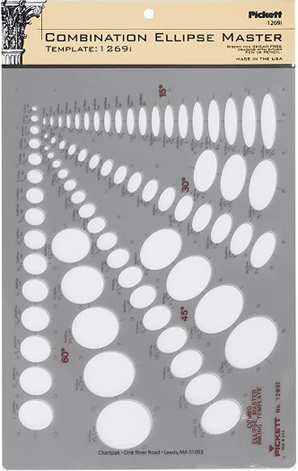
Ellipse Master Template

Ellipse Master Template

This recommendation is really just for those of you who've reached lesson 6 and onwards.

I haven't found the actual brand you buy to matter much, so you may want to shop around. This one is a "master" template, which will give you a broad range of ellipse degrees and sizes (this one ranges between 0.25 inches and 1.5 inches), and is a good place to start. You may end up finding that this range limits the kinds of ellipses you draw, forcing you to work within those bounds, but it may still be worth it as full sets of ellipse guides can run you quite a bit more, simply due to the sizes and degrees that need to be covered.

No matter which brand of ellipse guide you decide to pick up, make sure they have little markings for the minor axes.

This website uses cookies. You can read more about what we do with them, read our privacy policy.