goodboy123

Victorious

Joined 4 years ago

18100 Reputation

goodboy123's Sketchbook

  • Sharing the Knowledge
  • Victorious
  • High Roller
  • Technician
  • Geometric Guerilla
  • Tamer of Beasts
  • The Fearless
  • Giver of Life
  • Dimensional Dominator
  • The Relentless
  • Basics Brawler
    4 users agree
    12:57 PM, Tuesday August 3rd 2021

    Hello Gady, congrats on finishing the first construction lesson! I'll be looking over your work.

    Starting with your arrows, You've done a pretty good job drawing them with a sense confidence and fluidity, therefore making them appear 3D.

    Except for a couple of slightly wobbly lines, your overall line quality seems pretty solid here. However, you seem to get a bit hesitant when placing line weight. Remember that your line weight should be placed just like a normal line, by using the ghosting method and prioritizing confidence (like shown here). This is still a very small issue though, and I'm sure you'll be able to fix it if you keep practicing.

    Onto your branches, they look pretty solid as well. Even though there were a couple of instances where you weren't paying attention to this, you generally did a good job with extending your lines and letting them overlap for a smoother transition between segments. You managed to keep the width of your branches consistent as well. I'm also very glad to see that you were changing the degrees of your ellipses to create a better illusion of depth. There were a couple of misaligned ellipses at the top of the page but it seems you noticed this as well and tried to make sure they were aligned as you kept going.

    You did a really good job with your leaves. You tried doing more complex structures as well and on every leaf you drew, you managed to capture how they sit and move through the space they occupy. You were also careful when applying edge detail, adding every cut/bump by using individual strokes instead of trying to go over the entire edge with a single line.

    Onto your plant constructions, it seems that you were building them in stages and using the methods taught in the lesson material. Because of this, your drawings create a pretty solid illusion of depth. I'm also glad to see that you weren't trying to cut any corners. You made sure to create as many constructions as possible in order to get the most out of this lesson.

    • One thing that I'd like to mention is that, although it's great that you're trying to do more complex constructions (the echeveria drawings on page 7, for example), make sure to use line weight and cast shadows to show how the forms relate to each other. This is especially important in more complex structures because if you draw a lot of forms near each other without showing how they overlap, your drawings almost look like a bunch of lines drawn randomly, thus making it look cluttered and 2D.

    • This isn't just an issue with more complex structures though. On the construction on the last page for example, even though your drawing looks pretty 3D, adding some line weight (mainly to show how forms overlap, as shown here) and cast shadows will make the entire construction more comprehensible. Now we're obviously not trying to create pretty pictures here but you still shouldn't pass up on an opportunity to make your constructions look more readable.

    • (This is a very small detail but I wanted to go over it anyways.) You skipped drawing the pots of each plant throughout this lesson which is understandable since ellipses are a pain. However, on page 7, I think you were planning to draw a pot but you changed your mind so I wanted to point this out; when drawing pots or any cylindrical object, make sure to draw them around a central minor axis line to make sure that your placements are correct.

    • There are a couple of instances where you weren't fully drawing through your ellipses or where you were placing down another line over your ellipses to make sure they look correct. I know these ellipses don't feel as significant since they are still relatively small but keep in mind that the markmaking principles taught in lesson one apply for every mark we put down throughout this curriculum.

    I don't think I have anything else to add! If you have any questions or if there's any mistakes in this critique, please let me know by either replying to this critique or by tagging me on discord.

    Overall, I think you've done a pretty solid job with this lesson so I'm going to mark it as completed, good luck with lesson 4!

    Next Steps:

    Move on to lesson 4

    This community member feels the lesson should be marked as complete, and 4 others agree. The student has earned their completion badge for this lesson and should feel confident in moving onto the next lesson.
    7:45 AM, Monday July 12th 2021

    Hi, your ellipses and lines look way better here, great job! I'm sure they'll be even cleaner if you keep practicing. So, as promised, I'm going to mark this lesson as complete, good luck with lesson 3!

    Next Steps:

    Move on to lesson 3. Make sure to use some of the exercises from this lesson and lesson 1 as a warmup later on.

    This community member feels the lesson should be marked as complete, and 3 others agree. The student has earned their completion badge for this lesson and should feel confident in moving onto the next lesson.
    9:02 AM, Friday July 9th 2021

    You're welcome! I'm glad you found your plotted perspective page haha. You're still missing the second page of the rough perspective exercise though. If you take a look at your submission, you've uploaded the same image twice. I'm guessing you mistook the second page for the first one and reuploaded that one. I can't really mark the lesson as complete without that page so please post that one as well, thanks!

    6:21 PM, Wednesday July 7th 2021

    Hey weijak, thanks again for this detailed critique.

    I knew I was getting some of the intersections wrong but I wasn't sure what to do about it. Thinking about how the planes of each form sit in space seems really helpful!

    On the constructions, you're right about the inconsistencies I had with my subdivisions. I occasionally focused too hard on insignificant details, made my constructions too cluttered, and then skipped the more important parts of the construction. I'll do my best to remind myself to avoid this in lesson 7.

    And even though I was pretty happy with how much attention I was paying to the proportions, it seems that I forgot the observe how each form of my construction related to each other. I think I will need some time fully getting used to this but it'll definitely be on my mind during the last lesson.

    I hope you're not tired of me saying this but thank you again for taking your time to write these thoughtful critiques. I don't even think I'd be here if I didn't learn this much from my mistakes throughout this curriculum so thank you for helping me move forward.

    0 users agree
    8:02 AM, Wednesday July 7th 2021

    Hey there, congrats on finishing the lesson! I'll be looking over your submission.

    Starting with you lines, you seem to have done a pretty good job here. Although your lines get slightly wobbly and arced occasionally (mainly in the ghosted lines section), I can tell you were doing your best to prioritize confidence at all times. If you keep practicing using your shoulder and using the ghosting method, your lines are bound to get straighter and more accurate with time. One thing that I'd like to mention is the fact that you only did a couple of arced superimposed lines. Now I don't blame you for this, since trying to consistently draw the same curved line multiple times can be very difficult. However, practicing this part of the exercise will help you a lot in the future so I'd recommend adding this to your warmups.

    Onto your ellipses, just like your lines, your work here seems generally well done! You continued to prioritize confidence which is way harder when in comes to ellipses. Even when you realized your ellipses weren't as big/small as they were supposed to be, you still didn't lose your focus. When we try to fix our mistakes halfway, we tend to end up with shapes that end up looking deformed which is why prioritizing confidence is so important. As you get more and more used to the ghosting method, you'll have a better idea of how every mark you're planning to put down will sit on the page so the fact that some of the ellipses weren't fully within their bounds isn't as important right now.

    You weren't paying as much attention to the bounds of every ellipse in the funnels exercise but you seem to have realized that as well. You also have a couple of slightly misaligned ellipses in the funnels exercise but that's not a big deal for now.

    Your perspective exercises look pretty solid! I'm sorry you had to redo the plotted perspective exercise though haha. Other than the slightly wobbly lines, the rough perspective exercise looks pretty good as well. You're missing the second page of the rough perspective exercise though.

    Although the rotated boxes exercise was created to be challenging, you still managed to do a great job here!

    Just like the rotated boxes exercise, you did a great job with the organic perspective as well! Your convergences and line quality generally seems pretty solid. You have a couple of diverging lines but you'll have a lot of time to work on that during the 250 boxes challenge.

    Overall, you did great with this lesson, congratulations! I'm only going to ask for a page of the rough perspective exercise, just to make sure that you got everything this lesson has to offer.

    Good luck!

    Next Steps:

    Upload a page of the rough perspective exercise.

    When finished, reply to this critique with your revisions.
    2 users agree
    6:28 PM, Tuesday July 6th 2021

    Hello Zakinithos, congrats on finishing the lesson! I'll be looking over your work.

    Starting with your sausages, you did a good job with drawing them confidently and varying the degrees of your contours to create a solid illusion of depth. There are still two issues I'm seeing however; firstly, there are a couple of instances where you're not sticking to the characteristics of simple sausages. Remember that your sausages should look like two identical spheres connected by a tube of consistent width. The second mistake is the fact that you're not hooking your contours around the sausage to make sure that the contour you drew still looks 3D. As you keep practicing with these contours, hooking them around the form you're drawing them on won't be necessary but since you don't have much experience with them right now, some of them look out of place and make your sausages appear flatter than they actually are.

    Moving onto the constructions, although you have a couple of mistakes, your work here seems generally well done. I'll try to talk about what you've done right as well as what you could work on in the future.

    Firstly, I'm very glad to see that you were able to work additively. Throughout all of your constructions, you always prioritized building on top of your forms instead of starting big and then cutting into the forms you've created. The reason why we avoid cutting into the silhouette for these lessons is because when we only alter the silhouette we tend to end up with rather flat looking shapes (as explained here) . I'm sorry for explaining a mistake you didn't make but I felt the need to go over this because working additively is a huge part of lesson 5.

    Overall you've done a pretty good job with employing the sausage method as much as possible. However, you occasionally strayed away from this in order to make your constructions look cleaner (in some legs in the tarantula construction, for example). Remember that although it may seem unnecessary at times, drawing through our forms helps us develop a stronger sense of 3D space.

    The main mistake I'd like to talk about is your line quality. Overall, you seem to be very hesitant when it comes to placing down your marks. You also occasionally went over some of your mistakes to correct them, resulting in your constructions looking rather messy. It's completely natural for us to forget what we've learned so I'd recommend you to revisit the lesson 1 material. Also if you wish to read more about hesitation, make sure to take a look at this comment by Uncomfortable.

    On the topic of line quality, you should also pay attention to your line weight. When used correctly, line weight really helps make the image more readable. When used more loosely though (in your ant construction, for example), line weight only helps reinforce the silhouette. In order to get the most out of your line weight, try to only use it to show how forms relate to each other (like shown here).

    Overall, you did a pretty good job with this lesson and I'm sure you'll be able to fix the mistakes I mentioned here so I'm going to mark this submission as complete, good luck with lesson 5!

    If you have any questions or if there's anything I misunderstood with this submission, feel free to let me know!

    Next Steps:

    Move on to lesson 5.

    This community member feels the lesson should be marked as complete, and 2 others agree. The student has earned their completion badge for this lesson and should feel confident in moving onto the next lesson.
    2 users agree
    7:26 PM, Sunday July 4th 2021

    Hey, congrats on finishing the challenge! I'll be looking over your work.

    Starting with your lines, although your line quality was pretty solid even in the beginning, by continuing to prioritize confidence further, you still managed to improve in this regard throughout the challenge, to the point where your boxes looked almost like they were drawn with a ruler. Your line weight got cleaner as well; instead of drawing thick lines that stood out on their own like in the beginning, you started to apply line weight smoothly and subtly.

    I feel like you could've been more mindful with your hatching however. Even though your hatching lines got better as well, they were rarely as accurate as the lines on your boxes. They were usually shorter than needed and there were times where the lines wouldn't touch either edge of the box, implying that you weren't fully paying attention to where you placed your pen. These hatching lines obviously aren't as important as the lines of the box itself but they still help carry the illusion of depth. If we're not mindful of how we create every part of our constructions, we risk making them look unconvincing, thus making our drawings look 2D.

    Moving onto the boxes, just like your lines, you seem to have improved greatly in this regard. Although you still have some lines that converge too early in your later boxes (mostly the inner line), your convergences generally got cleaner as you kept going.

    On the topic of convergences, let me remind you that the mistakes in the inner lines are generally fine since they are mostly the representation of the accumulation of every small mistake you've done while drawing the box. I'd still like you to take a look at this diagram though. Also, if you want to minimize your mistakes with the inner line, make sure to take a look at this demo to see a different approach to constructing boxes.

    You did a pretty good job with trying out different shapes of boxes as well. However, I'd like you to try out boxes with different orientations in the future, as shown here. You also extended your lines in the correct direction which is great.

    One last thing that I'd like to mention is the fact that you used a smaller paper for this challenge. Although your line quality was pretty great overall, I think you would benefit from using a bigger paper and drawing big to fully engage your shoulders.

    I don't think I have anything else to add! I'm sorry if the structure of this critique was rather awkward since I accidentally closed this tab while I was writing this critique the first time. Because of this, I had to rush through a bit the second time to make sure that I didn't forget to rewrite any point I've made earlier. There is still a chance that I forgot something though, so if you have anything to ask, feel free to do so on here or on discord by tagging me.

    Overall, you did a great job with this challenge and you should feel free to move on to lesson 2, good luck!

    Next Steps:

    Move on to lesson 2

    This community member feels the lesson should be marked as complete, and 2 others agree. The student has earned their completion badge for this lesson and should feel confident in moving onto the next lesson.
    3 users agree
    3:37 PM, Saturday July 3rd 2021

    Hello there, congrats on finishing the lesson! I'll be looking over your submission.

    Starting with your arrows, you did a pretty good job with making them flow through the scene pretty fluidly by compressing the further end of your arrows. However, it seems like you weren't paying much attention to the overall quality of your lines. It feels like you were pretty hesitant while putting down your marks and you probably drew them pretty slowly (and occasionally used chicken scratching), thus filling your page with pretty wobbly lines that show a lack of confidence. You also tried going over your lines to fix your mistakes. Always remember that trying to fix your mistakes with ink will only shift the viewer's attention to them.

    I'm reading that you're having trouble with making your lines taper. Tapering your lines and being able to correctly apply line weight to them is only possible if you're drawing them confidently. Remember that confidence should always be your main priority during this course. Accuracy will come with time.

    Seeing that it's been a while since you finished lesson one, I highly recommend going over all the material again, especially the markmaking section. Also make sure to check out this comment by Uncomfortable if you wish to read more about hesitation.

    Moving onto the sausages, your lines look way better here. Even though your lines weren't always accurate, I can tell that you were doing your best to prioritize confidence. Although you did a pretty good job with shifting the degrees of your ellipses , you could've done the same with your contour lines to create a better illusion of depth.

    In the texture analysis exercise, you were focusing mostly on drawing lines instead of shapes when drawing the shadows which breaks the illusion of 3D and makes it difficult to identify the forms that creates those shadows. Make sure to check out this guide to see how to get used to working with shapes rather than lines.

    The dissections exercise looks better however. You did a pretty good job with breaking the silhouette and your textures wrap around the form nicely. However it seems like you weren't observing your references closely enough for a couple of textures and therefore you occasionally used random scribbles (the dog fur, for example).

    Onto your form intersections, even though your lines were still slightly wobbly, your work here is still pretty well done. You managed to maintain the illusion of depth by keeping the foreshortening consistent between forms. You also did a good job with showing the actual intersections between the forms.

    Again, apart from the line quality, your organic intersections exercise shows that you have a pretty solid understanding of 3D space. You managed to stack forms on top of each other in a believable way and you did a good job with your cast shadows as well. You forgot to draw through your ellipses here though, that's why some of them look slightly deformed.

    Overall, you didn't do a bad job with this lesson. I would love to let you move on to lesson 3 right now but i believe that investing some time to improve your line quality before tackling the construction lessons would generally be in your favor. Also I'm going to be asking you to do one row of the texture analysis exercise. I'm mostly asking this because you skipped a row in your submission but also I feel like you can do a better job with this exercise if you fully put your mind to it. Make sure to check out the 25 textures challenge if you want to get more used to drawing cast shadows.

    Good luck!

    EDIT hey, I forgot that only a single page of the texture analysis exercise was supposed to be included and you did two extra rows instead of skipping a row. So therefore you don't need to do the texture exercise revision, sorry for that.

    Next Steps:

    • Go over the lesson one material again. You don't need to revisit the entire lesson if you don't want to, just make sure to go over the lines section of the lesson. Once you're finished, upload 2 (or 3) pages of ellipses in planes. Make sure to prioritize confidence at all times.

    • Submit one texture analysis exercise.

    When finished, reply to this critique with your revisions.
    2 users agree
    9:16 AM, Tuesday May 25th 2021

    Hello again Kap, congrats on finishing lesson 4! I'll be looking over your work.

    Also I know we talked about a couple of your constructions on the discord channel so I'll try to be brief when talking about them.

    Starting with your organic forms with contour lines, you generally sticked to the characteristics of simple sausages which is great. However with your contour lines, you usually drew them pretty flat and kept the degrees of them the same. Remember that just like the branches, varying the degrees of your contour curves really helps sell the illusion of depth. Also when drawing the contour curves, try to think about the volume and the shape of the form you're drawing them on.

    Moving onto your constructions, you honestly did a great job here. I'll try to point out any mistakes I see without being too nitpicky though.

    • You generally tried to work additively as much as possible, starting from simple forms and adding new forms on top of them in order to create your constructions. You occasionally deviated from this method though. Instead of adding forms to an underlying construction, you instead tried to draw the entire form in a single go (the front and the back legs of your grasshopper and the claws of your lobster, for example). I'm going over this again because this is an incredibly important part of lesson 5. You'll start to realize this with your animal constructions as well but I'll mention it anyways: When drawing your organic constructions, the forms you're adding to the initial construction should almost feel like piles of clay that you're adding to a 3D gesture that you've created (with sausages, spheres, whatever). This is a very powerful approach in my opinion because this way, you will start to think deeper about how each individual form wraps around each other (like on this dog leg demo, for example), which is the main part of most of these construction lessons.

    • You did a really good job with your cast shadows and I'm really happy to see that after pointing it out on your lesson 3 critique, you managed to limit your use of shading only to show how each form relates to each other. Not only this helps make your constructions look more convincing, it also saves your overhead view constructions from looking 2D (like on your bee construction). However, on two constructions, I'm seeing that you colored in the little spots on the abdomen of your insects (this one and this one, to be precise). I think this was mentioned on discord as well but although they don't look too distracting here, these have the potential to flatten out the entire construction so try to avoid coloring in to show the actual color of your refs. (If you look at the comments of the tiger head demo video, you'll see that Uncomfy admits that coloring in wasn't a part of the lesson and should've been avoided)

    I don't think I have anything else to add! I'm sorry if this critique was rather weak. Even though I tried to make as many pointers as possible, I didn't want to overwhelm you by going over the same mistakes we talked about on the discord server.

    Also I know you completed this lesson quickly because you had a lot of free time but with your animal constructions, try to really take your time with each page and observer your references closely. This actually came up in your lobster construction as well. If you look at the scales on the tail of your construction, you'll notice that they kinda look like sausages instead of scales. This is mainly because you weren't fully paying attention to the silhouette of the tail on your reference. This is obviously not a big issue but I just though I'd give an example.

    Overall, you did a great job with the lesson so I'll go ahead and mark this as complete. Good luck with lesson 5!

    Next Steps:

    Move on to lesson 5.

    This community member feels the lesson should be marked as complete, and 2 others agree. The student has earned their completion badge for this lesson and should feel confident in moving onto the next lesson.
    10:03 PM, Saturday May 22nd 2021

    You're welcome, I enjoyed writing the critique as well!

    I'm very glad I was able to convince you to keep getting critiques. It's completely natural for us to make mistakes and I'm very happy to see that chose to accept your mistakes and started to work on them.

    Working through these mistakes will definitely take time (I still have some issues with the mistakes I pointed out on the critique, for example) but the important thing is that you'll gradually get better as you keep practicing. So keep at it, good luck!

The recommendation below is an advertisement. Most of the links here are part of Amazon's affiliate program (unless otherwise stated), which helps support this website. It's also more than that - it's a hand-picked recommendation of something I've used myself. If you're interested, here is a full list.
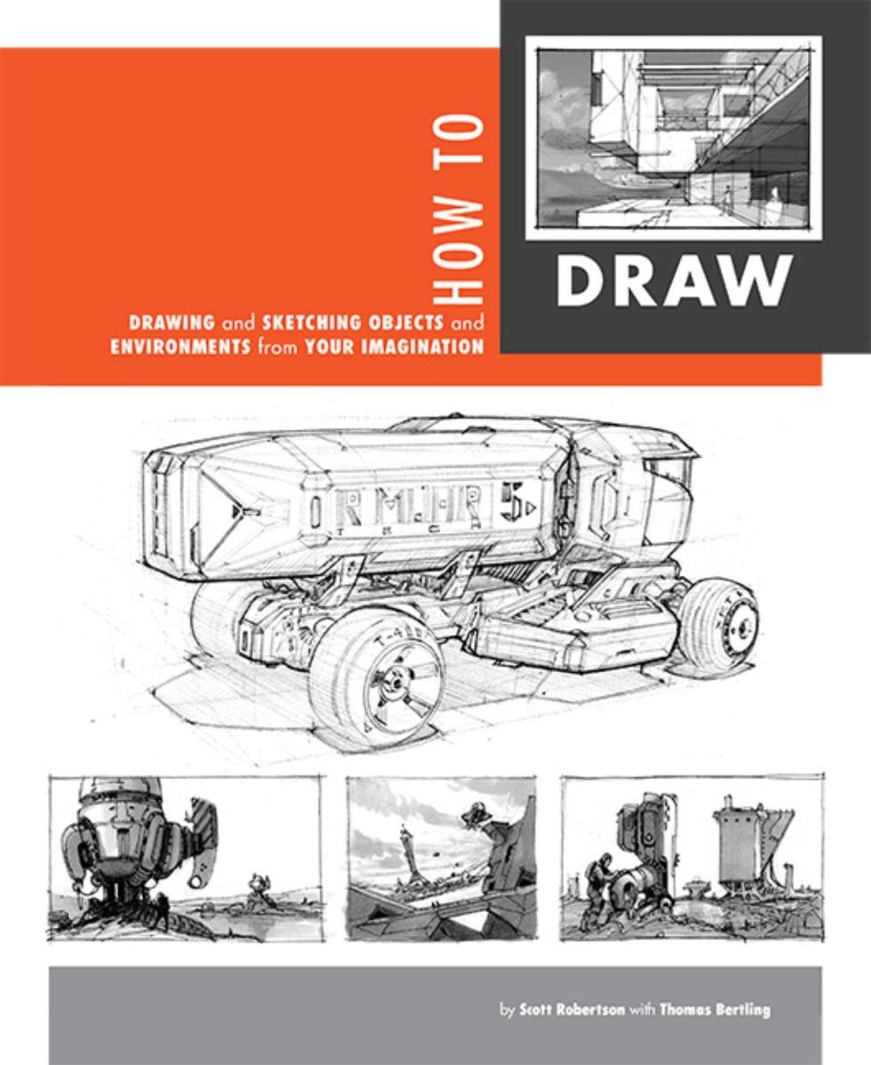
How to Draw by Scott Robertson

How to Draw by Scott Robertson

When it comes to technical drawing, there's no one better than Scott Robertson. I regularly use this book as a reference when eyeballing my perspective just won't cut it anymore. Need to figure out exactly how to rotate an object in 3D space? How to project a shape in perspective? Look no further.

This website uses cookies. You can read more about what we do with them, read our privacy policy.