f8upd8

Tamer of Beasts

Joined 4 years ago

625 Reputation

f8upd8's Sketchbook

  • Sharing the Knowledge
  • Tamer of Beasts
  • The Fearless
  • Giver of Life
  • Dimensional Dominator
  • The Relentless
  • Basics Brawler
    9:31 AM, Friday July 17th 2020

    I took my time to work on the issues you listed, the ones in this critique - the ones in the previous one as well. I'm pleased to present you assignments you required - please take a look. https://imgur.com/gallery/hrkfHig

    P.S.

    And references of course!

    https://imgur.com/a/XrgPas1

    1:10 AM, Monday July 13th 2020

    Thank you for this well elaborated critique! I tried my best to do better - and I'm positive to try again, because it seems at least to me that I was a little bit careless these 4 pages. I even was tempted to throw them in a trash bin and start over - but brushed this thought off. I must make a quick remark: only construction of each of these animals took me about 30 minutes. People on the discord informed me that it is too fast but I can't help it - perhaps I'm too confident. Please take a look at my attempts.

    https://imgur.com/gallery/XV3mS4e

    2:07 PM, Wednesday June 17th 2020

    What exactly did you put into the link field?

    2 users agree
    11:44 AM, Friday June 12th 2020

    Click on your nickname at the top right. After this, you will see a drop-down menu. Choose "sketchbook". Then, below your avatar, click "post your artwork to the sketchbook". Choose the submission type of "Drawabox Homework" and set all additional settings and input fields. Your imgur album link should go to "Link to the images" text input field.

    1 users agree
    7:16 PM, Sunday June 7th 2020

    From my experience, staedtler isn't very flowy. So some fade is just natural for these pens. Even on 80gsm standard print paper. But if this is out of concern - look for paper of density of about ~80-100gsm. But I really would advice you to get some simple print A4 and a clipboard.

    8:45 AM, Sunday May 31st 2020

    Great work! Your funnels are much better (but still have some problems, now mainly with keeping them in bounds) and ellipses and planes are definitely moving in the right direction now. I see no problems for you to proceed to 250 box challenge and eventually to lesson 2. Make sure to continue working on your ellipses in planes in your warmup routine!

    Next Steps:

    250 box challenge

    This community member feels the lesson should be marked as complete. In order for the student to receive their completion badge, this critique will need 2 agreements from other members of the community.
    0 users agree
    4:31 PM, Friday May 29th 2020

    It seems that you still have some "course correction" holding youur progress a back a little, but it's expected from a beginner. After all, your ghosted lines show less wobbling than your imposing lines. Good effort on ellipses - they are confident and I see you're trying to stay in the bounds, but the shape of your ellipses needs some training as well as how they touch the corners - make sure to do them as warmups later. Most of your ellipses in planes don't touch all the four corners - you'll need to work on that, I suggest doing one more page of them. You have a problem with funnels - they aren't aligned to the minor axis. I suggest re-reading about it in the exercise and giving one more page of funnels a shot. Good job keeping them snuggly though! Rough perspective looks fine but you sometimes struggle to keep your horizontal lines aligned - keep an eye on it.

    Next Steps:

    1. One more page of ellipses in planes

    2. One more page of funnels

    When finished, reply to this critique with your revisions.
    0 users agree
    4:16 PM, Friday May 29th 2020

    The main goal if I understand is that student actually understood what exercise asked him to do. Typically, if a student did not understand what exercise is about - it will clearly be visible. There is a section of "mistakes", which are good indicators that a student requires a little more pages. Generally, I'd first look at mistakes section and seek for some. After that I'd compare the actual work with example homework to spot any things that'd indicate the lack of understanding of the purpose of the exercise. Or the lack of actual effort (scribbling). But this is just my opinion, I didn't do any critiques on the community platform yet! Derived it from common sense and what Uncomfortable says in lesson zero about that student shouldn't get a perfect work done, but should complete it with a general understanding of what is going on and move forward with these concepts in mind.

The recommendation below is an advertisement. Most of the links here are part of Amazon's affiliate program (unless otherwise stated), which helps support this website. It's also more than that - it's a hand-picked recommendation of something I've used myself. If you're interested, here is a full list.
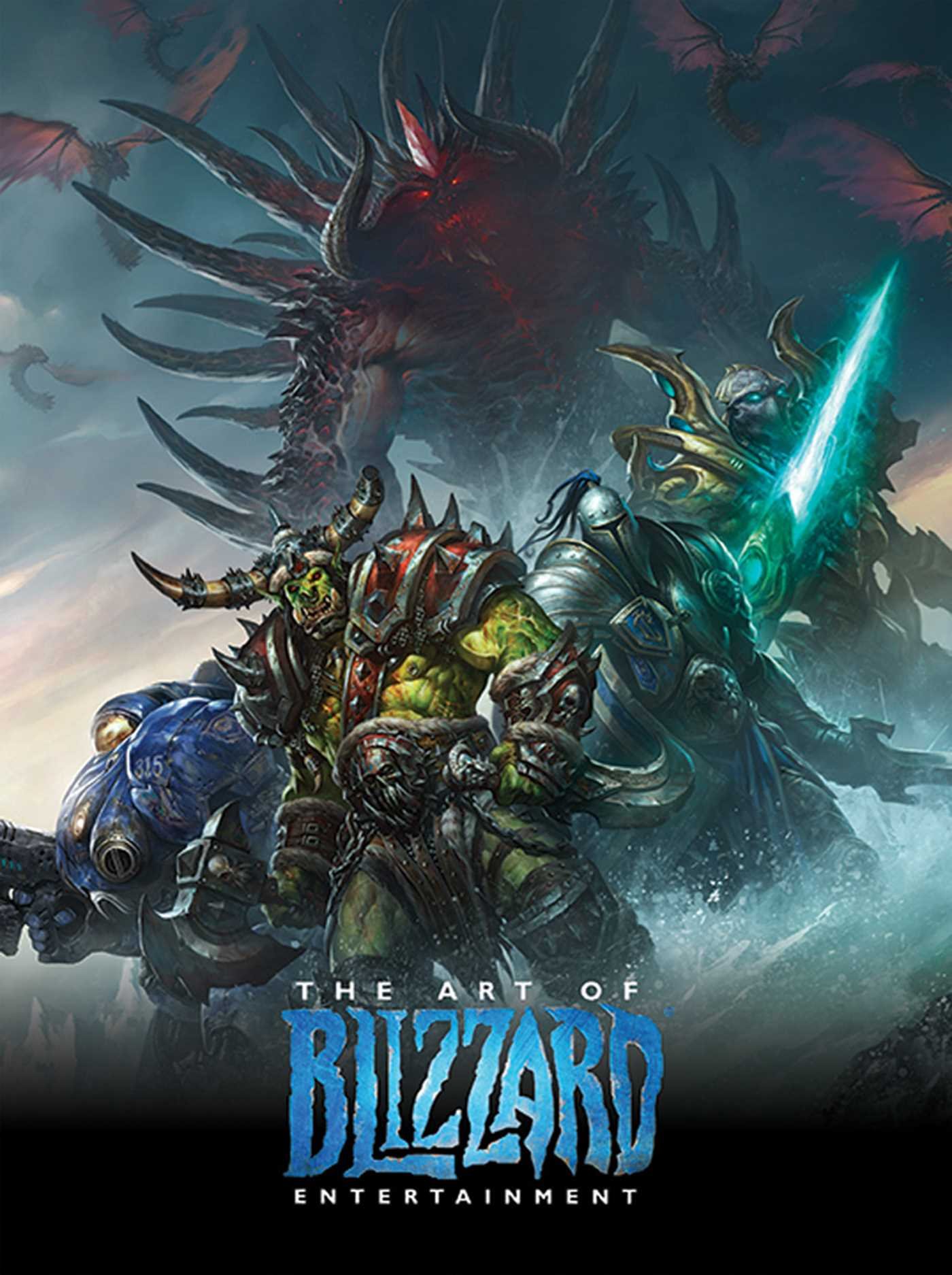
The Art of Blizzard Entertainment

The Art of Blizzard Entertainment

While I have a massive library of non-instructional art books I've collected over the years, there's only a handful that are actually important to me. This is one of them - so much so that I jammed my copy into my overstuffed backpack when flying back from my parents' house just so I could have it at my apartment. My back's been sore for a week.

The reason I hold this book in such high esteem is because of how it puts the relatively new field of game art into perspective, showing how concept art really just started off as crude sketches intended to communicate ideas to storytellers, designers and 3D modelers. How all of this focus on beautiful illustrations is really secondary to the core of a concept artist's job. A real eye-opener.

This website uses cookies. You can read more about what we do with them, read our privacy policy.