This website uses cookies. You can read more about what we do with them, read our privacy policy.

3:05 PM, Tuesday October 24th 2023
Hello, and welcome to drawabox. I'm TA Benj, and I'll be taking a look at your Lesson 1 submission today.
Starting off, your superimposed lines look mostly good. They're generally smooth and properly lined up at the start, but not always of a consistent trajectory, so please be mindful of that. I'll remind you that it's more important for our marks to be confident, than it is for them to be accurate. In other words, you should prioritize their smoothness/straightness, rather than how closely they stick to the guideline. I'd say the same for your ghosted lines, but it seems like you ended up figuring that out yourself by the time you reached the planes, anyway. I also appreciate that you made your start/end points smaller, though hopefully you didn't forget to include them in your non-diagonal center lines of the planes (they're so small that it's hard to tell now, ahah).
The table of ellipses exercise looks mostly good. Your ellipses are a little samey - this is to say, there's not a great deal of variety to their degrees/angles - but that's not a huge issue. More so, is the fact that here, too, you're a little too concerned with accuracy. Same as with the lines, it's irrelevant if your marks end up being inaccurate, here. What's important is that they're smooth, rounded, and properly drawn through. So please prioritize accordingly. The ellipses in planes are more of the same, which is to say, they're mostly good, but could be more confident than they currently are. The funnels, too. That said, every other aspect of these exercises is well done (your ellipses in planes properly fit inside of them, and your ellipses in funnels are snug, and properly cut in half), so it's just a matter of realigning your philosophy.
The plotted perspective exercise looks clean. The rough perspective exercise is good and bad. Starting from the good, your convergences look solid. They start off very strong, and still manage to show some good improvement throughout the set. Your linework, on the other hand, is very scratchy. Remember that you're only meant to draw each line once, and only once, regardless of how it turns out. Especially resist the urge to correct a line that's come out wrong, if for no other reason than all you'd be doing is drawing more attention to it. The rotated boxes exercise looks good. Your boxes are snug, and they do a good job of rotating, but this rotation is sometimes a little shallow, and not all of your boxes have been drawn through. For the record, we get into the habit of drawing through our forms as if we have x-ray vision - this is all of them, not just the ones where it makes sense to. Still, you've done well beyond that. The organic perspective exercise, too, looks very good; I especially love seeing so many unused points on the screen, as it's evidence of proper, patient planning. Your boxes are a little samey, as far as their shapes are concerned, and their foreshortening is sometimes a little shallow, but they flow well, nonetheless.
Next Steps:
Great work, overall! I'm happy to mark this lesson as complete. Onto the box challenge!
1:18 AM, Wednesday October 25th 2023
Thank you for your comment. As you pointed out, sometimes I'm a little concerned about the accuracy leading to scratched lines.
Sometimes, when I draw ellipses, my anxiety peaks and starts to control me. My hands were so stiff and shaking that I had to stop and breathe. It's a strange thing though, when I don't care whether I can make confident and precise lines or not, things start to get a little better.

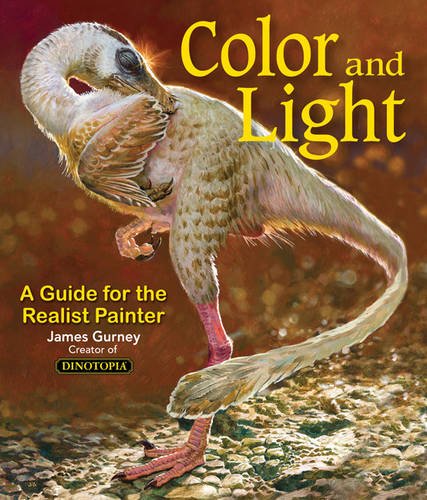
Color and Light by James Gurney
Some of you may remember James Gurney's breathtaking work in the Dinotopia series. This is easily my favourite book on the topic of colour and light, and comes highly recommended by any artist worth their salt. While it speaks from the perspective of a traditional painter, the information in this book is invaluable for work in any medium.


